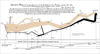
Yesterday I took my FIT students on a field trip to see the Places & Spaces: Mapping Science exhibition at the Science, Industry and Business Library of The New York Public Library. It’s a modest little show consisting of several dozen examples of maps, globes, and information graphics — as exemplified by Edward Tufte’s much-beloved “Napoleon’s March to Moscow” by Charles Minard (seen here), which illustrates the utter devastation of Napoleon’s army as he attacked and retreated from Moscow in the deadly winter of 1812.
I was a little surprised at the close attention my students paid to much of the work, examining and discussing some of them pretty intensely. I knew they’d be interested, but I didn’t expect them to really investigate and talk about the works in detail as they did.
But I think I understand why: The maps on display have a puzzle-like quality to them, which is I think part of the aesthetic and experiential appeal of information graphics. People like to try to figure them out.
And believe me, many of these maps were incredibly difficult to figure out. A great many of them were, quite frankly, completely indecypherable.
This is more than a little ironic insofar as the whole point of information graphics is to communicate more clearly than traditional textual description and raw data can. In some cases, the infographics hit a home run and communicated more in a few seconds than could possibly have been accomplished through text or tabular data alone (again, I refer to “Napoleon’s March to Moscow”). In other cases, however, the visualization exercise seemed a little pointless, the graphic obscuring far more than revealing.
In a few excellent cases, however, where the information being communicated is inherently complex, and parsing the infographic takes a little mental labor, there were some rewarding successes.
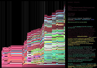
Martin Wattenberg & Fernanda Viégas fantastic infographic analysis of the evolution of the Wikipedia entry for evolution (seen here in detail) is an excellent example. At first it was a little daunting and confusing. But my students and I gatherered around and, after a little discussion, we finally figured it out… and in a group “light-bulb moment” we were able to appreciate the knowledge contained within the information graphic.
(Maybe they should be called knowledge graphics?)
Despite Steve Krug’s sound “Dont Make Me Think” advice, sometimes thinking is an absolute necessity to user experience. Sometimes the thinking itself is the primary joy of the experience. This is obviously true in literature, movies, art, and video games. But I think it’s also true for information and interaction design.
In the Wikipedia example, does the actual knowledge gained (about the activity around the Wikipedia entry for evolution) really make any difference? Is that why the work was made, why it was included in the exhibit, why we find it so interesting? Or is the real point simply contemplating and experiencing the infographic itself? Is the thrill and pleasure of thinking its own reward?