Newsweek invited four “hot” design firms to “reboot” the brand of the Republican party to appeal to younger voters. Not an easy challenge. And while the design work itself looks good, I think each of them missed the big picture objective by failing to speak to core Republican values.
First up is Pentagram.
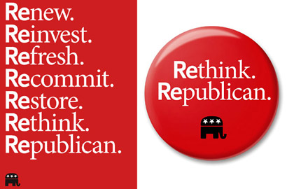
Pentagram proposes a solution that zooms in on the “Re” part of “Republican”, tying the prefix to a list of positive, progressive, change-oriented objectives. It frankly and straightforwardly admits that the party needs to do some soul-searching and needs to rebuild some of their ideas from the ground up, but spins it in a positive
way as if the change is complete.

Awesome Obama flag flying proudly outside Pentagram’s Manhattan headquarters
I’ll admit, however, that I was shocked at Pentagram’s solution from the first moment I saw it: Two years ago I proposed that, in response to the GOP’s habitual use of the term “DemocRAT Party” (rather than the preferred term “Democratic Party”), Democrats should respond by simply using the term “RE-publican”, suggesting that the party’s ideology is just old-fashioned, backward-thinking slapped with a new paint job. But here’s Pentagram using the “re-” prefix as some kind of positive, forward-thinking signifier.
Newsweek explains that Pentagram’s “re-” approach “shifts the dialogue” from potentially negative connotations by commandeering the prefix for positive purposes. I think it does just the opposite, inviting us to fill in our own descriptive words. In fact, I think Pentagram may have already used up almost all of the positive “re-” words in this single design. All the rest are pretty awful: retread, regressive, repressive, retarded, reactionary. I don’t see why any party would want to be “re-” anything, in particular the Republican Party.
In fact, just yesterday a candidate for RNC chair pre-emptively rejected (no pun intended) exactly this approach:
“I’m trying to avoid the use of words that start with ‘re,’ words like renewal, rebuild, recharge, re-this and re-that,” Steele wrote in a memo to RNC members. “I’m convinced we should not re-anything. Instead, we must stand proudly for the timeless principles our Party has always stood for.”
In fact, it’s hard to see Pentagram’s design as anything but anti-GOP propaganda. The editors at Newsweek claim that these four firms are “non-partisan”. I don’t know about the other three, but in the case of Pentagram I suspect they might have a sleeper cell on their hands. If so, seriously: Bravo Pentagram!

Our next redesign comes from The Groop, the only boutique firm in this mix. I didn’t know much about them before, but their portfolio and clients are really impressive.
Newsweek describes The Groop’s design approach as “Out: ‘old money,’ ‘faith-based.’ In: ‘new wealth,’ ‘spirituality-based.’”. And I think right there is the problem. How many Republicans would ever want to replace “faith” with “spirituality”? That’s the kind of thing that Republicans make fun of Democrats for! This is great liberal design.
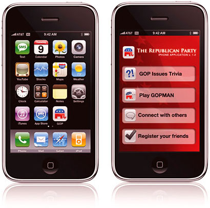
Next up is Razorfish, who proposes, essentially (and I hate to be petty), that the GOP should copy Barack Obama’s groundreaking iPhone app almost verbatim, with the biggest differences being fewer features and using a red background instead of blue.
Yes, I know the point is to show that the GOP should use social media more. But seriously, “GOP Issues Trivia?” I don’t even think there is an idea here.
At least Razorfish isn’t asking the GOP to abandon their policies. Let’s move on.

The fourth firm is Frog Design, who focuses on emotional qualities of freshness and vitality without a radical shift in ideology.
Frog, I think, hit the nail closest to the head. There it says, plain and simple, “small government”, not just getting the GOP’s ideology right, but predicting what will likely be the right’s biggest critique of President Obama’s policies and leadership in the coming years. And while the photo suggests diversity, it’s not too diverse.
My criticism of this design, however, is the weakness of it –Â weakness in contrast with strength. Compare it to John McCain’s or George Bush’s graphic design, both of which evoke muscular military and sports brands. Hand-written lowercase lettering and a cute sumi-e elephant don’t quite evoke the “daddy party” strength that the GOP has traded on for decades as its core emotional and psychological attraction. Without this fundamental strength on display, I wonder if this branding would alienate as many Republicans as it embraces.
Perhaps it’s the initial framing of the problem itself that’s distracting these design teams: They were asked to reposition the party to appeal to younger voters. But how can a party appeal to a demographic who already cherishes certain values (such as diversity and tolerance) that are permanently and irrevocably diametrically opposed to the values of at least a third of the party’s base? Not an enviable challenge.
But maybe it’s an even bigger problem, one that branding cannot solve. Re-branding cannot help the GOP any more than re-branding VHS can help it compete with DVD. The product itself is obsolete and needs to be changed.
All these redesigns attempt to paint the GOP as something it is not: an organization in favor of scientific and technological progress, social change, a capable and pro-active government, and cultural diversity. But the party itself has, with great success, for almost five decades specifically defined itself against these things — that’s what loyal Republicans like about their party.
If these four firms really addressed the re-branding challenge correctly, they would have focused on selling the Republican Party’s values to sympathetic customers, not on presenting the party as something it is not. All four approaches would clearly speak directly to the party’s core values. Despite a change of voice and style, the re-branded message should still speak about the GOP’s actual policies: That taxes and regulations are oppressive, that abortion is wrong, that homosexuality is wrong, that excessive cultural diversity is undermining American society, that a strong military is what makes America great, and that individual freedom trumps even well-meaning government intervention.
What’s probably true is that the party itself needs to change and needs to actually embrace some of the values on display in these designs. It seems likely that these design teams were, in a way, suggesting to the GOP that they need to change who they are, not just how they present themselves. But that’s a long way off — a generation of Republican politicians will need to retire and die before the party will bend on many of these policies. These redesigns might be useful in 2025. For now, however, I doubt the GOP will take any of this advice.
Until then, perhaps some of these branding ideas could still be useful: Recycle them and give them to the party they best fit: the Democrats.
Are you a Republican? Do these redesigns speak to you?
UPDATE: This article by Julian Sanchez at Ars Technica outlines exactly how clueless the Republicans are when it comes to using social media and technology to communicate about their message. But more fundamentally it argues that the party itself doesn’t have a clear message in the first place. What’s more, it’s only remaining message — opposition — is weak:
The dangerous temptation right now, especially for a party in the minority, is to seek to recapitulate the Cold War coalition model through oppositional self-definition, when something more robust is called for.
I feel like I better stop before I give the GOP any more good ideas.
UPDATE 2: Okay, I had to add this after I saw it the other night. The Daily Show went to yet another brand agency, this time to Droga5, for one more angle on Republican rebranding.
I don’t know if “Reagraham Lincool” was Droga5’s idea or The Daily Show‘s (and in either case Samantha Bee is a genius), but of all the rebranding contenders I think these folks got it just about perfect.
Republicans, take note: This is how you do it.

Comments
10 responses to “Grand Old Redesign”
Excellent analysis. You’re spot on with all of these, and I almost wonder if the design challenge here was really: rethink Republican branding for an audience that’s already disposed to think that design is a viable approach to problem solving.
In other words, there’s an awful lot of Republicans who’d think that “design” is some sort of fruity, urban, elite, etc. etc. thing to be doing at all; this project is for all the *other* Republicans. You know, Newsweek-reading Republicans. 🙂
hey chris – are you the new steven heller?
great piece, sir. i posted it on FB.
g
“Re-branding cannot help the GOP any more than re-branding VHS can help it compete with DVD. The product itself is obsolete and needs to be changed.”
Brilliant. It is totally obvious when you say it, which of course is what makes it so brilliant. I’m sick of marketing/advertising/branding being heralded as innovative if the product is still broken.
I was very cynical about the hype over Microsoft spending big money to rebrand Vista, given that its shortcomings were so widely discussed. I am, however, a big fan of the “I’m a PC” advertising because it’s not pushing a broken product but the overall notion of PCness which while not ideal (but what piece of technology is?) is perfectly valid.
I had liked Pentagram’s approach until you pointed out the easy parody “rejected, retard, etc.” flaw. The Groop’s design is just odd — I don’t get why they linked it so obviously with the Red Cross. Razorfish’s design looked like it was done by an intern on their lunch hour. Frog’s is ok but as you say is a really weak logomark.
I think all these flaws stem from the from fact that it the redesign targeted at young voters and instigated by Newsweek rather than by actual conservatives that are looking for a more change. The Andrew Sullivan and Culture 11 crowd would have been a better focus group for this.
@Thomas Good point — design itself as a solution, in particular design originated in a fancy New York, Chicago, or LA design firm, is open to question.
I do think that Newsweek was either disingenuous or duped by these firms: I suspect it’s a little white lie that these firms are “non-partisan”. I could be entirely wrong, but my gut says that 90% of the staff of these firms are liberal Democrats.
They’re only non-partisan when compared to overtly partisan firms. In researching this article, I uncovered two such firms, specializing in partisan design. What a contrast between the two:
Republican:
Spalding Group, who has designed all of the Republican presidential campaign brands since Reagan, including McCain.
Democrat:
Blue State Digital
@Gong Thanks!
@ Steve Portigal I thought the same thing about the two Microsoft caqmpaigns. People who use Windows don’t need to be convinced that Windows is like Mac — they know (or think they know) what Mac is like and they prefer Windows.
@Colin Good point about narrowing the focus of the rebranding to concervatives who have strayed from the Republican party’s values. Still, when you said “focus group” it made me realize that, in fairness, these firms probably did this work for free and that they didn’t focus group anything. Still, I can’t even imagine any of these designs, except maybe Frog’s, was ever touched or even shown to a real Republican during the design process.
Thanks for this piece. It’s terrific.
I am always skeptical of design exercises like this because as Colin pointed out, it cannot be a design *solution* unless the party with the problem is involved.
Pentagram’s contribution reminds me of the United Rising campaign of a few years ago. This isn’t the worst idea given the current state of the GOP brand.
Frog’s take on small government seems to be “government by small people.”
Brand design can’t help until there is some clarity around the legitimate promise of the Republic party.
I saw these designs in Newsweek and was thoroughly annoyed. In order to work, branding has to be authentic, and none of these very attractive and appealing designs is even remotely connected to what the Republican Party is or even can plausibly be in the next decade. I mean, their idea of a “fresh face” was Sarah Palin, who was about as conservative, religious, racist, right wing and reactionary as a Republican can be. She was even anti-feminist, when you come down to it.
And yet it’s true that the Republican brand HAS changed dramatically over the last 25 years. it used to be Republicans were thought of quiet, stodgy types who were conservative in every sense of the word. Hawkish, patriotic, frugal, cautious, responsible, growth-oriented, live-and-let-live, civic-minded, freedom-loving. I guess that’s what you would call the “good” old Republican brand. The new brand has some remnants of that, but has picked up a lot more negatives along the way. Now the words associated with Republican are narrow-minded, mean, crooked, incompetent, flighty, extremist. racist, religious fanatics.
It’s a long, fascinating (and depressing) story how the Republican Party grew from the 1970s through the 1990s, largely through the efforts of a few key strategists who shrewdly used the issues of race and class to divide and conquer in the South and heartland. The goal, of course, was to concentrate power and that goal reached its crowning glory with the election of Bush/Cheney. During their 8 years in power, the Republicans were able to run the United States as a service provider to their corporate interests.
That is what makes the last rebranding example “Small government, big contribution,” so obscene. Does anyone seriously think that a small government will help the little kids in that picture? How? By being very, very small??
This is a perfect example of stylish, empty sloganeering. And yet, in another sense, the slogan is perfectly accurate. Because Republicans certainly did look for “big contributions” from government while they were in power, in the form of kickbacks, pork, and no-bid contracts.
Wow, they really are awful. @Colin, you’re right, it’s like they *only* focused on new voters, at the expense of existing voters: that’s a great way to collapse a party. @Chris, I’m in the same boat — I’d love to make comments on what went wrong here, but I don’t want to share any help until the product is fixed, as you say.
GOP for smaller government? Oh, the irony. The size of government increased exponentially under Bush.