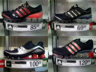
Running shoes must be usable, but it’s their seductive design that really sells the product.
I’ll be delivering a new presentation concept about “merchandising” at the O’Reilly Web 2.0 Expo in New York this September 18th (and again two weeks later in Amsterdam at Euro IA). Not about merchandising as in the design of retail environments (offline or online), but about merchandising as in how products themselves are designed to make people want to buy them.
Many UX designers see “merchandising” as another flavor of marketing, and therefore see it as something different from, or even opposed to, good UI design. It’s the evil part of the product design process that says we need to put 100 buttons on the remote control so that they can put 100 bullets on the box, which in turn will help the product sell from the shelves in the stores.
Mozilla Labs UI designer, and former Humanized ninja Jono DiCarlo writes about this phenomenon in his thought-provoking UI manifesto “These Things I Believe“:
6. Is UI design marketing?
User interface design is not marketing.
Software developers loathe marketing, so if they think that UI design is marketing, then they will loathe UI design.
The qualities of software that make for a good advertisement or computer-store demo are not the same qualities that make software usable and pleasant to work with long-term, day-in day-out. Often these qualities are opposites.
A shopper may choose the microwave with more buttons, because it seems “more powerfulâ€. However, the shopper will soon find out that it does the same thing as any other microwave, you just have to spend longer figuring out which button to push.
It is easy to fool people into buying something that is against their own best interest.
Don’t do that.
I’m not sure I agree with this entirely. The user experience designer’s job is essentially no different than what the industrial/product designer’s job has been for a century: To design products that people want to use. A product that is empirically hard to use but that people perceive as easy or fun to use because of delightful UI characteristics can be successful. A product that makes a lot of noise, takes up a lot of space, is expensive to maintain, and has a complicated interface might be extremely desirable and satisfying to many people simply because it makes them feel powerful using it, despite the measurable waste associated with the design.
A designer who neglects marketing concerns and designs a product that the target audience sees as undesirable (because, for example, it lacks a sexy list of features or a glossy interface) is just as bad as a designer who neglects production concerns and creates something that is prohibitively expensive and time-consuming to build (to manufacture, program, whatever).
And unfortunately for us designers who favor elegance and simplicity, there is a large cohort of consumers and purchasers who feel a *lot* better about instead owning products that they are confident have the most buttons and bullet points, regardless of usability or even performance. You can probably throw many Windows Vista champions into this category.
If efficiency isn’t generally seen as important to a product’s users, then we designers who do think it’s important need to make our elegant and efficient products scream out to users “I am simple to use! And (in case you didn’t know) that’s a good thing! Don’t buy the competitor’s junk with all the bloated features — buy me instead and you’ll be happier!â€
That’s a designer being a marketer, or even a salesman. But in a good way.
Comments
5 responses to “UX of a Salesman”
hi fahey,
great piece. and great picture to go along with it. this is a very complicated subject. there’s the “push” side of the equation (more buttons, more bullets, fool the fools) and then there’s the “pull” side of the equation (just give me something that works, oh yeah, and give me something that will make me impress girls if i am seen with one). and here we are, designers stuck in the middle of this neverending tug-of-war. the “right” thing to do (apropos dicarlo’s sentiments) is idealistic bullocks. he must think people are actually thoughtful about their consumption. perfect function without frivilous form is, well, as exciting as a doorstop. and that won’t generate sales. because sales are based on things being too sexy for my..
what do i do? as a consumer, i just buy the most expensive thing in the category – then there’s no guessing, and bragging rights trump whether or not it’s actually really any good. as a designer, i do what da man tells me to do because i am spineless and afraid of losing my job. plus i am anti-social, anyway, so i don’t really care what people think of my buttons. no, really. i am telling you the truth.
oh oh oh, sorry for multi-posting – apropos the photo you used in your post – check it out dude! the RED one is $15 more than the white one! they are the same exact shoe! who came up with a $15 red-markup? the designer? doubt it. who gets to pocket the 10% profit margin phat? the designer? again, i doubt it.
RED, dude. it’s all about the RED.
@Gong: You’re gonna love this: I actually bought the $120 pair, very likely because they were the most expensive. On top of that, it comes with two insoles (whose color shows through the translucent heel cup), one black and one RED.
An old art school maxim: “If you can’t make it good, make it big. If you can’t make it big, make it red.” One might add “if you can’t make it big or red, make it expensive.”
@Chris (and what the heck, Gong too): You forgot “round”! And on the theme of emotion and irrationality as a driver of consumption I submit to you this little gem. Seen it yet? Not sure it’s “big”, but it’s certainly red and round-ish and expensive. I think that’s constitutes a trifecta.
One other anecdote: in the high-end real estate world, if a property isn’t selling, one standard trick is to try *raising* the price.
Good post!
Good post. Very true. I encourage you to read Don Norman’s post on simplicity being overrated: http://www.jnd.org/dn.mss/simplicity_is_highly.html
You know, as UX people we often tell others that if “the feature is unusable, it might as well not be there”, but you could throw that right back at us: “If the product is not used, then your design does not count”. So of course your deisgn must invite use.
Good topic. thanks, Christian