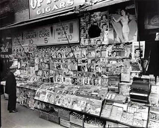
 Newstand by Berenice Abbott, 1935
In print design, the expression “above the fold” dates from an era where broadsheet newspapers were folded in half and piled up in stacks in front of newsstands, showing only the upper-half of the front page to potential customers. If an article or a picture did not appear “above the fold” on the paper, it might as well have been invisible to potential customers. Putting a sexy photo or a gripping headline “above the fold” was a way to drive up sales.
From the very earliest days of web design, that old term “above the fold” was appropriated to allow designers to discuss which page elements would be visible to users without their having to scroll the page. You see, way back in the 1990s it was generally accepted as fact that many everyday web users rarely used their browser’s scrollbar — it was even thought that some users didn’t even know how to scroll at all!
These days it seems hard to imagine millions of helpless computer novices wondering why so many articles on the web seem to end abruptly halfway through, especially now that everyone and their grandmother uses the web (well, except, apparently, John McCain). But things were different a decade ago. Many users had only owned computers for a few years. Few people had ever bought anything online or posted a comment to a message board.
Since then, however, it has become clear that people do, in fact, scroll their web windows quite a bit. Usability tests of all kinds have shown this. Our old fears of content below the fold being lost forever are no longer valid.
This does not mean, however, that “above the fold” is obsolete. It has just become a little more nuanced.
For one thing, despite the fact that users can and do scroll web pages, the first impression a web page gives a user is still critical. Before the user can actually get around to scrolling a page, they are already getting a instantaneous impression of what they see. This instant is dominated by the above-the-fold design elements. If you want something to grab your user’s attention, even on a subconscious level, it obviously helps to put it above the fold.
Also, when you are talking about those specific page design elements that appear on every page in a site — navigation, cross-promotions, related items links, etc — these items will appear repeatedly to the user every time they go to a new page. Again, being above the fold makes those elements more prominent in the user’s mind.
That being said, I still don’t see the fold as the critical factor in designing for web page prioritization. The underlying objectives of these two examples (to expose users to important content and features) is entirely achievable through other, traditional graphic design techniques other than simply placing things “above the fold”. Size, color, positioning, typography — there are ways of calling something out besides putting it at the top.
In fact, we should start thinking of “the fold” as something other than a hard line with an “above” and “below” portion, and we should stop thinking of the vertical positioning on a page as equivalent to priority. Scrolling up and down through a web page is a fundamental aspect of the web user experience, and there is much more to it than simply seeing what’s on top and then gradually seeing everything else.
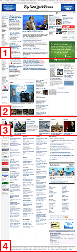
When scrolling the New York Times web site, for example, the above-the-fold content (here shown as Zone 1) certainly contains many of the page’s most critical elements. But as you scroll through the page, the landscape changes. It’s not just a stack of elements of gradually-decreasing importance. Instead, the scrolling experience is punctuated by elements of clear high-importance: the video in Zone 2, the belt of featured stories in Zone 3. Even Zone 4, the page’s “links ghetto” has a distinct identity of its own.
Scrolling down the page, then, is an opportunity to view the page as an unfolding temporal event, not as a static snapshot.
I’ll often find myself in design meetings where someone says they want Element X to appear “above the fold”. Some designers may wince at the expression, but in reality the client is saying something fairly straightforward: They want Element X to be prominently displayed to the user. If the holistic page design can make an element stand out on the page while the user is scrolling the page, even if it is below the fold the design can succeed in that goal.
Comments
13 responses to “The Scrolling Experience and “The Fold””
I work at a large ecommerce site. The “fold” remains incredibly important on most of our pages, and vertical position is very often exactly equal to priority. We see this not just in usability studies but in data, too.
There are an enormous number of people who don’t scroll, or who don’t really make the leap that something they’re looking for–but don’t actually see in front of them–might be offscreen.
I do agree with your idea that vertical scrolling ought to be punctuated–there are screens within screens, each of which really needs a complete visual hierarchy. That’s absolutely sound. But it is still very true that old fashioned “above the fold” pixels are the most important ones on the page.
I wonder what Thomas defines as ‘the fold’. How far from the top of the browser is the fold? Screen resolutions and window sizes are so varied nowadays, I would imagine it’s difficult to even come to a consensus of where ‘the fold’ is, let alone what should appear above it.
Dang, I thought this was going to be about Deleuze…
Interesting thoughts as always, Chris.
This was a topic on Boxes & Arrows almost exactly a year ago: http://tinyurl.com/2y8lag
There is increasing evidence that users have become trained to immediately scroll all the way to the bottom of the page, then slowly work their way up. I imagine that this explains designers beginning to implement large footers in their sites.
It should also be noted that what users consider “the fold” can vary greatly, not just in terms of screen size/resolution but also the amount of browser chrome. My Firefox is pretty thick with toolbars, but I’m likely the minority.
Great stuff to think about …
I really do believe that people scroll, so in that sense I agree with the basic premise that the ‘below the fold’ region of a page is probably somewhat undervalued.
However, in my experience the click-through rate of links placed above the fold is higher. If you equate click-through with priority, then you have a pretty difficult to deny commercial argument that placement above the fold is more or less synonymous with higher prioritization.
That’s not to say that placing something lower on the page completely disqualifies it from being a high priority element; it just makes it a much, much harder proposition. And, I would say, usually, it’s a losing proposition.
The trick, as with many things in design, is getting the client to understand the motivation underlying their “above the fold” request, and not letting them get too wrapped up in some literal implementation of it. Asking them, “Why is it that you want that above the fold? Prominence? A-ha! Now we’ve got something to work with…” Helping them towards a more conceptual understanding is probably the biggest favor we ever do for them.
Almost everybody I work with today attests to some level of understanding that the fold’s nature is variable, but almost none truly “get it” until they’re physically shown a variety of devices and setups. Then the light goes off, and the deathgrip on “counting pixels” eases. In the commercial space, who are the biggest holdouts? Advertisers. Perhaps a more sophisticated replacement measure is in order?
I agree wholeheartedly, that thinking that users just don’t scroll in 2008 is absurd. With vertical screen real estate on laptops being so constrained, this would mean that most people would be missing out on most of the web.
I like your nuanced take about the ideas of zones, each with it’s own identity. To further that, I think there’s something to exactly how you “activate the fold” — i.e. what content is on the fold line. I think it’s best that there be some content on the fold line itself, so that the user immediately knows there’s more just below. Present all the killer content up front, but give them a teaser that’s just partially obscured.
Also, where are we drawing the fold? I’ve been thinking that it’s 640 – 660 pixels tall (I’m assuming that most users are using and tending towards using a 1280×800 laptop). Does that seem reasonable?
Yes, the fold remains important, but, without data to back it up, I’d say that the size of the graphic or headline equally affects click-thru rates. I would guess this is especially true for sites like the NYT, which has many repeat visitors.
In fact, the lack of font-size variety in the “link ghetto” on nytimes.com often makes that area of the page useless to me (it all glosses over). I’d much prefer a tabbed interface that would simulate flipping through each section of the real paper as I check out what’s above the fold.
@Khoi: I don’t dispute the basic statistics that clickthroughs are significantly higher above the fold. But do you think that perhaps a big part of the reason why items above the fold get clicked more frequently might be because interesting things tend to be positioned above the fold (while all the boring lists of link-junk are usually piled up below the fold)? If something is really important and interesting to users, we’re more likely to put it above the fold. And an ad or content put below the fold may be unattractive to clicks simply because it (or the other content surrounding it) (or even the design around it) is just plain unattractive and uninteresting. Which is why we cram such things below the fold.
perhaps we could liken the area above the “fold” somewhat like the cover of a really good magazine – there is enough information , hooks to provide enough information to the users to take the next step to explore the site.
definitely in a site that is chokeful of good content, not all of them could be place within the fold, else we would probably be using really small fonts to squeeze in the headlines.
Sometimes web technology helps the information architects we are. What do you think of this :
http://www.treehugger.com/page2.php
On the right side of the screen, there is a sort of vertical tab, indicating the number of screens for the current web page. I don’t think end user now realize the usability of this (they did not realize and appreciate, years ago, the scrolling thing on the mouse).
But may be in some years those type of functional navigation tools will be standard on websites.
Another question linked to the fold issue is the possibility given to the end user to customize its web (home)page. If so, then, no hope you can put your critical content up the fold…
@MurielV: Thanks for the pointer — I’ve not been to the treehugger site in a long time, but I’m impressed by some of their IA innovations:
1) The in-page fold-embracing pagination isn’t so interesting to me functionally (clicking to scroll to the “next screen” seems silly), but from a visual design and layout standpoint it’s pretty impressive. It provides landmarks for situational awareness, but more importantly it provides anchors for the recurring side-column content (which in a normal site layout ends partway down the page). This also enables them to position more advertising throughout the page, it appears.
2) The final post in the stack of posts on each page is an appealing and thorough guide to what can be found deeper in the site. So much better than a “next” link!
Thanks!
If you use a liquid layout then you will generally get as much above the fold as possible.
One thing no-one has mentioned is the text size in a users browser. Large text will push a lot more content below the fold so it is just as important to consider as screen resolution.
One way to get around some of the problems with only a small area above the fold is to have dynamic areas of content that become visible when parts of the interface are hovered. Apple does this brilliantly on their startpage with stacked content blocks in the side columns that slide open when you hover over the headings. This could never be done with a newspaper.