I have a tendency to be extremely skeptical about user research in the design process. This is mostly because so much of it is, IMHO, (a) fundamentally bad (e.g., employing sloppy research methods or hamfisted statistical analyses), (b) flatly dishonest (e.g., dressing unscientific research in pseudo-scientific drag in order to justify a desired result), and (c) runs against what I think to be effective design methodologies.
I’m beginning to think my distrust runs even deeper. So deep that I fear I may be gaining a reputation as a “research curmudgeon” who’ll always have a knee-jerk dismissal of any new or clever techniques that pass under my nose. This may be true — I may be overly skeptical sometimes.
But now I think I can explain it with a little more nuance than before, and offer a new and largely positive perspective on research as part of a design process.
In the past, my scorn for user research has been aimed at everything from baroque user persona proceses to no-duh eyetracking studies. The latest technique I reflexively scoffed at is “modemapping” (pointed out to me by David Armano), a technique developed by Stuart Karten Design. Thinking more about the potential uses of modemapping made me realize that my scoffing was not directed so much at the technique itself, but that, instead, I have a deeper problem with the formalization of design research in general.
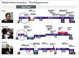
First, what is modemapping? Well, it’s not so much a research gathering technique as it is a method of interpreting data. To produce a modemap, researchers first interview and observe users (no differently than they would for any sort of primary ethnographic research). Then they use the data to diagram each user’s behavior on a timeline-like chart. The resulting “modemaps” visually distinguish between different types or modes of activity a person may find themselves in during a given timeframe, such as during a typical weekday.
To someone like me, a lover of information graphics (and in particular of timelines), modemapping did have an immediate visceral appeal.
When I thought a little more about modemapping, however, I asked myself: Could the observations gleaned from these modemaps really be any different from — or better than — the observations that a good researcher could have gleaned simply by conducting the interviews, reading the transcripts, and watching the videos? Is this just a way to spend an extra week or two of research budget to develop fun graphics? Is this just infoporn that looks hot but doesn’t reveal new information or insights about the underlying data?
But then I realized that this kind of seemingly-pointless abstraction is exactly what I do when I make a jump from facts to ideas, from thinking to designing. For me it’s not the diagram or the artifact that matters. It’s the process of making the diagram that produces innovation. The most powerful design insights do not simply emerge from the diagram for any third-party viewer to read as if they were reading a billboard. More likely the design insights enter the mind of the diagram-maker while they are assembling it. The final modemap artifact simply serves as a tool to explain the designer’s inspirational process to other people (non-designers, especially, but also to other designers) in the hopes that the customers of the diagram (whether they be clients or collaborators) may understand the merits of the design. The diagram may even, in fact, be let incomplete or even discarded upon completion if the design insights may be better expressed through another means.
My Design Process
When I am designing, I almost always do tons of research first. But at some point I will start doodling and sketching different ways of making the data mean something. I try to visualize and organize the facts into systems. I’ll go through dozens of quick and wildly different sketches of how the data might fit together, almost always with no idea of how the sketching process will end up.
Quite frankly, much of this time might even be spent staring into space and just thinking, visualizing the data in my head. Sometimes the resulting sketches will resemble or even closely conform to known data interpretation techniques such as mental models, flowcharts, affinity diagrams, Venn diagrams, quadrants, and many others. I’ve probably used half the techniques in the visualization periodic table without even knowing it.
The “not knowing it” part is where my user research curmudgeon-ness comes in. I have a passion for letting my mind wander freely and letting it discover revelatory and meaningful visualizations. Rather than letting the visualization lead my idea process, though, I let the idea process generate the visualization. Because I prefer this way of thinking and designing, I have an immediate disdain for any methodology that purports that a particular data interpretation or visualization technique is the right one for a job. How can a great designer know what tools they will use before the design process begins? They simply can’t.
It’s a fundamental quality of design thinking, I suppose, to let the ideas determine the process. What veers us away from design thinking and towards (for lack of a better term) business thinking is the formalization of a research and research interpretation process. Instead of asking researchers to bask in the data using whatever methodology suits their temperament and idiosyncratic thought process, commercial design culture often asks the design researcher to fit their research into a proscribed process, in this case the “modemapping data interpretation machine”. The techniques themselves don’t demand this — the demand for pre-planned processes comes from business constraints where customers need to know what they are paying for.
This is a real conundrum for the research-minded design thinker who needs to keep to a budget: How do you sell a research-based methodology if you cannot say for sure what research-interpretation method you will use? How do you productize or justify the value of “staring into space for a few hours thinking about the problem”, or “sketching in a moleskine for a few days”?
Comments
12 responses to “Design Research is a Design Process”
Chris,
You make good points (as always) but the best part of modemapping which I never expanded on was how nicely it fed into the actual design solutions.
In fact, it was the designers themselves that did the videos, the maps and went on to design the solutions. This goes against the planning model which neatly places folks in a hybrid “strategy/planning” mode. (which isn’t what planning should be IMO)
I asked Stuart Karten what he attributed the alignment between the maps and the design concepts to and he simply said “our designers did the research”.
Yes, the modemaps are nice artifacts to look at—but the reason I was drawn to them was how they acted as a bridge between the field video work and the design concepts.
From my perspective, the risk of personas or anything persona-like is that we end up with an artifact that neve influences the design solution. And that’s probably what folks like Portigal are reacting to.
Still, getting corporate cultures to think about users instead of just the bottom line sometimes seems like waging a war one battle at a time. We need lots of weapons in our arsenal. 🙂
@David Armano: I agree completely that designers doing the research, or at least doing the interpretation of the research, is everything. That’s my next post.
“The diagram may even, in fact, be let incomplete or even discarded upon completion if the design insights may be better expressed through another means.”
This is one of the biggest problems designers face: we don’t know how to best communicate our insights to the various stakeholders.
We need to get better at the “executive summary” version of all of our cool process documents.
Nice post, Chris.
What’s important, of course, is that research is done. If it means staring off into space, dumping it into a mind map, or creating personas isn’t really that important. My guess is that those people who do lots of research (as I’m finding out myself) have many ways of cutting it up. It’s a different ballgame every time.
The ultimate tension is between process and unprocess. Once you get too processed, too much into the idea that this is the *one* way to do things, it becomes much harder to think outside the box.
Austin, I don’t know if “communicating the executive summary” really is the problem. It’s not the problem I have most often. Chris writes above: “It’s the process of making the diagram that produces innovation. The most powerful design insights do not simply emerge from the diagram for any third-party viewer to read…”
That’s the crux of it for me. Almost everyone I work with needs to think through a process to come to a conclusion–it’s that thought process that’s really convincing, not some clear one-pager or diagram. I’ve found that instead of shorter summaries, I have to more or less guide people through a (shorter) version of the design process that led to a particular solution. Buy-in is easy when everyone thinks they’ve personally figured out the same solution you came to them with.
@Andrew: An interesting spin on this. I like that idea — that the design research process artifact is a way to engage the customer in the design process itself.
Another purpose for delivering the design research artifact just occurred to me: A design manager needs to understand how (or whether) the people they manage think about problems. A designer working for me often needs to show me that s/he has thought through their ideas. I’m no different from a customer in this situation, and a thoughtful and good-looking document says to me that the designer really immersed themselves in the concepts and (if applicable) data available to them.
If the designer does research, and it’s the process of creating the artifact that counts, and, the designer, being a designer, is going to start having ideas before the artifact is even completed, then we shouldn’t spend too much time on perfecting it. It seems to me sometimes a lot of effort is put into designing the _artifact_ (layout, font, photos, fancy graphics, and such), when by the time we’re doing that we should be putting your design efforts into the actual product.
Maybe such a waste of effort is the source of some of this skepticism over personas, mode maps, and massive usability test write-ups each worthy of a dissertation. If indeed, as Spool has recently posted, the artifact is merely a reminder, then just jot down some paragraphs in a word processor or scribble a diagram on notepaper or take a picture of the whiteboard and move on. Certainly, at some point we need to communicate the rationale behind our design to stakeholders, but I’d bet that takes different artifacts than those that help us design.
Another way to look at this overall question is to go backward. When a project is complete, review the discovery/exploratory process (or lack thereof) that was pursued. Post-mortem it. Catalog relevant components of it. Make process (making of) case studies available to team members & clients. Pick and choose from the best of the various methods used and embed the stories into the next project’s kickoff. I’m curious to know how many designers/agencies pursue this type of look-back as a best practice……
I agree with your premise, Chris, which I also group under the heading of Analysis Paralysis Prevention. There’s a song in this somewhere…or a bumper sticker.
@Eric Swenson: What a great thought, to focus post-mortem analysis on the research that went into the design.
Not just user research, too, but even project scope research — how well did we understand the technical, logistical, and domain problems we were going to tackle?
Got my gears spinning now…
I made a quick connection to this thread tonight while reading the SND (Society of News Designers) blog. The Poyneter Institute report re: Eyetracker data puts this overall discussion on a slightly different axis, but I thought it might be interesting to anyone who was into this thread. I am not making an argument re: the validity of data by reporting this link. But I think that News designers, for example, may see this data in a slightly different light – and may have a slightly different appreciation for the method since it seems to be helping them break certain static and outdated molds in news design:
see: http://eyetrack.poynter.org/ and then see how the NSD contextualizes this data within workshops on ASFs (alternative story forms): http://www.snd.org/update/labels/ASFs.html
Gets to the hear of the issue – research, like design (if not more so), is about the process and the results.
I’ve written about the analogies between design and design research here:
http://www.designingforhumans.com/idsa/2008/02/sketchingdesign.html
Gets to the hear of the issue – research, like design (if not more so), is about the process and the results.
I’ve written about the analogies between design and design research here:
http://www.designingforhumans.com/idsa/2008/02/sketchingdesign.html