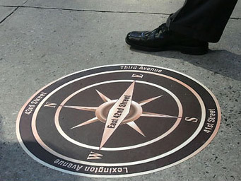
The New York Metropolitan Transportation Authority (the people who run the subways) have done a test installation of a new feature to help riders orient themselves as they exit our often-labyrinthine subway stations. They’re placing sidewalk-level signage to tell riders which way is north and indicating which direction the nearest streets and avenues can be found. The Times has the full story today, and I’ve copied their photo here.
I think these are great. Despite what many New Yorkers will claim, we all get disoriented when we exit subway stations in neighborhoods we are unfamiliar with, and often it takes a minute or two to figure out exactly which way is north. (This has, by the way, gotten a lot harder since we lost the World Trade Center as a landmark).
I like two things about these orientation medallions:
- They make a relatively high estimation of people’s knowledge of New York City geography. I don’t have any data to back this up, but based on the truly abysmal performance by Americans in general at reading maps, I’m not confident that many people, even in New York, are cartographically literate enough to even know north from west. Such people would certainly find these medallions somewhat hard to use. Designers and urban planners commonly design for the lowest common denominator of their user base, or at best they aim for features that are understood by and useful for a solid majority of their users, and as a result they don’t build features for the slightly-more advanced users of their systems. So cheers to the MTA for trying something that will clearly help those riders who already have a good general understanding of New York’s lay of the land. Who knows, the medallions may even have the happy side effect of educating the commuters who don’t quite get it.
- I really dig the nice touch of deliberately making the compass a little bit inaccurate in order to conform with the average New Yorker’s mental model of the city. You see, the long slender island of Manhattan is not actually oriented directly north to south. The island and its avenues actually run a little more north-north-easterly, rotated slightly away from the true N-S axis. But most people think of uptown as due north, so that’s how the MTA oriented the compass directions and the street IDs. No hobgoblins of foolish consistency here.
Also, it’s delightfully surprising to me that this idea was originally proposed by a regular New Yorker, and the city somehow made it happen. Nice job.
Comments
12 responses to “Subway Orienteering”
I think you answer your question in section 1, with information in section 2.
The fact that it’s a compass doesn’t really matter as much as “following this arrow will take you to Lexington Ave, following this arrow will take you to 42nd street” (and beyond that 43rd, 44th, etc).
@CM Harrington: That’s very true — people who don’t know north from west can simply disregard the NSEW indicators as they probably always do when looking at maps and such. I’m just glad they didn’t put eight geographically precise arrows on the dial instead of these four fuzzy ones.
I would like to invite you to participate in a research conducted by MIT – Massachusetts Institute of Technology and ArtForecast.
The research examines the myth of the term “Eye for Art†by presenting a set of artworks images to various participants.
Participants are challenged to choose the most promising artwork out of a given set and to try to predict which artwork will be the most valuable in one year.
http://www.artforecast.org
Funny thing, I actually saw several subway exits where someone created some rather beautiful chalk art that displayed “NYC North”. I thought it made perfect sense.
Agreed; nice to see something simple and useful like this actually get done. The visual rings separating N,S,E,W from the street names would surely give Tufte a cardiac though — heavy heavy, crushing those street names visually. At least in the pic.. haven’t walked over one yet.
@CMH: It would be great if, when executed citywide, they had different artists design each one. This would be great to propose to an arts oganization… Hmmm…
Hallelujah! I was just thinking about something like this after emerging from a station all discombobulated last week. More times then I care to admit I have to do the “walk to the corner and look for street signs” routine. Half the time I wind up at the corner closer to where I need to be. Half the time not.
I have a dim memory of reading an article about renegade stencil cartography similar to this. The official version provides a lot more info, though. Nice.
AFAIK, the original proposal for a “guerilla wayfinding” stencil-based system was a post on the pretty excellent Social Design Notes.
I actually prefer the visual style of the original proposal to the official solution, but I guess adding street names would help directionally-challenged tourists like myself…
It would be great if, when executed citywide, they had different artists design each one. This would be great to propose to an arts oganization…
I have a dim memory of reading an article about renegade stencil cartography similar to this. The official version provides a lot more info, though. Nice.
Funny thing, I actually saw several subway exits where someone created some rather beautiful chalk art that displayed “NYC Northâ€. I thought it made perfect sense.