(This is Part 2. Please read Part 1 first.)
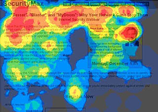
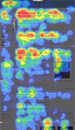
An eyetracking “heatmap” showing in red where users’ eyes were pointing for the longest time during a page-view.
There is a limit, I think, to what a so-called “empirical” user interface test can tell you. At some point, the results must be interpreted in order to be useful as a design tool — and interpretations can easily go wrong. They can overlook a critical objective or even reach the wrong conclusions, especially when interpreted by people without the appropriate design skills.
Eyetracking (breathlessly called the “future of web design” by one writer) is a great example of a “design tool” that is getting a lot of buzz lately. Jared Spool says it’s probably not worth it, and I tend to agree with him there. My first objection is that an eyetracker can tell you what people are looking at, but not necessarily what they are seeing (or why they are looking at it). Secondly, the results generated by an eyetracking study are, to a good UI designer, rarely surprising. Finally, as with any analysis of subjective experience, the results can be easily misinterpreted.
I am not saying that eyetracking is useless. Seth Godin has a nice little story about how eyetracking gave him some useful insights into how people saw his web site and web sites in general. What’s great about Seth’s comments is that he sees the eyetracking results not as a definitive scientific measurement of his web site’s effectiveness, but as just another peice of information that he will use, as a seasoned marketing strategist with good design instincts, to plan his site’s design.
That’s the key: he’s a seasoned strategist with good design instincts. In his hands, this data is likely to be useful to just the right degree: that is, not too much.
Stating the Obvious
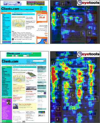
A leading Eyetracking company, Eyetools, has a fascinating blog with dozens of case studies of real eyetracking studies with heatmap examples, each with a short analysis and interpretation of what the heatmap means and how the design can be improved. In almost all cases, of course, Eyetools seeks to give the impression that without the eyetracking studies we (and the site’s owners) would have no idea how or if each design was working.
What strikes me about the analyses is (a) they mostly seem like pretty good conclusions (although there are some overblown examples, IMHO, based on pretty skimpy data), and (b) the good conclusions seem to be the same conclusions that a good UI designer (one who understands the desired effect of the design) would come up with without the aid of any tools, just going by their design instincts.
In another example (right), a clearly atrociously-designed page is given a slightly- but- noticably- better graphic design treatment (with more color differentiation, more varied typography, and an more compartmentalized layout), and performs markedly better on a follow-up eyetracking test. Is this supposed to be surprising?
Interpreting Research to Influence Design
In the case of eyetracking, the risk of reaching deceptive conclusions that will, in turn, lead to bad design decisions would seem to outweigh the potential positive outcomes, especially in an organization lacking experienced designers to properly evaluate the results.
If, for example, an eyetracker tells you that people don’t spend time looking at your company’s logo, does that mean that you need a new logo, or does it mean that your logo is already deeply familiar to the user? If the eyetracker shows someone spent a lot of time looking at your “how it works” diagram, does that mean that the diagram was extremely interesting or that it was extremely perplexing?
In the wrong hands, this sort of data can easily be intepreted in entirely the wrong way. A little bit of design knowledge is, indeed, dangerous.
Differentiating Between Design and Content
On the IXDA discussion list recently, Jared responded to an already-skeptical comment by Todd Warfel on the topic of eyetracking:
TODD: We have a client right now who’s undergoing a redesign. They can’t figure out for the life of them why their promos for signing up new customers aren’t working.
JARED: Maybe it’s because it’s something nobody wants? If so, no amount of eye tracking will help.
In this example from the Eyetools blog (right), it is noted that blog readers skim headlines but don’t read body text, and that this might be because of the writer’s inability to capture the reader’s imagination. I hate to keep picking on these guys, but really is this conclusion (that people skim headlines but don’t read body texts) something we need an eyetracking test to reveal, or is common sense enough to tell us this?
But it Can’t Hurt. Can it?
Again, it is possible that, like chicken soup, eyetracking can’t hurt a redesign process (although, as I’ve said, grossly misinterpreted results are clearly a risk). But unless you are working with graphic designers with no talent whatsoever (and I will admit that most web sites seem to suffer from this predicament), it’s hard to believe that the recommendations of an eyetracking study would be a meaningful influence on a design process, much less form the very basis for the redesign. The money spent on this sort of research would, in my opinion, be better spent on hiring a better UI designer. Hell, you should probably hire a better UI designer anyway, because only a good UI designer is really qualified to interpret the results of an eyetracking study in the first place.
But what if you do hire a great designer with a winning track record, but your bosses don’t believe in the designer’s recommendations? Even if your superstar UI designer can easily distinguish between a design that works and one that does not, many other people cannot make that distinction as easily. Some people’s design instincts are not only dull, but are often dead-wrong. Oftentimes these people are in senior management positions.
So how does a designer or a design manager convince their boss that a good design decision is in fact a good design decision if the boss has no design instincts? What if the site won’t get redesigned at all unless the boss can be convinced that the current design stinks?
Hm, maybe that eyetracking study can come in handy after all…
Comments
18 responses to “User Research Smoke & Mirrors, Part 2: Research as a Design Tool”
Well put. I can’t say how many times I’ve started to write a post along these exact same lines but always stopped short because I could never get my point across as clearly as you have here. Thank you.
A journalist friend told me that good writers put into words what other feel but have trouble expressing. Nicely put!
As I was reading along I found myself nodding in agreement, coming to a conclusion that eyetracking, like Jakob Neilsen, is a useful tool that can be used in situations where quantitative data is required.
I was pretty much a naysayer until a colleague showed me how his company (one of the largest online brands) used eye tracking tools. They did a lot of testing with their site & email communications as compared to competitors. In their commoditized business, it’s all about finding efficiencies. If nothing else, eye tracking is a good tool for quenching the “Why don’t we do what competitor X is doing.†Also, using non-subjective data to illustrate to business owners that nobody is reading (let alone seeing) the 3 extra paragraphs of copy they feel is so important. No, it is not a silver bullet, but can add value like any other research tool.
I’m not sure I agree with all your conclusions re. eye tracking.
Why is it common sense that users skim headlines but don’t read body text? That’s quite a generalization you’re making.
Perhaps it is the case that users don’t read body text when it is the same font size as the headline. Infact, this has been shown to be the case.
If you make the body text smaller than the headline, then users are more likely to read it (which is actually quite counter-intuitive). This is the sort of thing that eye tracking can show you and which will save you from falling into the trap of making assumptions about what people read on a page.
The point is (which you make in a roundabout way) that eye tracking is another tool in the web designers box. Just like log files, if you interpret the data incorrectly, you could end up making completely erroneous design decisions.
However, used properly, eye tracking can provide you with information on which to make decisions that you would not have otherwise been able to obtain (or, at least, not as easily).
Garrett & Adam: Thanks!
Alex: Your point about fine tuning a commoditized business is very good. I would, for example, think that Amazon.com would be irresponsible to NOT use eyetracking on their product detail pages, where they are essentially supporting billions of dollars on a single HTML page template. But for a site whose sales don’t reach the billions, the value proposition decreases pretty dramatically IMHO.
Christian: People who know how to read generally understand that the headline is the best place to go to understand what the body text will be about, and if they’re not interested in the headline they won’t need to read the body text. We do this every day when we skim the papers. This is why newspaper columns have such a strict fractal-like writing format: tell the whole story in the first paragraph, tell it again in the first few paragraphs, then tell it in detail over the length of the article. Copywriters have known for centuries that people generally don’t like to read a lot of words — which is why they invented things like headlines and pullquotes in the first place. How is that not intuitive?
I agree, however, that eyetracking is just another tool among many, and one that is open to (vulnerable to) wide differences in interpretation. I think log files, while also misinterpretable, are far more valuable.
Maybe I misunderstood you, but you seemed to be saying that headlines shouldn’t be followed by a summary sentence/paragraph (the body text) as no one would read this content. And that this was common sense.
If this was so obviously the case then why does the New York Times do exactly the opposite on its home page?
But perhaps you were talking in more general terms, in which case my comment does not apply.
You mention that the results that eye tracking illuminate are not a surprise to a good designer. That may very well be true. But how many truly good designers are there? I’m talking about people who are both attempting to produce the most attractive and usable web pages possible.
There are the obvious extremes of usability geeks who produce logical and boring pages and the ain’t this cool design freaks who are more into Flash effects or edgy design-of-the-minute trends. There are also the corporate marketing people who are more interesting in branding than in effective experience design.
I guess that the main point is that too many designers get caught up in their own theory or aesthetic and don’t design for the end user. Most of them would benefit from having their work subjected to eye tracking analysis.
You are correct, Christian, you were misreading me (I never said that designers shouldn’t follow headlines with body text, just that people won’t always read the body text when it is there). You were perhaps also assuming that the Eyetools people were uncovering something at least a little bit new and interesting, but really all they were saying was that people tend to mostly just look at the headlines and that they don’t usually go on to read the body texts. Which is ridiculously obvious. Interpreting the accompanying heatmap to reach this conclusion is child’s play; but, more importantly, common sense tells us this already, heatmap or no heatmap.
Michael: I agree that most designers are not great (a large number are really terrible), but, at the risk of sounding incredibly snobby, I must say that my whole milieu: my company, my colleagues, my friends, my peers, my clients, and (not to be immodest) my self, are all excellent designers or design thinkers of one sort or another, and it is to them I address this post and indeed all of graphpaper.com.
There is a whole world of design tools and techniques out there intended to help mediocre designers achieve better results despite their shortcomings. There are clip art collections, document templates, logo generators, “for beginners” books, etc. But just as BMW does not make cars for people with average incomes, and just as the New York Times does not make an edition for people with an average reading level, I do not dispense design advice to average, much less to bad, designers.
I also disagree that eyetracking can be helpful for bad designers. As I’ve said, it seems to me that in the hands of a bad designer eyetracking data seems likely to be interpreted in 100% the wrong way. It’s like giving an MRI machine to a hypochondriac.
Thanks for a great series of blog entries! This article reminds me of Joan Didion’s comparison of 1922 Emily Post essay on funeral etiquette to contemporary (scientific) psychological studies that confirm recommendations of the earlier article. In Didion’s book, the tone was “isn’t it interesting that Emily Post intuited so much, without the aid of science”, whereas your own posts seem to take an inverse position: “Duh!”
Shouldn’t all of your “good UI designers” feel great that their opinions are being scientifically validated? Why the ill will?
On the one hand, I feel your pain – explaining the difference between statistical correlation and causality is only interesting the first dozen times someone at the conference table refers to the Gospel of The Numbers.
On the other hand, I worry that this series reinforces an antagonistic relationship between designers and the suit set. It’s difficult for many business decision makers – who have little personal UI experience – to distinguish a good UI designer from another (far more common) angry aesthete in designer duds. Perhaps an interesting follow-up article would be investigating why Eyetools garners such visceral interest while so many designers’ parallel recommendations are ignored.
Christopher,
I disagree with the implication in your first sentence; that empirical studies conclude with an interpretation of results is in the nature of all research – it does not diminish their value; they are no less empirical for it.
The quality of the conclusions drawn are _always_ a function of the quality of the person interpreting the results. Where research (in all forms) becomes a waste of time and effort is when the research design and methodology applied invalidate the conclusions _before_ they can be drawn. And this may be the danger of tests such as eye-tracking – they tell us _something_, but is it meaningful?
The value of an experienced designer, then, comes from their involvement in the interpretation of data, and the insights they draw. It should encourage, not discourage designers from being involved in user research.
Steve: I’m not sure what you think I was trying to imply in my first sentence — I think I was only saying that, no matter how empirical your data collection methods may be, the data is/are meaningless without skilled interpretation. I’m not saying that interpretation is inherently un-empirical. I am saying, however, that a poor interpretation of good data is functionally the same as a poor interpretation of bad data; the same, for that matter, as making stuff up out of whole cloth.
I think you may be saying that this observation is, well, obvious… but I’m not sure many readers of design research bother to question the interpretations presented to them.
But I totally agree with you that a potentially bigger risk is in the structure of the research itself. A crummy methodology will produce bad data. See my reply to your comment in Part 5.
Christopher, I guess I was reacting particularly to the perjorative phrase “so-called ’empirical’ user interface test”, and with the above clarification I agree.
I wasn’t suggesting that you were pointing out the obvious – this is clearly new ground for a lot of people.
Thanks for the response & clarification.
Yeah, I was just talking about the bad ones. 🙂
The ‘heat’ images fired a few memory synapses, recalling a different sort of misuse of data, boldly illustrated in a similar interface presented at a data warehousing conference in the mid-90s.
At that time the only way to display such data visually was with SGI (Silicon Graphics) boxes. In this case the data was from a telecommunication call center. The ‘red’ mapped a correlation between frequency and recency of calls to the call center. The vendor was proposing that perhaps such individuals might be clients for which the ‘overhead’ of the relationship might be too high (e.g. they were too ‘needy’) and that these were clients who needed to be evaluated — or perhaps ignored out of existence (mind you, this was a tool in the CRM space!).
I was nearly livid. In fact, that same vendor from whom the data originated had caused me to be on the phone with them 5 times in the same day — because their call center representatives either hung up on me and/or could not answer a simple question, “I was to have phone service at my new address today. Why do I not have service and when can I expect to have service?” Having requested the service some 6+ weeks in advance (this was an install for new home construction), it was beyond reasonably acceptable to finally discover on the 5th call (after I’d been accused of either having a locked fence or dog — it was new construction…our ‘yard’ was nothing but open dirt) that there weren’t enough connections in the area and I wouldn’t have phone service for SIX WEEKS!!! [and you were planning on telling me this when?]
I was seeing red over their conclusions about what ‘red’ meant. But this is a classic example of the things this series really points out (maybe not directly), it’s not really an issue of pseudo science, it’s an issue of pseudo analytics.
How many agencies employ “skilled” eye-tracking analysts who understand the physiology as well as the psychology as well as the typographical implications of using this technique, and their interactions? What are these individuals’ pedigrees? Their proven success rates vis-a-vis controls (as measured by scientific statistical methods that test reliability, of course)? For an agency to remain profitable and still offer this type of service, it has to cut corners. Dabblers.
Geez, I hope the next three essays aren’t as forgiving!
[…] In the past, my scorn for user research has been aimed at everything from baroque user persona proceses to no-duh eyetracking studies. The latest technique I reflexively scoffed at is “modemapping” (pointed out to me by David Armano), a technique developed by Stuart Karten Design. Thinking more about the potential uses of modemapping made me realize that my scoffing was not directed so much at the technique itself, but that, instead, I have a deeper problem with the formalization of design research in general. […]
[…] With giving us this eye-tracking example, the author of Smoke & Mirrors points out that even apparently unambiguous research results can be interpreted in different ways: “If, for example, an eyetracker tells you that people don’t spend time looking at your company’s logo, does that mean that you need a new logo, or does it mean that your logo is already deeply familiar to the user? If the eyetracker shows someone spent a lot of time looking at your “how it works†diagram, does that mean that the diagram was extremely interesting or that it was extremely perplexing?” […]