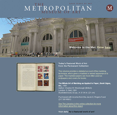
It’s always been perfectly acceptable to me to have an underlined text link in the center of a large graphic, suggesting that the user should click the text link when, in reality, the user can click anywhere on the entire image to the exact same effect. In other words, the text link is something of a red herring.
The idea, of course, is that some users will notice the text link and click it, while others might notice the finger cursor as they roll over the greater image area. The primary goal is to get the user to just click the damn thing, and no harm is done by the subtle inaccuracy of the fake text link.
I’ve always said that foolish consistency is the hobgoblin of information architecture (I am still the 12th hit on Google for my SIG-IA take on the Emerson quote). This is a great example, I think, of an instance where blatantly breaking the rules makes for a more usable interface.
Do you disagree? Do you think that this practice is an abomination?
And let’s not get into the web style proscription against linking from the word “here”, which I pretty much agree with. Click here for more on that hot topic.
Comments
7 responses to “When Links Lie”
There is nothing wrong with this approach. We live in a world comprised with people with different understandings of how the digital world, particularly the web, works. Building sites for use takes more than one approach at times. It is affordance for different interactive perspectives.
Your aside about the “[click] here†link is actually the nub of the problem. The link text, which, by the way, could be live text over a CSS background or just a normal image, should be “Enter the Met†or “Welcome to the Met. Enter.â€
Joe: Agreed, but do you think that the areas that are not link text (i.e., the other words and the background image) should also be clickable, even if it says “Welcome to the Met. Enter.”?
I would argue why does the site need to have that splash page at all. Why not make the page that you click through to the home page?
In my opinion, this page is pretty pointless. How does it help the user achieve their tasks on the web site? All it does is block their access to where they want to go.
Yes, this page is pretty but it’s functionally useless.
You could look at the text over the image as an example of breaking the guidelines or you could see the image under the text as simply providing a larger click target.
Christian: Good points. If they really wanted to have a branding “splash” page, they should have at least put the museum’s hours on the page. I think the web design is probably intended to match the museum experience: you see the imposing exterior first, then you have to climb in. I agree that that’s not necessary.
I don’t see what anyone would have against this practice, let alone think that it was an abomination. How can it be bad?