It’s not bragging (in fact, it’s probably a little embarassing) for me to say that I am an expert user of Microsoft Word. I can do just about anything I want with it, and I understand most of Word’s idiosyncracies and tricks. Still, the UI has always seemed to get in my way. For example, there are a ton of buttons I never use — so for kicks I decided to see just how many.
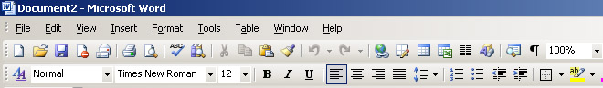
Here’s the epicenter of MS Word’s toolbar, as it appears when you first install it:
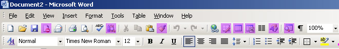
Even at a glance I see a bunch of buttons that are complete mysteries to me. Remember, I am a self-professed Word expert. And I honestly have no idea what these buttons (in purple below) are used for. I’ve never used any of them.
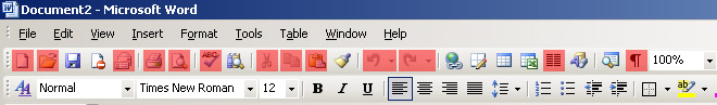
I do know what these buttons (in red below) are supposed to do, but I’ve never used any of them. They’re almost all features I that can invoke either through keyboard shortcuts (for the tasks I do a thousand times a day) or through menus (for those I do twice a day or less).
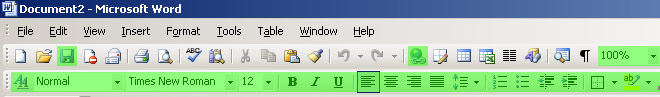
These buttons (in green below) are the only buttons I ever use. I use the second row of formatting options all the time because they are convenient and absolutely appropriate as buttons. (I have no excuse for using the Save button when ctrl-S is faster, I suppose, but I guess I like the illusion of security of pressing a visible button.)
The funny thing is that I know that there are millions of Word users who use these buttons all the time (and who have never used keyboard shortcuts). And there are millions of Word users who use the pull-down menus for every single cut-n-paste task they ever do (something I find painful to observe).
And, of course, there are those people who don’t use Microsoft Word at all.
Comments
17 responses to “Microsoft Word’s Useless Buttons”
I use the Format Painter (the paintbrush icon next to Paste) quite a lot to copy formatting from one block of text to another. No idea what all that stuff to the right of Undo/Redo is, though…
The second purple icon is for finding refrences, very useful for writing essays or articles. Third is the format painted, as mentioned above. Fourth is the “Draw Table” function, which allows you to easily make complex tables (instead of adding rows, splitting them and merging them). The next I would have thought to be pretty obvious, it’s “Insert Table”. Same with the next, it inserts an Excel Spreadsheet inline. The last is obviously something to do with searching.
But I’m sure you didn’t want an explination, my point is I knew little of what some of these did, but they were for the most part descernable through the iconography and clarified by finding them and testing them myself (I am using Office12, with the new UI so I could not find some features, most likely due to iconography changes).
It is interesting looking at what you do use the GUI for, as they all seem to be formatting, the very actions you would be incoking regularly as you type. How often do you print? Create a new document? Not too often. Yet how often do you change font, styles and list formatting? These are all incokable through the keyboard so surely it would be worthwhile to learn how to use them effectivly, I’m sure it would save you alot of time. (Of course, new document, print etc. are all very common functions, and that is the full reason you use them via. the shortcuts instead of the GUI, because they are *common* timesavers).
[Sorry, just re-read through the post and realised it could be read as vaguely insulting. Sorry, don’t mean it like that, but don’t have the time to change the tone]
Even though I indicated that I use the various text formatting buttons, for almost all of them I use keyboard shortcuts far more often. I guess these are edge cases, where sometimes I just want to take a break from typing or something.
I guess my point is twofold:
1) The Word UI assumes that if any user anywhere on Earth might want to use a button for a task, then that button should be made visible by default. They did not consider that perhaps if a button is only used once a day or once a month (or for most users never ever) that maybe it shouldn’t be there at all. The UI should start simple and the user should be permitted to make it complex, not the other way around.
2) The idea that any icon can be self-explanatory is just wrong, especially with these icons. The magifying glass icon you said had something to do with searching? It opens the document map pane. Nothing to do with searching at all. I would have guessed that the “Draw Table” button did what you say it does, but since I obviously can’t trust my instincts for these icons, why risk it?
Why do I say “risk”? Well, have you ever clicked the fourth icon? I have — accidently. It prompts you to install a Rights Management tool. If I wanted that tool I would have installed it when I installed Office for crying out loud.
A better alternative would be what the Adobe/Macromedia Flash authoring UI does: you can select and save your configuration of toolbars/pallets very easily, and it offers some default sets for developers, animators, and other high-level types of users. Word should have such settings, too. Oh, and it shouldn’t have so many features. I guess that’s my real beef.
I have a little program that goes into Adobe Acrobat and literally disables 90% of the features that Adobe thinks I want from it. In four years of using the tool, I’ve never noticed anything missing.
i don’t even want to know. to be honest, they frighten me. one time i accidentally knocked the ‘track changes’ box and my name appeared on the page with the date and time. i now know what the function is for, but at the time i was convinced that the thought police had hacked into my mainframe and were trying to devour my brain. i take off spell and grammar check. take off auto correct. then if i want to get fancy, i dump it in a design program and go from there.
“and it offers some default sets for developers, animators, and other high-level types of users”
Actually, I prefer the road they have taken with Office12 and the ribbon. When you start offering different UI modes, you force people to relearn and readjust when they need the more advanced functionality. What if they need it only some of the time? They have to enable it and then dissable it? Leave it there to get in the way?
In Office12 everything is still there all the time. However, because it is much better laid out in the ribbon format not only do most of the buttons have a text label, but a hover hint too. Everything is still there all the time, but it doesn’t get in your way and discovorability as to what the tool does is much higher.
If I come and use your computer and load up Office12, I know exactly where everything is. If I have to start using the Bibliography tools all of a sudden, I have a pretty good idea where they are.
ICR: I very much look forward to trying Office 12, because as I understand it, they scrapped the whole mode of thinking that led to the silly toolbars seen above.
What I find frustrating is that other products, seeing Office’s market share, try to emulate its silliness. Granted, I guess it makes the transition to, say, OpenOffice a little easier for users, but it would be great to see something so much more intuitive that it breaks the cycle relatively painlessly. (In their defense, OpenOffice 2 seems to be more independently thought out than 1.x.)
I understand the pressures placed on UI designers for this kind of thing – to promote adoption of alternative options, they’re stuck trying not to upset very entrenched Office users. But there’s still room to have a “Wow!” product (like the first Mac, for example) that blows the hair off of the Office UI.
I’d do it, but I’m, er, pretty busy right now. And I have a dentist appointment today.
No, actually, I’m just new to this and would have no idea where to start. But the UI world is starting to get noticed, and some very intelligent people are getting very deeply into it all. I can’t wait to see what they come up with.
I have a buddy on the Office 12 team, and some of the stuff he’s been telling me about it is pretty cool. Microsoft really is still trying to improve their products (despite what the Slashdotters say) – the visual improvements seem quite elegant and visually intuitive. Still, they adding processor cycles to add bling, so there may be a price to be paid for them in speed. I haven’t downloaded the beta yet, but I’m thinking I may do that today (after my dentist appointment).
I couldn’t resist doing this:
http://panzer.serveftp.net/files/wordAtItsBest.png
The image shows all of Word’s toolbars. The red highlighted ones are those I don’t use. Ever. I’ve left some buttons that I press about once a year unhighlighted so that gives you some idea how little used the highlighted ones really are.
With respect to Word, depite the quantity of useless functionality I very rarely feel overhelmed by it (unlike OpenOffice or Photoshop) and also people who write really big documents may find a lot more use for some of the more advanced features.
And I leave you with:
For those of you who haven’t heard,
Here’s a tip for Microsoft Word,
If you pictures become unstable,
Simply put them in a table.
Priceless! If I do say so myself 🙂
Oliver, the link doesn’t work. Have you seen this one:
http://www.graphpaper.com/2006/03-12_superbrowser
Sorry about that there link, its on my home server here and I turn it off when I go to bed.
and yes I have seen the FF one Chris, that was probably what gave me the idea.
I understand your commentary. The thing is, I don’t see the use for any of those toolbar fields save for the font drop-down! Font styles can be deployed via simple shortcuts everyone knows.
You can right click the toolbar to customize it, but alas– it’s not very customizable. I want to be able to choose the font face and size, the wordcount, new|open|save, and the zoom. You can’t minimize the toolbar clutter THAT much, but it can be improved upon by the intrepid Office user.
What you really want is Blockwriter.
There’s a reason why you can customize the buttons on the toolbar.
If they really find them useless/intrusive, why not remove them instead of making a useless post?
There’s a reason why you can customize the buttons on the toolbar.
I agree, there is clearly a reason why: Because so many users don’t want them there! Your attitude is “throw a pile of crap on the user, and let them clean it off themselves.”
The point is that most of these UI elements are extraneous to 90% of Word’s users, not just me. MS agrees, by the way, and have decided to overhaul the UI in the next version so that a ton of utterly useless UI elements aren’t visible on screen at all times. (I would have thought you would have known this, what with you posting from a Microsoft IP address and all).
Anyway, if you found my post so useless, why not ignore it instead of making a useless post?
I took computer classes in high school and all those buttons I used. A lot of them are for making spreadsheet designs on a regular word document… they put them there for your convenience when doing these types of projects… i agree with you… many people never use them and are annoying!
can i have one please for my project please
and I really need it
Would someone please tell me how I create graph paper in Word 2007? I am a novice at this. I need to insert graph sections into a word document (to graph functions, such as y = 2x + 4) that’s the kind I need. I have tried using text boxes, with columns, and double arrowed lines, columns, and double arrowed lines, and finally, just the double arrows. I can not copy my work into the submit box for my college course. Nothing appears! Please help. Thanks.