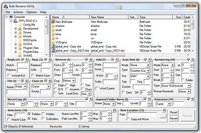
John Gruber invites public ridicule to the UI design of this file renaming application. And yes, it certainly looks terrible, like a stereotypical case study in haphazard, bloated, bad UI design.
But is the UI design really that bad? I’m not so sure.
As someone who has had to do all manner of complex and esoteric batch file renaming over my career, this tool looks pretty darn powerful to me. I’ve had to do some absurdly massive batch file renaming (hundreds or even thousands of files) about twenty times in my life, and every single time it’s been a unique and bizarre challenge.
This is one of those tools where, at a fundamental level, more features is better than less. Fewer features make this tool less likely to serve its core function: saving your ass during a freak once-in-a-lifetime file renaming emergency. Even the wacky features like renumbering the files using roman numerals doesn’t seem absurd to me. This tool is intended for people without ninja-like mastery of the black art of regex construction (and, for that matter, for office production workers who may not know how to program anything at all, for example a photo editor).
So if it’s not the number of features that’s bad, let’s focus on the UI itself. The signature quality of this design is that every single feature is shown on one page. There are no layers of dialog boxes, no multistep wizards. The fields are numbered, too, which seems to suggest the order the transformations are processed. The entire transformation is right there for the user to see, no surprises. What’s more, showing all the possible transformations on this one screen educates the user on what the application can actually do: No poking around through menus and manuals to find out what this app is capable of. It’s all right there.
My only substantive critique, in fact, would be aesthetic: the grid of the page and the layout of the form elements could be more pleasing and better organized from an information design perspective.
Is that the nut of Gruber’s critique? Or is he being a little hasty in his judgement here?
Comments
64 responses to “How Bad is Bad?”
“The nut Gruber”?
I agree, I think realignment and some contrast could drastically improve the aesthetics. This is a good post for me, I would have jumped on board about the bad UI however you make some very valid points worthy of keeping in mind, especially as a software interface designer. Thanks Chris.
Make the easy things easy and the hard things possible?
@zeldman: Looks like I forgot the word “of” and turned myself into an asshole. Fixed!
The aesthetics are obviously a train wreck, but part of me does see your point. Ultimately though, I think it’s a failed design because it’s a poor use of a GUI. Having all options immediately and simultaneously accessible on high complexity system tasks is why we still have command lines and user manuals. (And can you really call making no decisions whatsoever on what to include/exclude designing something? Well, maybe…)
It’s about scale, and this UI simply doesn’t. Also, while many features are straightforward, some are abbreviated only to fit into the tiny space allotted.
Is this a powerful tool? Sure (assuming it actually works). Would I be more terrified that I’d screw something up when I hit the “go” button? Yeah.
David makes a good point with the idea of “JIT” (just in time) interface. Show all categories, and if I input something into one of the fields, automatically open up other fields as a logical progression. Don’t however, show me interface elements that are in conflict with my input, or otherwise nonsensical.
And the main thing it doesn’t seem to do is show you a preview of what a filename would look like. After I fill in all this stuff, I should be able to have some idea of what it’s going to look like, especially if I can’t undo the action. Many “renamers” on the Mac (and I am sure on the PC as well) show you a dynamic preview as you build your substitution.
I say get rid of the tree, and either get rid of the file list, or make it a drawer to be hidden. It’s useless if you’re renaming more than a handful of files, or if you’re looking for recursive renaming.
Ah, I take back my last statement. It seems there *is* a preview in the file list.
Who is the likely intended user of this tool? Most likely, tech-nerds who are unlikely to be overwhelmed by a busy screen like this. In fact, having designed tools that were specifically for developers, I’ve often found that they prefer to just to have everything on one page. Those are also the same users who would understand that, because everything is on one screen, that they can type and tab to fill out the various options, which in that regard makes this solution superior to a progressive disclosure solution.
But perhaps the real and only reason why this interface is designed the way it is, is because it’s a lot easier and faster to implement a single-screen application than one that does high-falootin’ ui stuff like progressive disclosure. After all, this is free software targeted to geeks. If this were some pricey piece of software directed toward mainstream users, I’d be the first to tear it to shreds.
I think the effectiveness of this UI is summed up in the first paragraph of the tutorial, which says (in bold):
“DO NOT PANIC!”
it’s basically a UI that allows you to define the variables in a batch script. it is what it is. the only recourse is a sequential task wizard – and that would have a zillion screens. i am with you fahey. hey what on earth is that on your head in your FB photo?
I think, when the UI gets this complicated, you’re better served by a command line.
PS. Your blog software seems to be being affected by the ‘sattan.org’ redirect hack.
Your comment, ” … this tool looks pretty darn powerful to me … ” reveals a conceptual bias — that ugliness is acceptable in the pursuit of power.
Seems to me that this program could be modified to maintain all the functionality and be even better if it used a workflow metaphor like Automator on Mac OS X. You present the user with a list of possible transformations and a workflow that allows you to drag the transformations you need into a workflow. You could even save the workflows for later in case you ever have to do the same transform again. Seems much simpler, easier to learn and only exposes the complexity you need to get the job done.
If you need a utility that has near-infinite capability, you’re better off using a command-line where you can specify to the nth-degree what exactly it is that you want to accomplish. You can take advantage of all kinds of things that are unavailable to you in a GUI application by the nature of their design.
Want to rename files with less than n bytes ending in .txt one way, and files containing your name another? With a command line (scripting language, really), it’s easy. But imaging trying to write a GUI flexible enough to do all that. You’d end up with the screen shot above, and it still wouldn’t do what you wanted.
why doesn’t that nut gruber allow comments? I’m always suspicious of blogs without comments – what they think they are better then me huh?
@Anders The trouble is, despite the stated comfort level of a specific audience, this is the kind of UI facilitates user error. There’s a threshold with the average human you really shouldn’t go beyond when adding multiple focuses of attention. (It’s a variation of what Jef Raskin dubbed “portmanteau interface design” in The Humane Interface, where he cites the example of airplane autopilot system designers included numerous control methods to suit various user preferences — which led to user confusion, higher pilot error, and greater expense in production.)
Batch renaming files is not something my Mother or my Grandmother would ever do. I’d guess that it’s usually reserved for people who fiddle around with vast amounts of files, not those that use email and a word processor.
In this context, if the UI is at least intelligible and actually useful, maybe the UI complexity is a necessary evil. Sometimes it’s great to make things simple, but if you can’t make it any simpler, well, bugger…
It’s kind of like bashing UNIX because it has a bad UI. It gets things done that can’t really be done (at least easily) via a GUI. Using the command line (or at least a rather intimidating looking program) requires the skills and job or at least knowledge of what you’re going to do, to use it.
Does that make sense or have I gone insane?
The fact that you think that the ‘aesthetic’ and the design of this app are two separate things shows me you don’t know anything about the process of design. That in itself isn’t a crime, what irks me is that you still somehow feel qualified to post about it as if you’ve got some idea of what you’re talking about. Perfect example of a ‘read-it-on-blogs’ trained designer.
Is anyone else reminded of the “Homer Simpson-designed car” when they look at GUI’s like this? “Three horns, because you can never find one fast enough when you’re really angry!”
’bout sums it up right there.
Functionality vs aesthetics? Nope. Missing here is any mention of usability. That’s the nut. “Do Not Panic” indeed.
Some tabs, maybe? This would make the “chronology” of the beast more fluid, I think. The fact that the screenshots are shown on Vista is strike one. The fact that it took me a good 30 seconds to find step 1 is strike two. The fact that step 1 is “regex” is strike three. I think I’ll stick to Linux.
As well as all the points mentioned above, the biggest problem is not that it has a lot of features, it’s that it tries to present them all at the same time, with no way to focus on what you really want to do.
Roman numbering! Great! Wonderful! But it comes at the cost of making it harder to find the ‘rename the prefix’ as well as making the prefix field smaller. And so on and so forth. The key is data hiding, of showing only the relevant information to the user as they choose.
Sending options to a user through a fire hose doesn’t make the options any better than presenting the same amount through an as-needed basis. It just means it’s sent through a fire hose, where the user can’t grasp it all.
Unlike most of the commenters it seems, I’ve actually used this application, and it works really well. Where I wanted specific functionality, it was there right in front of me, no need to hunt through menus or tabs for the right option.
It’s ugly, but that’s not equivalent to bad design. All the functionality is exposed, and you don’t have to think ‘how would the author have categorised this action’. There’s an excellent preview function that shows you exactly what the result of all the options will be, and you can experiment and get instant feedback across the whole range of features. Compare that to creating a smart playlist in iTunes, where you’re flying blind despite the nice design.
@James Grinter: THANK YOU! I was wondering what the hell was going on with my search traffic. I think I fixed it, but I am just waiting to get hit again now.
@people-who-disagree: Good points all around. Just as an exercise, however, I wonder how many of you have actually had to use tools like this before. Are you really imagining yourself using such a tool, confronting a folder with a thousand files whose names need to be idiosyncratically changed? Most of you seem to be falling back on perfectly reliable and wise design principles (such as the portmanteau principle), making general heuristic critiques without (IMHO) considering the unique niche (both niche users and niche use cases) this product is designed for.
For example, I cannot imagine the specific cataclysmic user error @David Sleight imagines might occur with this UI (especially since it does have both preview and revert features). None of the dozens of settings are triggered unless you actually touch it, and the whole process doesn’t happen until you want it too. The idea that users will accidentally (and irreparably) do the wrong thing with this seems a little far-fetched when I try to imagine just how they’d go about executing such an accident.
Can this UI be improved tremendously through better layout and information design, or even a few new functional elements? Absolutely. (it’s easy to come up with examples: highlighting any field you’ve modified from the default/blank state would be a nice touch; having clearer descriptions around the field labels would help a lot; having a live preview file list would be awesome)
But is it a disaster for the more obvious reasons I think many of you are focusing on (too many features showing all at once)? I don’t think so.
Again, I feel it needs repeating that this is a complex tool intended for advanced and idiosyncratic uses. There is absolutely no mass-market use for this tool. There isn’t even a middle ground here: this is exclusively for people in the trenches facing thousands of files with wacky and weird naming problems.
@shazam: I’m not sure where you think I said that aesthetics and design are “two separate things” — I’ve long been a proponent of aesthetics (and style) as a key component of good usability and holistic UI design. This is a blog on which discussions of functionality and aesthetics are held on a higher level than I think you might be assuming. Maybe you should read other posts elsewhere on my blog (or for that matter you might want to start by reading this post more soberly) and get a sense of context before lobbing personal attacks and making yourself look like an asshole (and anonymously, too!) in public like that.
What, no renaming via EXIF data?
I have seen other batch file rename utilities, and this is by far the busiest one I’ve seen.
I do bulk-renames often enough for various reasons, so such a utility should be easy to use and not require a “DO NOT PANIC!” exhortation!
Do you claim that this is targeted for a geek? I’ve been a programmer for quite a number of years (over three decades) and if I were to see this busy GUI, I’d simply shake my head and look for another tool.
Personally, I use a rather simple batch rename utility. It simply copies the names of the input files into a text file and opens your favorite text editor to that file. You now can use your text editors search/replace to muck with the names. You can even define a character sequence that will be replaced by a increasing number (zero-padded if the character sequence is more than one character long). You can then see the output (it’s right there in the text editor!). Exit the text editor and the utility does its thing. Make a mistake? The utility has created an invisible “undo” file that will allow it to restore your file names to their original state, and that file is available for a preset number of utility runs.
I’ve found that this is about all I need in a batch file rename utility.
There is a reason that you don’t see an airplane cockpit level of complexity on your typical passenger automobile…!
@Peder: We can talk about fundamental usability ideas without mentioning the word.
@Rob Brooks: Thanks. I’ve used dozens of file-renaming programs out there, and this looks like it’s far from the worst of them. Most of them require a lot of “Make me think” time spent analyzing the UI (where is the menu that lets me change the date). In fact, I took a look at Name Mangler, the Mac app Gruber recommended, and found that UI incredibly hard to figure out. This example, however, doesn’t seem to require much thought — it is what it is, and you know up front what it can and will do when you click the Rename button.
@Blain: Yes, having Roman Numerals as an option clearly makes finding the more common features a little more difficult. The key word being “little”. IMHO the value of making the more common features more accessible isn’t a big deal — if finding your desired setting takes 4 versus 8 seconds to do, it’s not a big improvement for this obscure and esoteric app’s purposes and certainly doesn’t counterbalance the requirements that the application must make it clear (a) what you can and cannot do, and (b) what you are about to do.
The old 80/20 rule (80% of your users only really want 20% of your features) sometimes doesn’t apply. The 80% of users who only need the handful of most common renaming features can go use another application. This particular app is targeted at the 20 of the users who need lots of features. Given that specific overall product strategy, this is IMHO a clever solution.
Note that hiding some features would require adding UI elements to hide and show those features. Instead of arbitrarily deciding which features are basic and which are advanced (i.e., which to show and which to hide), they put everything upfront and eliminated a need for another kind of UI complexity.
If it’s designed for complex file renaming tasks, it fails to provide sufficient flexibility. With A Better Finder Rename, I can use several types of operations in arbitrary order — regex, then append an index number, then another regex, then replace the second underscore in the name with a dash, then…
More importantly, I build the command by a series of choices that are related to the task at hand — “what’s the first thing I need to do to make these names make sense?,” not “let’s see, regexes are first, so how can I stuff all my regex needs into step one?”
I also have a hard time accepting that this UI offers “no surprises,” with I think 76 fields (I only counted once). In A Better Finder Rename, there are no surprises because what I see is what I told the application to do. There’s no looking around to make sure that “everything else” is blank.
So I guess I see a conflict. If it’s a power tool, it’s not flexible enough; and if it’s a novice’s tool, it’s too overwhelming.
@lar3ry Actually I was careful to not claim this UI is for geeks. It’s for people who manage lots of files but who do NOT know how to do regex or command-line stuff. Animators, sound designers, photo editors (I’ve used renaming apps for all three roles). Product catalog inventory and customer order managers. But probably not just programmers.
As for the airplane cockpit analogy people keep mentioning, I’d say this app *is* an airplane, not a car, and that’s why it has this all-at-once UI.
@Dan Hallock: “There’s no looking around to make sure that “everything else†is blank.”
With this app, they’re all blank unless you actually touched it. That said, I totally agree that the UI should highlight the fields you’ve modified. That would be a big usability improvement.
By the way, in response to your @people-who-disagree — I do in fact do batch renames, a lot. Most common reasons are to make images fit a scheme for either thumbnails or part numbers; or to systematically replace unusual characters. I’ve processed as many as several thousand items at a time, and I have used about half of the rename options in ABFR 7. I have about a dozen droplets (presets, where I can drag and drop a batch of files onto an app and have it auto-rename according to my criteria), and I even have a script that takes files from my graphic designer, processes them with ImageMagick into thumbnails, runs them through an ABFR droplet, and copies them to a repository.
Now, I have tried lots of file renaming programs before finding my soulmate in ABFR, and I agree that Bulk Rename Utility is not the worst UI out there. But I do think it’s pretty bad.
I also use ABFR, which used to have a hideous interface but recently (v8?) had a redesign and became so much better to use. But even when ABFR had a bad interface, it was still better than this mess.
One other point regarding the need to scan over the parts of the UI that you’re not using — I’m going by screenshots, not actual usage of this app, but it appears that rather than starting blank, many of the fields have default harmless values, like “0” or “None”. This seems like it adds to the perceived complexity and to the mental burden on the user who’s about to press “Rename.” A sea of empty fields would be much more obviously harmless than a sea of zeroes and “None”s.
I think this UI could be improved by prioritizing the groups of fieldsets, hiding those that don’t get used often and showing only the ones that are most commonly used.
Asking the user to click through an action to get more specific options is not a bad idea, but it takes quite a bit of user testing to understand what the priorities are.
Picking on bad UI is a fun sport but unless there is a conversation to go along with it, it just makes the person doing the picking look like a jerk. Perhaps the designer of this application and UI will be open-minded enough to read through the comments above and elsewhere and take this as an opportunity to improve their product.
I’ve done crazy batch renaming, and the tools I’ve used looked remarkably like this one. Were I to encounter this as an end user, I’d probably chuckle when I saw the interface. Then I’d shrug, find the part of the screen that applies to my need, and go to work. If the app works, I’d go away happy. End of story.
This is a “get it done” app whose developers took the same mentality when compiling the interface. Surely a little UI design could make this app prettier, but as Chris notes, that’s not the point. Tabs and menus would simply obscure functionality in a reversal of the screen that’s in place now.
To me this is all about COURTSHIP.
When a product is looking to infuse itself into our common everyday habits and patterns, it has to win us over. It has to be easy and feel natural, and if possible – be aesthetically pleasing. It’s courting us. It’s attempting to insinuate itself into some aspect of our lives (e.g. playing music or sending photos).
For an application as specialized and niche as this, the tables are turned. We are looking to complete some bizarre one-of-a-kind task and we will bear with it because the thing can do it – we just need to figure out how. Besides, its potential population is inherently small.
There’s a direct correlation between how badly we want something and how much we’re willing to tolerate to make it work for us.
In light of this “bad interface” feels very loaded. It really doesn’t matter if its bad or not, we may very well need it and are willing to put up with the learning curve.
One other point: if you get past it and you become a pro at this thing, you’ll love it and defend it to the death; blaming others for not fully getting its awesomeness. 🙂
@Cameron here here!
Who’s really being hasty here? Gruber didn’t critique it or even judge it for that matter. He simply linked to it and said, “Not a joke.”
The UI isn’t terrible, but it’s certainly not good. We could go on for days about what part of it actually works and how it could be improved and in the end all we would have are a bunch of opinions.
The interesting part of this story isn’t what’s right or wrong about this application’s interface, but why the developer chose to design it that way. By understanding their original intentions and goals we can reconsider our own ideas and perhaps discover something new.
Sorry, that’s just a bad UI. It looks like an almost literal mapping of the switches of a command line tool onto a GUI, with no discrimination about user priorities, most likely options to be used, etc. The command line tool with a help file would be as good or better, and that is definitely a sign of a failed UI.
I think you are completely wrong the advantage you give that you show every feature on one page does not really work here. It is more like you hide every feature in a maze of fields and labels and lines for the extra information needed for those features even those you do not use. Progresive showing of those pieces will give you a much clearer view of the all the options.
There’s a major fallacy going on here – that because it is cluttered and complex, that it must be very powerful. That doesn’t appear to be the case here.
It seems very inflexible. If that’s “the entire interface” – then that limits its power to the number of fields you can fit in that screen space.
Compare with things like A Better Finder Rename – which has a multi-step process – you can add as many steps as you like, far more than are in this interface. So, it allows complexity and power, but maintains a simple interface – because you don’t have to be distracted by stuff you don’t need right now, but it’s available if you like.
As others have noted, it appears to have a fixed order of operations. That’s not desirable, it’s not powerful – it’s limiting. In ABFR, you can easily change the order of operations, and see a live preview update. You can save a particular order of operations for future re-use.
I really don’t understand why people are saying that this utility must be powerful because it’s ugly and cluttered.
I also don’t understand the people who think that batch renaming is some esoteric, once-in-a-blue-moon task. For me, it’s a nearly daily task. It’s a very common job in web design, digital photography and publishing.
I suspect Mr. Gruber delights in the feeling of superiority and ego gratification he gets from getting his minions to laugh at something (or someone). He thinks he is tremendously cool and au courrant.
He makes the point that you must be doing something wrong if your software looks like an airplane cockpit, implying that approaching the complexity of an airplane cockpit is wrong.
I too have had to undertake a few horrendous and Herculean file re-namings of thousands of files and would have loved to have had access to a program like this.
I hope Mr. Gruber doesn’t have a hand in designing the cockpit of the next airplane I get into.
@David B: I’m not going to try to read Gruber’s mind — I have both his site and this one in my RSS reader, so I don’t know if I count as a “minion” — but I _think_ the airplane cockpit references is about approachability, not complexity.
Very little software justifies an airplane-like learning curve. What’s more, while a traditional airplane cockpit does require every control to be present at all times, that’s not the case with software.
There are many cases where the UI design that you have to use for hardware like a cockpit — “put a control within reach for every capability of this device” is not a very good way to approach a software problem.
In this case, complex file renaming is much easier to handle by giving the user a blank slate and letting them list out steps: “these are the steps that need to be taken to get these filenames from what they are to what I want.”
I saw Gruber’s zinger and smiled. But I’ve used this app for about five years and it’s saved me from hours of tedious, error-prone work. It may be ugly, but it’s powerful and efficient.
After all, it’s a niche app. A sort of industrial application, really no worse than opening up Soundtrack Pro or DVD Studio Pro in advanced mode — initial reaction is going to be “what now?”. It isn’t a note-taking app!
I do a lot of file renaming and often just for speed I use name mangler http://www.manytricks.com/namemangler/.
It splits the different tasks into different sections and I’ve yet found a time when this interface didn’t work for me. What it does really well is allow me to focus on what I’m doing without wading through an interface. I’m sure your programming kicks ass but that interface would have turned me away.
I’m not sure if there’s ANY way you could organize all of that information in one window and have it be logical and easy to use – it’s simply too much.
My main problem with this UI is that there’s no sense of direction. When I look at it, my first thought is, “where do I start?” I have no idea what to do. Do I have to fill in every field? Are things processed in a certain order? If so, what is that order?
It also appears that there’s no previewing ability (if there is, I can’t find it in the jumble of everything else).
Overall, I’d have a very hard time trusting this app to rename hundreds or thousands of files – partly because I’d be unsure if I set everything correctly, and partly because there’s no apparent way to see what will happen before you actually run it.
If I showed this to my father (who is quite computer-savvy), he would take one look and immediately tell me to get it away from his computer. Heck, that was my initial reaction, and I’m a full-time software developer with 20 years experience on a dozen different platforms.
There has to be a better way to provide these kinds of features in a GUI. And if there isn’t, then it means this problem is not suited for GUI operations at all, and should have features removed, telling users to use a command-line for the rare cases where the simpler application doesn’t cut it.
I’ve been an animator for thirteen years and have actually written my own text-based batch renaming utility in an IRIX shell many years ago. I agree with those who find this kind of mapping-command-line-to-GUI approach to be less useful than actually just reading the man file on how to use regular expressions. It’s also ironic that this tool is supposed to help people who don’t understand such expressions, and yet that’s the very first option! I got a chuckle out of that.
The idea of a GUI is to use a different metaphor to make software accessible. I don’t care how advanced a user I become, even when I’m renaming image sequences several times a week, there are only a few functions that I’m going to be using on a regular basis. I don’t dump my toolbox out on the floor every time I need a screwdriver; I take out only the screwdriver, which happens to be on top, because I use it more often than, say, my hacksaw.
So while this GUI might inspire a sense of power in some, in others, it merely looks like a tangled mess that fails to lower the learning curve for the average person, and doesn’t lend itself to customization for power users. I agree with Paul Franceus that Apple’s Automator is a great example of intelligent GUI design where all features are exposed but are only implemented if intentionally placed into a visual pipeline.
You guys are polishing the silver on the titanic. This thing is so far off GUI best practice, that it’s a practical joke. Get a clue.
http://www.asktog.com/columns/022DesignedToGiveFitts.html
You can just TELL the programmer had no clue and decided to “play in the sandbox” that is Visual Studio’s interface builder…. so please, don’t defend it. As far as the interface looking more “powerful” – it’s basically just a UI version of blinkenlights – no purpose other than to “look technical.”
I don’t mean to take Windows programmers to task for it, but this sort of too-clever-by-half, complexity-is-power style of UI design is all over the place in the Windows world.
Backup Exec, anyone?
Oh, and you misspelled judgment.
That program got me out of a massive bind one day. Sure, when I opened it I was pretty bamboozled, but I figured out how to use it soon enough…it even gives you a preview of the filenames before you commit. Quicker than learning regex that’s for sure.
Sattan.org is still wrecking your blog by the way. All links from Google Reader are stuffed.
“As someone who has had to do all manner of complex and esoteric batch file renaming over my career, this tool looks pretty darn powerful to me.”
I don’t think the issue was ever whether or not the software is “powerful” or even useful. I’m sure the program is darned powerful. The problem is, I doubt I would ever invest the amount of time necessary to find out. Most people who do not look upon learning new software programs as some sort of neato challenge would run from this app at top speed if they knew of any reasonable alternative.
“I agree with those who find this kind of mapping-command-line-to-GUI approach to be less useful than actually just reading the man file on how to use regular expressions.”
This specific program isn’t quite the CLI>GUI transfer it appears on the surface. The key features for me are:
1. Live preview of changes, as I make them, not by adding an option and test-running
2. A big go button that’s easy to hit when needed, but hard to accidentally press (unlike ‘enter’ at the command line)
3. I don’t need to read a man file on regexp, or the program’s built-in help, especially as I only use it occasionally.
This is not a beautiful tool. It doesn’t have to be, just like it doesn’t have to appeal to everybody. Sometimes you just need to accept that what works for you isn’t universally right.
It could lose or hide some of the sections without affecting my usage of it, but the person choosing what’s hidden will probably not have the same priorities as I do.
@Rob Brooks: “Sometimes you just need to accept that what works for you isn’t universally right.”
I think that’s the smartest thing anyone has written on this whole page.
@Rob Brooks: “Sometimes you just need to accept that what works for you isn’t universally right.”
That does go both ways, though. Just because this tool works doesn’t mean its UI is good.
UI is not everything, of course. I use applications with terrible UIs all the time, even when there are competing apps with great UIs, whether it’s because I’m used to them, or they’re cheaper, or they have one feature that the competition doesn’t, or they’re what my colleagues use; and I seem to get my work done. I could even do my renaming in this app, and it wouldn’t make me run down to the pub to drown my sorrows after work.
I don’t speak for Gruber; maybe he sees a bad UI and thinks nobody should ever touch the app with a 10-foot pole. But from my perspective, it’s basically a missed opportunity. An app like this could be more useful and more pleasant for more people if it had a good UI; and could actually be more powerful at the same time.
> The key word being “littleâ€.
The thing is that it’s death by a thousand paper cuts. You have one feature. Then another. Then another. The other aspect of the 80/20 rule is that 20% of the features are used 80% of the time, and the other 80% are only used 20% of the time. Thus the reason for data hiding.
With everything out in place like that, all features shown equally, you’ve got the code that gets 80% of the use only getting 20% of the visibility. The code that has a fourth the functionality has four times the visibility.
Am I advocating that 80% of the functions be harder to reach than the used 20%? Yes. It’s Huffman encoding in a sense, of giving a disproportionate amount of access to the most common elements.
> Note that hiding some features would require adding UI elements to hide and show those features.
The first version of MacOS, back when they called it System 1.0, had no folders to speak of. Everything was laid out at the root level. For maybe a dozen items or less, that’s useful. Beyond that, and structure and logical organization is needed. Yes, it requires more logic. It means the programmer has more work to do. Simple is hard.
> Given that specific overall product strategy, this is IMHO a clever solution.
I would give more credit to the clever solution theory, if there was more strategy behind other aspects, fit and finish. Instead, the fields read:
1,3,5,7,8,10,2,4,6,9,11,12,13.
That’s not a logical order of functions. It’s Text Field Tetris, trying to jam everything in to fit. There’s other disconnects, like how in the first section, “Replace” means “text inserted”, yet in the next field, “Replace” means “text deleted.”
> Instead of arbitrarily deciding which features are basic and which are advanced
All this conspires to say it’s not an intentional case of empowering the user as much as the coder throwing up their hands and not doing the work to figure out which aspects really are useful. It’s a case of relying on the user to do all the brainwork memorizing what does what, which goes where, and thinking it’s powerful because they have to focus on it instead of what they actually want to get done.
Does it rename files? Yes. Does it rename files in bulk? Yes. Is it free? Yes. But is it a case of good user design, where difficult aspects of usage, reordering, and fitt’s law were given full consideration? That’s where I beg to differ.
Yes the nut Gruber. He’s a nut alright. A pretentious less than worthless nut. He contributes nothing whatsoever to the community.
BRU’s seems like a challenge to read at first; but really, isn’t it just a man page laid out as a gui for one set of tasks?
It IS a mish-mosh as far as logical sequencing and hierarchical thinking are concerned, but the ONLY ESSENTIAL DECISION to make has been made BEFORE you start the program.
YOU WANT TO RENAME A SET OF FILES QUICKLY, and more or less the same way.
This will halp you do it, and avoid having to write a BAT file with RegEx arguments listed in it.
Not so bad really, but at the same time, also a good example for one to ponder when considering how to help a user get what (s)he wants done, and at a given price point.
The only thing that might be more specifically explicit is the RegEx portion, which is adequately though not extensively covered in the Help page.
The programmer put it first, so that the typically impatient power user can just fill in what (s)he wants, see if it works in the file listing preview column.
That said, the rest of the options address just those things that a user uncomfortable with RegEx might want to do.
For the most part, this display IS self-explanatory. NOT in the mac gui way, but in the way of reading a help page.
The additional fields have been added over the years as the users and the programmer arrived at notions of what might be most useful. And that is the order you see reflected on the screen, reading from top left, across then down to bottom, like a page from a book in English. It’s chronological, in order of development.
This reflects the cost of the program: donations requested.
This discussion got me thinking about how people see things, and about how very useful I have found BRU over the years. In fact, though in haste I neglected to mention it in my first post, BRU has been helpful in learning RegEx, because I can try out various statements without damaging any files.
I use it because it works. I like it because it works.
Pretty is for page layout.
Chris and All,
Great comments! I’m really glad you opened up this conversation — it’s always good to make these conversations about interface design more nuanced and thoughtful than just “x is bad, y is good”. Rules of thumb always guide good design practice, but all rules break down somewhere.
All this talk got me writing:
http://thingsthatarebrown.com/blog/2008/12/more-than-just-the-interface/
@Groper: “Yes the nut Gruber…He contributes nothing whatsoever to the community.”
I think he earned his stripes with Markdown, and he’s got some useful BBEdit scripts. Not saying you have to like his blogging style, but he’s contributed _some_ by anyone’s standards.
@graffito: “YOU WANT TO RENAME A SET OF FILES QUICKLY, and more or less the same way. This will halp you do it, and avoid having to write a BAT file with RegEx arguments listed in it.
…
I use it because it works. I like it because it works. Pretty is for page layout.”
It could be prettier and also work better. They go hand in hand, if thought is applied to the process. (Yes, sometimes apps get prettier and lose functionality, but that’s not what I’m advocating.)
Apps like A Better Finder Rename, or Rename-It! on Windows, also let you rename a set of files quickly, and they do it without throwing up a messy smear of 76 fields. In addition, they give you much more flexibility in your results, since you can, for example, apply more than one regex, or apply filters in the order you want, rather than getting one of each type of filter applied in the order the app predetermines. For simple bulk file renaming tasks, they’re quick, easy and far more approachable. For complex file renaming tasks, they make possible operations that this app wouldn’t perform, or would require multiple runs to perform.
“It works” is a start. But dismissing UI entirely with a comment like “pretty is for page layout” is missing the point.
To clarify, I didn’t mention anything about cataclysmic user error (though the reference I cited in my second comment did). I indicated this UI would most likely facilitate higher error rates when compared against something with a more thoughtful UI. It’s demanding too many points of attention simultaneously. @Dan Hallock referred to the high “mental burden” this app places on the user. I think that captures it nicely.
Preview and reversion features are great, but both are a little beside the point. I can easily see this UI leading to hide-and-seek behavior when previewing and debugging complex operations. (“Oh man, that’s not what I want at all. Why is it doing that? What part controls X…?”) As designers and developers, we shouldn’t underestimate the ease with which mistakes can be made sorting through clutter like this, even when we fail and try to address it on the back-end with things like previews and undos. Give a user enough rope…
I’ve spent plenty of time using utilities for precisely this kind of operation before, including a few GUIs very much like this one (though admittedly not this specific app). I have several shell scripts on my machines right now that I wrote to handle operations just like this. I’m very much in the target audience for this app. Yet the “niche audience” angle just makes me shudder. While it may not necessarily be the case here, it’s too often used to excuse all manner of UX atrocity and outright laziness (see medical billing, insurance industry, even internal banking apps). The fundamentals of good UX remain wonderfully universal.