One thing that’s been fun about watching the Presidential and Vice Presidential debates on CNN is that you get to also watch a scrolling EKG-like graph of how viewers are actually responding to what is being shown.
The methodology appears to involve a live audience, selected by CNN, to manipulate some sort of control that indicates how much they agree with what they are seeing and hearing. When the audience agrees, the meters go up; when they disagree, they go down. It can get a little confusing when, for example, one candidate says “My opponent wants to eat babies!” and causes the meters to go up — does that men the audience approves of eating babies, or that they agree with the the candidate’s indignation? Generally, I think, it’s the latter.
I also can’t attest to the scientific validity of the graph — there are far too many variables in play to put much stock in them (for example, How did CNN pick the audience? How big is the audience sample?). Still, it’s fun to try to find patterns in the graphs, in particular to examine places where different audiences responded differently to the same statements — or when audiences didn’t respond at all.
For the Presidential debate, three different graph lines tracked Democratic, Republican, and Independent voters. For the most part, the red and blue party lines reflected which candidate was speaking, but there were many times when they converged indicating broader agreement with what the candidate was saying.
- Whenever McCain spoke in generic patriotic platitudes (America is the greatest country on earth, etc.) the Republican line shot through the roof and the Democratic graph barely notched above a flatline. Either Democrats aren’t patriotic and Republicans are, or Democrats don’t fall for that kind of rhetoric (and Republicans do). I think it’s a little of both — part of the appeal of Democratic and liberal politics is a sense of independence from systems of authority. Tellingly, Independents did not respond to overt appeals to patriotism.
- When McCain spoke of victory in Iraq, and criticized Obama for what he thinks is a plan for precipitous withdrawal from Iraq, the Independents in the audience barely responded at all. But when Obama spoke of leaving Iraq, the Independent numbers shot up. Republicans and Democrats generally followed their candidates on this question, but I think I remember observing that even the Republican line failed to reflect much enthusiasm for McCain’s emphatic case that we needed to pursue victory in Iraq. People want the next President to get America out of Iraq.
- Whenever either candidate attacked the other, particularly for some obscure or feeble inside-baseball political gaffe, the lines would split along party lines… but the Independent line would tumble. Independents do not want to hear political attacks.
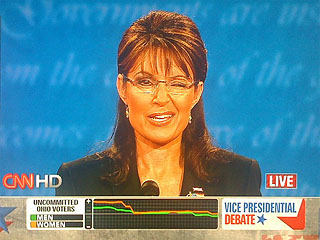
The Vice Presidential debate was even more fun, where CNN selected an audience of undecided voters in Ohio. In this case, the graph plotted only two lines: men and women. Presumably, because they are undecided, most of this audience was not partisan D or R. My observations from this round:
- Anytime either candidate mentioned the word “nuclear” (or, in Palin’s case, “nukular”), the line for men shot upwards — literally at the very moment the word was uttered, like some kind of magic button was pressed in their brains. Apparently men love them some nukes. Perhaps the graph is also something of a Geiger counter.
- Whenever Sarah Palin spoke about her track record and accomplishments in Alaska, both of the plot lines were flat. Apparently nobody gives a shit about her accomplishments in Alaska. Nobody gives a shit about Alaska. If this was intended to bolster her executive credentials, the CNN chart shows that it wasn’t working.
- When Palin spoke of representing “regular Joe Six Pack” Americans, the meters did go up. The back-slapping stuff works.
- When Palin spoke about Iran, she spoke forcefully and strongly, and had some scathing critique for Obama’s (frankly baffling to me) “no preconditions” position. But, interestingly, the audience meters didn’t go up for her. People don’t want to hear belligerence towards Iran.
- When the critical question was asked (one of Ifil’s only really good questions, I think) about how the candidates would handle ascending to the Oval Office if the President were to die, Palin’s chart was nearly flatline. This is one of the few moments in the debate where the audience was asked to seriously and realistically contemplate the possibility that Palin could be our President. Despite her likability, nobody wants to even think of a President Palin.
- When Biden spoke about the death of his wife and child, the graph surged. When he choked up, however, they dropped suddenly but rose back up again. It’s as if peoples’ bullshit detectors went off immediately, only to then declare a false alarm, that indeed his pain was real.
- When Biden went on the offensive against Palin, the numbers did not respond. Fortunately for him he rarely attacked Palin in the debate. Pundits on both sides criticized him for being too gentle, but the numbers, both on the graph and in the post-debate polls, speak for themselves. Biden’s no-attack “aikido” strategy was completely correct, and his self-discipline paid off.
- That said, when Biden went off on Dick Cheney, the women’s line on the meter went through the roof.
- When Palin said “Drill, baby, drill”, the women’s line dropped. Oops!
- Palin’s winking and cute you betchas and goshdarnits didn’t work, either. When she said she wasn’t going to answer the moderator’s questions, and when she joked that she was new to this campaign and hadn’t made many promises, both meter lines dropped. People may like her and may even strongly agree with some of her positions, but they don’t like Palin not taking things deadly seriously.
- When the candidates discussed kitchen-table economic issues, a clear gender gap emerged: Men gravitated very strongly to Palin’s championing of Republican platforms, tax cuts in particular; while women responded to Biden’s empathy for the effects of the economy on everyday budgetary challenges. My theory on this is simple: Men are idiots when it comes to practical money issues. Men have no idea how much consumer prices have gone up in the last year or two (grocery costs are up 10% this year); women know. Men think that they’re going to make over $250,000 next year; women know this is a delusion. Believe me, I fit both of these patterns.
- Overall, Biden seemed to have greater appeal to women than Palin did. His appeal to women often exceeded his appeal to men, too.
For both debates, the pundits rated the candidates’ performances roughly equally. And in both cases, the post-debate polls revealed commanding victory margins for the Democratic candidates. And, as should be clear from my analysis above, the CNN studio audiences were similarly less moved by the Republican arguments. Why the discrepancy between the pundits and the audience?
The GOP strategy seems to be to run the same campaign they’ve run for the last six elections. Normally this would work. But I think things are different now. The American people are different now.
The conclusion I get from these debates is the same as Bill Kristol’s: Americans simply aren’t buying what McCain is selling. It’s a different electoral zeitgeist than it was in 2000 (when America was complacent) or 2004 (when America was scared but cocky). Obama and Biden did not have to be circumspect about their positions (as, say, John Kerry felt obliged to be) because their positions are what the American people want right now. They don’t want America to be belligerent around the world. They’re okay with taxing the rich. They want something to be done about healthcare.
The pundits will continue to equivocate about the candidates’ performances in the debates, and will give McCain’s platform credence from a rhetorical perspective. But the American people are already giving plenty of indicators that they’re just not buying it.
Comments
6 responses to “Graphing the Debates”
Those devices and methodology are pretty common when focus-grouping TV shows and ads I believe. I was plucked off the street once in Vegas to twiddle a knob while we watched some stupid sit-com.
Endlessly fascinating. Thanks, Chris.
I thought these graphs were marginally useful and quite distracting. Honestly, somebody at CNN should be shot for their “debate analytics”, I know so many people that were utterly confused by the “pundit scorecards” in the HD broadcast. Twitter was abuzz with people ditching CNN for MSNBC.. I guess it has been all downhill for CNN since the magic wall from super tuesday.
@Greg J Smith: The pundit scorecards on the sides of the HD broadcast did look pretty incomprehensible.
But I disagree that the bottom-of-the-screen graphs were distracting — obviously I found them immensely interesting.
And the magic wall? I’ve always found that to be a groundbreaking tool for explaining voter demographics and electoral strategies. They keep adding features to it, and John King uses it like Al Gore uses Keynote — that is, expertly.
Obviously you found them interesting! I didn’t mean to suggest you shouldn’t have posted about them, I just (personally) found them a bit perplexing. I think the information communicated in these graphs could serve as good source material for more “wide angle” analytics/diagrams/visualizations.
Regardless, thanks for posting this. I don’t think these kinds of graphics have matured yet but they are an interesting development in broadcast design.
@Greg J. Smith: No problem! I totally understand how some people might find them maddeningly distracting. It made me wish that data was on an optional, interactive backchannel (like election.twitter.com… see my latest post). I also wished the sample pool was larger, and segment-able (“Show me the graphs for just Independents in all the swing states”… “Show me women nationwide”… “Show me Democratic men in West Virginia”. Maybe someday this will happen.