The following is in response to an interesting and thoughtful video and essay by Edward Tufte, posted on his blog/site, in which he argues, among other things, that many of the applications on the Apple iPhone do not adequately take advantage of the iPhone’s screen resolution and its compelling and easy-to-use zoomable UI paradigm.
In one specific case, he advocates replacing the iPhone’s Stocks application user interface with one that displays immensely more information in the same space. He critiques the Stocks app for the cartoonish UI design that wastes space with useless decorative graphic design.
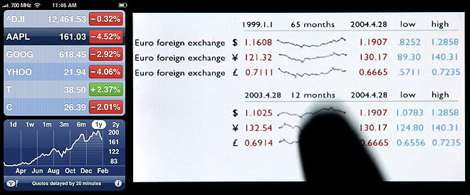
You can see the iPhone’s Stock app and Tufte’s suggested solution side-by-side here.
I submitted the following comment to his site, but apparently Tufte doesn’t seem to think my critique is interesting enough to warrant passing through moderation :-(. So I am publishing it here on my own blog:
You are neglecting the fact that iPhones are *mobile phones*, designed to be used primarily by people on the go, or by people who are otherwise occupied. The cartoony UI screens are designed to be usable by people who are walking, talking, riding on a train or bus, waiting in line, bored in meetings, and (unfortunately!) while driving.
Typical iPhone usage lends itself well to the information-thin designs you criticize precisely because it does not attempt to do more than deliver the most important information in a heartbeat. The “image resolution” style of information design you advocate is great for someone using an iPhone while sitting in a comfy chair with lots of time on their hands, or for someone who posesses no other information platform (i.e., no desktop or laptop computer). But for most users, they will use the iPhone to informally keep their finger on the pulse, and use their main computer to actually think about and analyze data.
There is no need whatsoever for someone on their way to work or waiting in line for a sandwich to know what a stock is trading at down to the third decimal place, or for them to see a historical sparkline. In fact, I would contend that 90% of the benefit of the stocks app is in the colors alone — even if there were no numbers at all and just red and blue boxes, the design would be effective.
I find it ironic that Tufte is actually advocating the addition of more information to the screen, something which would seem wholly out of character for him. I suspect this is because he is thinking about the iPhone’s UI as a graphic design challenge, not as a component in a larger lifestyle-based user experience. He doesn’t view the iPhone as the object of delight that most iPhone users I know find it to be, and instead he sees it as a straightforward challenge of graphic efficiency. IMHO, he’s overlooking the most important part of the user experience.
Resolution
I also want to add that Tufte’s focus on the word “resolution” is revealing. He praises the iPhone itself for its high-resolution screen. He seems to extend the word’s meaning, too, in an intriguing way to include the fact that the iPhone’s zoomability effectively and elegantly increases the available screen resolution without adding what he calls “administrative debris” in the form of scrollbars, etc.
These are great thoughts, but is he playing with the meaning of “resolution” deliberately, or is he simply impressed with the iPhone screen’s dots-per-inch? Perhaps another view into this question is through Tufte’s insistence on posting his video as a 56-megabyte Quicktime file instead of as a one megabyte YouTube or Vimeo enclosure. He apparently cannot bear to post this video in a low-quality streaming video format, preferring crystal-clear resolution over ease and speed of use. This seems to relate directly to his more general fetishization of “resolution” as the saving grace of all screen-based communication.
From all of this, I am not getting a strong feeling that Tufte is up to speed on how we do things on the Internets these days.
If this is Tufte vs. Jobs, this one goes to Jobs hands-down.
Comments
43 responses to “Edward Tufte’s iPhone”
I find it ironic that Tufte is actually advocating the addition of more information to the screen, something which would seem wholly out of character for him.
Actually, that’s what he often does. His mantra is “get a high resolution display (usually paper), and pack it with as much informationally dense “stuff” as you can. Note “informationally”, not “random cruft”. His argument is “you’ve finally got a high resolution display… make the most of it”.
But, as you point out, the iPhone is what I’d call a “casual” display. You’re not going to use your iPhone to make monumentally weighty decisions for your financial future. You may however, wanna check out how AAPL is doing.
Often we talk of the 10′ interface, where the viewer is sitting/standing 10′ away from the display. I say the iPhone is a variant of this 10′ display, as the scale is the same. You may be 12″ away, but the screen is much, much smaller, and your level of interaction is similar (usually more passive than active).
I also disagree on his comment about the image display. I think a 1px grey border in the thumbnail view would cause all the images to blend into one another, and make it *more* difficult to differentiate images, not less.
With all due respect to Tufte (I have one of his books and plan on getting another one soon and am fascinated by what he writes) I think you’re dead on about this.
Understanding the context that the information is presented in (on the go) and tailoring the data to be most usable in that specific situation is the best solution for the greatest number of people.
However, I do think there is some demand for some applications that do present more information. So once the iPhone SDK is released, I wouldn’t mind if somebody writes a few applications that adopt some of what Tufte says in this video. But I don’t think that this is what Apple should be focusing on.
Good points, Mr. Fahey! As you note, Tufte has really interesting thoughts and has taught us much. I suppose that I just tune him out when he gets like this, but I wish he would display (sorry) some nuance when it comes to applying his principles.
Just a quick note: I love Edward Tufte’s thinking about information design and graphic design, and I think about his advice constantly. A day doesn’t go by where I don’t use his ideas to make my work better. His views on user interface design, unfortunately, don’t nearly measure up. Perhaps this is simply because he is not a practicing user interface designer and lacks experience in working hands-on with designing — and evaluating — interactive experiences.
Okay, what do people not named Chris think? 🙂
I must say I had pretty much the same reaction when I first saw the video.
It’s also interesting to note that Tufte’s suggestion fails to incorporate the notion of interaction in any way. It’s a bit unfair of him to say that the stock screen contains six stock listings and a single chart; it actually displays a chart for each of the stock listings, each of which are revealed as the stock rows are clicked. This is arguably a much more efficient use of space. His mockup treats the screen as if it were just paper, which seems to be reinforced by his fondness for the flicking gesture, like the act of leafing through printed pages.
I agree with your comments — he’s not thinking about the actual use only the “resolution.”
I do agree with him that the weather app is only minimally useful, but his replacement example is ugly and terrible. Radar images are neat to look at but they are informationally meaningless to most people. What I really would like is an hourly forecast view. Or at least something that links to better weather information than the crap yahoo cityguide page that the Y! links to.
Other useful weather info:
– what the weather was yesterday (so I can compare)
– percentage chance/inches of rainfall
– pollen/pollution index
Overall I agree with you, but I want to reiterate CM’s point. Tufte, wants to cram as much information into his designs as possible. Data rich is his mantra. What he doesn’t want is “chart junk” or “interface debris”.
Interesting perspectives, and I’d tend to agree with most of your assertions.
More shocking, however, and perhaps I missed something in the black market, but where did Mr. Tufte come up with an iPhone running WiMAX? Broken phone to be sure, but that network – and 700GHz – are not for the meek at heart….or population at large, correct?
Overall, I’m more in agreement with Tufte than with you here — though his weather design doesn’t do it for me; I do think Apple’s iPhone widgets are too cartoony.
The truth is, though, Apple makes a distinction between iPhone applications and widgets; they refer to the weather and stock apps as widgets and their design and functionality are very much akin to their Dashboard counterparts. I’d like to see a Tufteian iPhone stocks application; but it would probably be a different beast than the stocks widget.
Also, since he is describing and detailing resolution-centered data, a YouTube video would *not* do the trick. He couldn’t effectively demonstrate the greater information density of his stock image versus the Apple widget if 2/3 of that information density was stripped away by YouTube. Sure, there might be a happy medium between YouTube and 56 MB, but I think that it’s not so much that Tufte is not up to speed on how we do things on the Internet, as that he is unhappy with loss of resolution and density being an accepted tradeoff, and he wants to argue against it in high res. 🙂
I love Tufte, but I agree with everything you’re saying here. What I want to add is in response to your “resolution” comments.
Went to a Tufte presentation last year and I remember him using the term “resolution” not to mean how many pixels you can fit into an inch, but how much information you can fit into an inch.
It’s a bit of a stretch, I like to think of it as a Tufte-ism. Makes sense when you’re on his train, but out of context, some meaning is lost.
Here’s a thought: could iPhone’s zooming ability be used as not just as a “show me bigger” function, but a “show me more detail” function?
So a widget that started out at a high level of detail–the “green stock go up”/”red stock go down” level, but let me pinch and zoom in to more increased levels of data detail? Let me literally zoom into that third decimal of resolution and historical sparkline.
Admittedly, I too watched the video a couple of days ago and thought he missed the point when commenting on the stocks app. I use it quite often to get a glimpse of how stocks are looking without caring about fine detail. As you said, the colors often matter more than the numbers themselves in a typical on-the-move situation.
Now, that doesn’t mean that I wouldn’t use another app that made better use of the iPhone’s technology that would be a better fit for power-users looking for control and detail. In fact, I think we’re bound to see a few come up post-SDK.
A widget cannot be everything to everyone – given the limited available screen space on a mobile device, and the amount of will someone has to read it all, it would be impossible to deliver everything you could ask for at a glance.
For me – varying degrees (+-1-2C) don’t mean a lot, and as such I would prefer a brief description of weather in time periods, and if there was any significant changes. For example:
4am-8am: Cool, with a mild breeze. Patchy cloud.
8am-12pm: Brightening up. Blustery wind and mild showers.
12pm-4pm: Showers continuing. Less wind.
4pm-8pm: As above.
For someone else, that kind of display would be completely insufficient.
Andrew – what you suggested would be perfectly possible – as we delve into a small graph by pinching, more figures/calculations could be made. A more accurate picture could be gained easily. Just like the zoom on a photograph.
What this could ultimately mean is that a user will see at first glance, the 90% s/he wants to know 90% of the time. The other 10% comes from zooming in on certain data. All accessible from one screen.
Going back to my previous example – if I had my descriptions on the display, then I could pinch into one and reveal temperature indicators, previous time period yesterday comparison etc.
I will be getting a new iMac at the end of February, it will be then I might have to buy an iPod Touch… all this buzz on the Internet!
It’s enough to drive you crazy.
Tufte is generally great, but becomes less relevant as displays become more interactive.
It drives me *nuts* that there is no indicator for wind speed on either the Dashboard’s or the iPhone’s weather widget. Most weather sites don’t give it another thought. There’s not even an opt-in option to display it. I often care less about temperature than wind speed, for that often dictates whether it’s feasible to bike to work that day.
On the 56 MB hi-res video, I think it would be difficult to make out the details of his alternative designs, or indeed appreciate the iPhone screen’s resolution, after the usual YouTube mangling.
In the video, he particularly rails on the stock application for being cartoony. There’s lots of “chart junk” and other junk on the page that doesn’t convey information. His solution shows a very minimal design with lots of information — some 14,000 points of information accurate to two significant figures.
While it’s possible to pack that much information into a single display on the iPhone there’s a slight technical issue here. That’s a whole lot of data for each stock that would be automatically downloaded, which in turns puts some weight on the 2.5G network that the iPhone uses. Adding maps in motion to the weather applet would make things worse. Such maps would need to be downloaded in the background because I can’t imagine most people waiting for the map to come up over the network.
Indeed, if we’re on a superspeedy network, such as a WiFi connection at your home connected to a good cable modem, you may be able to get away without caching — but downloading over the 2.5G network or through an overloaded wifi connection at a conference would cause nothing but a black box to appear for a while — which I’d imagine even Tufte would agree is a step backward,
@Patrick Wagstrom: I don’t agree that Tufte’s stocks solution would be a bandwidth hog. Worst case scenario, it’s just a big and easily-compressed image file, which isn’t any worse than, say, a photo on the NY Times home page.
I think you are being thrown by his “14,000 points of data” claim, a number which in all frankness I think he pulled right out of his ass. Those sparklines hardly pack that many pixels, much less actual datapoints. Hyperbole.
Regarding the weather maps, yeah, that would be a bigger problem, but remember: People are viewing YouTube videos over the Edge network, videos that, while slow, are far far longer than the weather clip he portrayed. The map he showed would probably load in, at worst, under 20 seconds, and could be loaded (as you point out) in the background anyway so it’s already there for you when you load up the app (like the email app does).
I just read this response and it’s eerily similar to a comment I just left on ET’s site (we’ll see if it makes it through moderation…)
The iPhone interface is consistent with Apple’s design philosophy. Usability and the cartoony-style interface are integral pieces of Apple’s branding strategy. The comments here seem to come from an interface design and usability standpoint whereas Tufte is focusing simply on displaying information. I have to say that I’m on the side of the interface people. If I pull the phone out of my pocket and can’t get certain information at a glance, what’s the point?
Just wanted to mention that I agree with everything and while one commenter noted that maybe the huuuuge video file was to help show clarity, he didn’t frame it well at all! Check out all that un-used blackspace in that clip. That in itself amused me quite a bit.
There appears to be a theme emerging, we all love and are inspired by Tufte’s work but feel uncomfortable with his utterances about interaction design and usability issues.
An interesting read is a criticism (yes some people do criticise his work) of “Visual Explanations: Images and Quantities: Evidence and Narrative.” by David Sless of the Communication Research Institute in Melbourne Australia.
http://www.communication.org.au/htdocs/modules/smartsection/item.php?itemid=52
Enjoy….
hmm, I do have to say,.. I would like to see and apple product, with less apple ‘pop’. I really think apple could loose some of the cartoonish design, and retain all of it’s class and usability.
I understand what Tufte is saying and in part agree. But in Apple’s defense, I don’t look at the original applications for the iPhone to be the end-all solution for stock or weather information. The iPhone is a consumer device. To me, it would seem that adding the kind of detail that Tufte suggests would be overkill. I definitely see more advanced applications with richer amounts of data being displayed coming around once the SDK is released.
I think of the iPhone like Apple’s iLife applications. It’s more about style and ease of use. The applications help to make the statement about how the iPhone works. But like I said, I could see more professional versions of the apps we see coming out (not necessarily from Apple). It’s like comparing iMovie to Final Cut Pro.
Y’know, I sometimes forget this in light of the elegant lines of the physical design, but Apple’s software UI does often err on the side of cheesy. (Seriously: Marker Felt? Sand? &etc.) Nonetheless I totally agree with you. The weather interface is much better at-a-glance as it is. Frankly, Tufte’s satellite recommendation is useless; it looks pretty, certainly, but there’s *practical* use to knowing a bunch of clouds are going in one particular direction or another.
I heartily agree with @nickd’s assertion that there needs to be a wind speed indicator, or something similar (wind chill? “feels like”?). Living in San Francisco means that every day has a nearly identical *posted* temperature, but the perceived temperature depends largely on the wind.
I agree.
More is not always more.
Given the choice between Tufte’s information rich alternatives and Apple’s original graphics I’d take Apple’s because of their vastly superior aesthetics.
I realise that information design is his topic and not information aesthetics, but it seems impossible to separate the two.
Higher rez displays are ideal for including more detailed information but are also great for glossy graphics, cinematic transitions and animation.
The iPhone has to be useful but also enjoyable – quite a difficult balance to achieve.
The thing about the criticism here (http://www.communication.org.au/htdocs/modules/smartsection/item.php?itemid=52) is that, well, it is spot on; what works for exhibition certainly does not necessarily work in real life. Just because the iPhone’s interface allows dense information to be displayed, does not mean that NOT using it to display dense information is in some way flawed. Instead, though, maybe the iPhone could scale up the information density as the user requests? (e.g. touch the rain icon to see a weather map, use “pinch in” to see more stock data). Perhaps one could even make more use of the accelerometer – display less data when the user is rapidly changing acceleration (driving, walking?)
[…] Interactions Magazine is now online. Read up. All the links you can handle regarding Google’s Social Graph API. Shaun Inman shows the role geometry played in the Mint logo. Easy podcast recording remotely using a few cheap tools. Blink Interactive shares their informal design library. Neat stuff. If Tufte redesigned the iPhone. And, a response. Some controversial thoughts on debunking the Tipping Point. […]
Am I the only one who thinks Tufte’s website is poorly designed? One continuous page with a mishmash of content.
One problem with his site is that all the “related links” at the top of each thread push the actual page content below the fold, including the title.
I think the way his discussion forms work is really interesting: there is a very high signal to noise ratio, and threads (which number is fairly limited) tend to last for years.
I also agree with the notion that when interactivity enters the picture, he isn’t quite as on the mark. He seems not to acknowledge the multidimensionality of interactive displays.
If you have ever heard him speak or have read any of his books you’ll know that Tufte’s focus is on information design. His goal is presenting an unbiased, focused narrative about large quantities of data using a small amount of space, and allowing the viewer to make their own conclusions in as short amount of time as possible. Simply put, the difference between your opinions is he sees an iPhone as tool capable of producing his goals in information design. You see it as a plaything. At no point did he say “Jobs failed.†He was just offering his vision of what this device is capable of.
I really think what is going on here is that you are suffering from a disease that is plaguing designers everywhere. Fanboyitis, The disease where someone buys into a company’s marketing campaign so hard, they let it cloud their judgments. If asked, a fanboy would deny their was anything wrong with their $600 phone because after forking over twice as much as a product with similar features that didn’t have the ‘i’ in front of it, they are compelled to defend their purchase. Fanboys would suffer that crap service from AT&T so they could pull out their credit card and say “ME TOO†in their hopes of some day being cool.
Finally, a fanboy would disrespect a much smarter man than him for merely suggesting that the fanboy’s idol may have chosen another approach to something.
Chuck D & Flavor Flav said it best – Don’t believe the hype
@NicHexum: It’s not a plaything. It’s not an essential productivity tool either. It’s a mobile phone.
I have deep respect for Tufte, as my essay clearly states. It’s possible, however, for him to miss the mark on a topic (interaction design) that he has absolutely no track record of actually practicing. As you yourself note, his focus is on information design, not on the temporal experience of interaction design. It’s not his forte: Seriously, show me a digital interactive product Tufte has actually designed. I can’t think of any.
You say:
“large quantities of data using a small amount of space, and allowing the viewer to make their own conclusions in as short amount of time as possible”
My point is that nobody actually wants to do this on a mobile phone. Very few people will want or need to see large quantities of data.
What’s more, zooming in and out on the iPhone, and panning from left to right, is NOT as fast and easy as you might think. Have you ever actually used an iPhone? The panning and zooming is great, but it’s not as easy as Tufte seems to think it is. Tufte’s solutions are beautiful, but I don’t think it’s quite as easy to use as he thinks, and what’s more it doesn’t solve an actual real-world problem (as I said, who needs 65-mont stock records while walking down the street?).
Tufte is so focused on the one problem he is unparalleled at thinking about (information design) that he is missing several other problems that are equally important in this context (usability, usefulness, speed, appropriateness).
Also: I’ve never been called a fanboy before — I’m the biggest skeptic out there. Perhaps you need to take a look in the mirror, too, because your apparent inability to engage in a calm and reasoned debate reveals a certain unquestioning fanboyness (for Tufte) on your own part. I think Tufte is probably mature and confident enough to know the difference between a professional critique and “disrespect”. Are you?
Okay, maybe that last line about the Internets was a little disrespectful. Sorry, ET!
i’m really getting a kick out of this … especially when you consider that its all about just a bunch of pixels on your screen and how best they should look …
[…] People are sensitive about technology they bond with and the iPhone is a recent example. Infoesthetics picked up Edward Tufte’s comments and critique of the iPhone and the reaction of Christopher Fahey, the information architecture practice lead at Behavior. You need not imagine the cat hiss of the commentary that follows either blog post, a quick glance reveals the emotional charge often experienced when pointing at people wearing t-shirts that read, “Don’t mess with Texas.†[…]
circa 2004 …
http://www.sellsbrothers.com/spout/default.aspx?content=archive.htm#My_Day_With_Edward_Tufte
“I find it ironic that Tufte is actually advocating the addition of more information to the screen, something which would seem wholly out of character for him.”
—–
Not at all. That’s the entire basis for one of his main design principles: Micro/Macro Readings.
From Envisioning Information, pg 50.
“Visual displays rich with data are not only an appropriate and proper compliment to human capabilities, but also such designs are frequently optimal. If the visual task is contrast, comparison, and choice — as so often it is — then the more relevant information within eyespan, the better. Vacant, low-density displays, the dreaded posterization of data spread over pages and pages, require viewers to rely on visual memory — a weak skill — to make a contrast, a comparison, a choice.
Micro/macro designs enforce both local and global comparisons and, at the same time, avoid the disruption of context switching. All told, exactly what is needed for reasoning about information.”
—–
Tufte has always been fairly clear and consistent on this point.
“These are great thoughts, but is he playing with the meaning of “resolution†deliberately, or is he simply impressed with the iPhone screen’s dots-per-inch?”
—–
Tufte has always used resolution to mean both the density of the dots/pixels we put onto the page/screen and how it directly relates to the density of the information we can display given that context. Given he feels more density is generally better when used properly, I think he’s basically doing what he always does here: You’ve got this great device with higher resolution and even virtual resolution, so why not use it to its maximum potential instead of all the chart junk it has on it?
Tufte’s approaches to information design generally require very high resolution display systems. At this point in time, since paper is really the only thing that provides him the resolution he feels he needs to do the work, his approach feels antiquated.
In reality, Tufte is way ahead of everyone. The day the display systems reach the resolution of paper, which can easily happen in our lifetime, all of his design methodologies will be right back on track and will be more relevant than ever.
@Andrei: My point was that he was advocating the addition of more irrelevant data to the page, data that is manifestly not required for the application to do its job. The data he suggests adding (65 months of stock prices? Three decimal places?) is, IMHO, largely chartjunk. It’s infoporn. The key word from your quote from EI is “relevant”: his iPhone proposals do not take relevancy into account, and instead put all the emphasis on data quantity. That’s where I think he’s straying from his own advice.
The quote you provide is interesting, however, in what it reveals about the suitability of his theories to interactive media:
The zooming-in approach he describes in his video, however, creates a far worse situation than the very real problems often involved in merely spreading data across multiple pages. In his iPhone examples, the data is spread across a two-dimensional plane. Once you’ve zoomed in on portion A of the display, you have to remember where portion B is in both the X&Y directions in order to pan over to it, or you have to zoom out and then zoom back in again. And you’d have to do this in-and-out trick quite a lot because the zoomed-out view is pretty much illegible.
That will be a happy time for everyone, indeed, but methinks Tufte will still argue for the “fit everything on one page” approach and not the “users can move around through data freely” approach. Not every data visualization challenge is best solved through flat graphic design. There are more methods to model data for user consumption than fitting it all on one page, and I contend that many of them are superior to fitting it all on one page — and, further, I contend that interaction designers are already using these superior methods quite proficiently.
I-phone is a great invention, you can always check emails for work wherever you are.
I just returned from a Tufte one-day seminar. If I heard one more time how bad Powerpoint was and how great he was I would have screamed. For someone who made a big deal about content and credibility, his presentation sure lacked both. First of all Mr. Tufte … writing a book doesn’t make you an expert … and doesn’t come close to giving you license to declare ‘principles’. If my science background serves me well … it takes more than someone’s one-sided opinion to make a principle. Second, you never provided any content to support your contention that your way is right and everyone else’s is wrong. Where was the data content that you require others to have to prove their credibility?
I have been building presentations in the real world since 1972. I used 3-D physical models to present complex problems in the 70’s and built GUI end user interfaces in the 80’s that are still used today. I teach my staff how to build presentations based on the needs of an audience. It might be instructive to consider not only the needs of the audience but the role personality types play in the balance of content and format.
In business Mr. Tufte, a presentation is more than just data. It is a negotiation. As such, there are considerations that go well beyond data … and yes … sometimes format is an effective devise.
Mr. Tufte’s model has an academic leaning that requires an audience to invest in self-learning. After 36 years in business, I have yet to encounter a management group that is so inclined. You said that you presented material to business groups … but have you ever really listened?
I attended this one day seminar because a young manager down at work is trying to apply Mr. Tufte’s model without success and I wanted to get a better understanding. In that sense, it was a successful adventure because now I know why this manager’s presentations fail time after time. They are presentations Tufte would be proud of. He blames the uninvested audience of course.
I feel obliged to comment on the I-phone. Get over yourself Tufte. Sometimes other people are right. Sometimes their objectives will be different than yours. And please … what possible value is 20,000 high resolution data points for the past 3 years to an investment decision that is based on what will happen in the next 24 hours? Clearly … more data is not always the answer.
Sometimes … I just want to know what the temperature is right now.
Sabrina
Sabrina, Tufte has been right more often than not (why he’s a professor emeritus from Yale, ya think?), and his ideas get people thinking as evinced by this page. I think his analysis of the Challenger slides, for instance, dovetail nicely with Richard Feynman’s observations.
Actually you seem to be the one who’s unwilling to listen to Tufte’s ideas, shooting down every one of them based on very arcane rationalizations. What’d he do, hit a little close to home?
I happen to agree with Sabrina to some extent. I’ve read Tufte’s books and don’t dispute his design advice, however Sabrina is right in that you have to take into account your audience. You may have the most elegant, information-dense graphic, but if your audience cannot understand it, or you have to take 1/2 hour to explain it, then it’s a waste on most people.
There is certainly a danger in dumbing-down information too much. As soon as you remove or simplify information you take the risk of lying with your presentation. Knowing where/when to make that distinction takes experience and knowledge of who you are developing the information for.
With more web-based activities going on, I’d personally like to see some sort of interactive presentation that allows the interested user to dig deeper, parse the data differently, and perhaps dispute what the graphic generator did in making the top-level graphic.
There is more to effectively conveying information than cramming as much data (no matter how valuable and targeted it may be) into as small a space as possible.
Unfortunately, with all due respect, Mr. Tufte doesn’t seem to appreciate that simplicity (even if it means leaving things out) and aesthetics do contribute to effective communication.
Anyone who’s attended one of Mr. Tufte’s seminars may wish to reflect on the folded 11×17 handout he distributes. It is absolutely crammed with highly useful information, but it’s so dense and visually overwhelming that it might as well be in an alien language.
I do appreciate some of Edward Tufte’s ideas (sparklines in particular are a brilliant invention that I would like to see more widely used), but overall I feel he has about as much to say to me, as a web designer, as Jakob Nielsen does, i.e. not very much. But at least they’re both efficient about it.