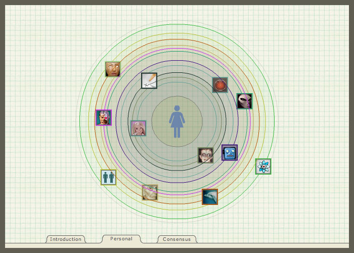
A few years ago I was invited by the Whitney Museum to contribute an artwork to their Artport site, their showcase of interactive artists. My contribution was “Concentric Empathy”, a work about the various sorts of non-human emergent intelligences we will, or might, have to confront in the coming century. Go check it out yourself and share your feelings on these new types of persons and how close you are willing to invite them into your lives.
I am showing it again here because of my comments the other day about the OLPC’s use of the “circular menu” paradigm. As with the OLPC, Concentric Empathy uses the circular menu to place you, the user, in the center of the universe and to position various options around you. I obviously find this model attractive, and I also think that circular interfaces in general are a fun and compelling way to interact with digital information. They are frequently used in computer games, in fact.
On the other hand, they are criticized for their lack of flexibility and usability for business-critical applications, despite a number of academic studies (if I recall correctly) showing that they perform well in interaction speed tests (using speed to measure usability is a methodology I find extremely questionable) .
My critique of the Sugar UI’s use of the circular interface was not intended to be based on its inefficiency, but was rather intended to suggest that the origin of the decision to go with this UI may be related to my own choice: an aesthetic and conceptual choice, not based on usability, user research, or audience need. That said, I rather approve of the idea of making aspects of the Sugar UI fun rather than efficient, given that the devices are designed for kids and are intended to be exploratory in nature.
The argument for speed/efficiency with respect to Pie Menus/Radial Menus just comes out of Fitts’s Law–cursor only has to move in a direction, not a specific distance. The further argument is that people only have to be aware of–and remember–a specific direction, thus making it much easier to use spatial memory for the items within the menu.
As far as speed being a dubious measure of usability–in this case, at least, I think it’s more suggestive of the Pie Menu’s power for expert use cases. Hence seeing them in games and some professional software (I believe one of the 3D software packages uses them extensively).
Certainly no one is saying “with learning people are faster with pie menus than linear menus, therefore they’re more usable.” I think it’s more a matter of “when speed and efficiency count and people will be using this small set of actions repeatedly, it’s faster and more efficient for an expert user to use a pie menu than a linear menu.”
None of this is speaking to what the motivations were for the choice of Pie Menus and other circular UIs within Sugar UI, of course.
I think it is interesting that they chose to use the circular navigation, I am also a little concerned about it’s introduction to developing countries and the rest of the world. This form of navigation puts the user at the center of the universe. While this form of relating to the world is very familiar to us in our western context, I worry that it will break down the understanding that the world could be viewed through the eyes of the community – which is how a good portion of the world interacts. I am talking about the navigation, the way people will understand the world through this tool, not the tool itself.
I know a lot of criticism has been written about the introduction of this tool, but I would argue that it is will be the way this tool teaches people to understand the world that will be it’s ultimate success or downfall.
jimmy
The kids are OK.
Kids these days.
When I was young…
The children will get it, if they don’t like it they will mutate it into something they do.
Comments
5 responses to “Circular UIs are Fun”
A few years ago I was invited by the Whitney Museum to contribute an artwork to their Artport site, their showcase of interactive artists. My contribution was “Concentric Empathy”, a work about the various sorts of non-human emergent intelligences we will, or might, have to confront in the coming century. Go check it out yourself and share your feelings on these new types of persons and how close you are willing to invite them into your lives.
I am showing it again here because of my comments the other day about the OLPC’s use of the “circular menu” paradigm. As with the OLPC, Concentric Empathy uses the circular menu to place you, the user, in the center of the universe and to position various options around you. I obviously find this model attractive, and I also think that circular interfaces in general are a fun and compelling way to interact with digital information. They are frequently used in computer games, in fact.
On the other hand, they are criticized for their lack of flexibility and usability for business-critical applications, despite a number of academic studies (if I recall correctly) showing that they perform well in interaction speed tests (using speed to measure usability is a methodology I find extremely questionable) .
My critique of the Sugar UI’s use of the circular interface was not intended to be based on its inefficiency, but was rather intended to suggest that the origin of the decision to go with this UI may be related to my own choice: an aesthetic and conceptual choice, not based on usability, user research, or audience need. That said, I rather approve of the idea of making aspects of the Sugar UI fun rather than efficient, given that the devices are designed for kids and are intended to be exploratory in nature.
Anyway, I hope you enjoy the artwork.
The argument for speed/efficiency with respect to Pie Menus/Radial Menus just comes out of Fitts’s Law–cursor only has to move in a direction, not a specific distance. The further argument is that people only have to be aware of–and remember–a specific direction, thus making it much easier to use spatial memory for the items within the menu.
As far as speed being a dubious measure of usability–in this case, at least, I think it’s more suggestive of the Pie Menu’s power for expert use cases. Hence seeing them in games and some professional software (I believe one of the 3D software packages uses them extensively).
Certainly no one is saying “with learning people are faster with pie menus than linear menus, therefore they’re more usable.” I think it’s more a matter of “when speed and efficiency count and people will be using this small set of actions repeatedly, it’s faster and more efficient for an expert user to use a pie menu than a linear menu.”
None of this is speaking to what the motivations were for the choice of Pie Menus and other circular UIs within Sugar UI, of course.
I think it is interesting that they chose to use the circular navigation, I am also a little concerned about it’s introduction to developing countries and the rest of the world. This form of navigation puts the user at the center of the universe. While this form of relating to the world is very familiar to us in our western context, I worry that it will break down the understanding that the world could be viewed through the eyes of the community – which is how a good portion of the world interacts. I am talking about the navigation, the way people will understand the world through this tool, not the tool itself.
I know a lot of criticism has been written about the introduction of this tool, but I would argue that it is will be the way this tool teaches people to understand the world that will be it’s ultimate success or downfall.
The kids are OK.
Kids these days.
When I was young…
The children will get it, if they don’t like it they will mutate it into something they do.
Thanks