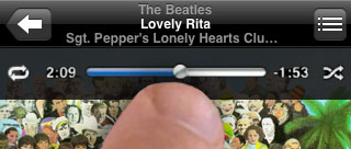
I thought it was a pretty bold design decision when Apple discarded the iPod’s signature feature, the scroll wheel, in the iPhone and iPod touch. But the new scrubber bar is almost useless, especially for long tracks like podcasts where it’s impossible to move the playhead any less than a few minutes per hop.
So I thought I’d just fix it, or at least show a little idea of how Apple might fix it.
For scrolling through menus and adjusting volume, the iPhone’s new UI methods are, IMHO, superior to the old iPod’s wheel. But the “jog dial” is still the ideal user interface for arbitrary positioning the playhead in audio and video tracks. It’s a hardware solution that has been in professional and consumer use for decades.
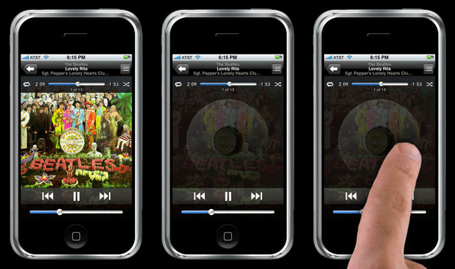
And the iPhone and iPod Touch are totally capable of doing it. Here’s how: When you touch the currently-playing album cover to reveal the scrubber interface, instead of only showing the playhead the screen shows the old iPod disc as well. You just roll your finger around the screen’s virtual scroll wheel. That’s it.
For the time being, here’s a helpful tip for using the current UI: If you hold your finger down on the “skip to end” or “skip to beginning” buttons, the playhead will scroll quickly through the track.
Comments
60 responses to “Scrubbing the iPhone Scrubber”
Ah! Thank you. I am definitely frustrated with this; podcasts and audiobooks are my sleep aid and so this gets operated in non-optimal (lying down, in the dark, half asleep) conditions and doesn’t work very for me…I’ve been messing with using different parts of my finger (even my nail) JUST to get the thing to even grab…forget about any precision in where it lands.
Now can you fix the navigation through a contacts list that is over 300? It doesn’t work at all for me. At all.
@Steve Portigal: Note my last comment, above, for scrolling through podcasts. As far as laege contact lists go, I run my finger down the right edge to skim through the alphabet quickly, then use the main area to scroll to the name. Clumsy, but it works.
Hey, Chris –
Nice idea. Would you envision that to close the scrubber and go back to the album art, you would just tap the screen again and the software would be smart enough to derive that your intent rather than adjust the song ahead to where you tapped?
Just a thought. Otherwise, I agree, the current scrubber sucks, and I find myself just skipping to the beginning or end of a song.
@Kyle: D’oh! I hadn’t thought of how to close it! Tapping outside of the scrubber — in any of the four corners around it — would probably work well. Tapping anywhere, either on or near the wheel (as you suggest) would probably work, too, insofar as tapping the wheel wouldn’t (as you fear) actually move the playhead at all — see, the playhead would move only when you actually moved your finger around. Think of the four buttons on the normal iPod’s wheel and you’ll see what I mean.
The current iPhone UI where you tap the cover art to access the scrubber is already a little wonky, so either closing solution would at least be consistent with that.
That would work, but bringing back that wheel for one thing might confuse people since it was used for everything under the sun before. Maybe you could just put widely spaced tick marks next to the scrubber that move closer together the longer you scrub, kind of like the way the alphabet kicks in when scrolling through lists on the old ipods. However, there might need to be drag on the scrubber handle to coincide with the scrub speed, which might seem a little weird.
This may return, since it’s appeared in several Apple patents between the the 5G and the iPhone. There’s a reason they didn’t implement it — I wonder what it was they ran into in testing that kept them from doing it.
BTW: your blog has been eating my comments. This is my third attempt to post this and each one has less and less text 😉
@Noah Mittman: I do believe Dreamhost has been screwing me again this last hour or two. So you can rest assured that I’m not blaming the user when I suggest that you do what I do, which is copy your post to the clipboard before hitting submit. I do this on all blogs I comment to just so I don’t end up losing my work due to a net traffic hiccup.
Regarding why Apple might not implement this type of solution, someone elsewhere contended that it’s inconsistent with the new iPhone/iPod brand experience, that it harkens back to the old experience. Eric touched on this idea, too: from a usability perspective, the wheel connotes the old way of changing volume, browsing lists, etc.
How about just being able to “pinch/expand” the slider in order to get better accuracy? Seems more iPhone-ish and would be more intuitive within the new realm of UI interaction.
You think the new method for volume adjustment is superior? I have lots of difficulty with it, primarily because my fingertip obscures the whole ‘thumb’ and I can’t see where it’s going. I want a big glowing circle around it while it’s moving.
This is one of the few things I don’t like about the iPhone interface. I loved how easy it was to scroll with the click wheel. I’ve been hoping Apple would include a virtual scroll wheel for a long time.
Nice idea!
I’d even be happy with having a scrub bar the size of the volume bar-I use the hardware volume controls anyways, so it seems odd that the volume control is so big, and the scrubber bar so tiny.
I realize this design decision was made to accommodate the Touch though, as it doesn’t have hardware volume controls.
@Robert Sharl: Sorry, I meant the hardware volume buttons. I agree with you. The software volume adjustment UI is, IMHO, useless and should probably have just been left out in favor of the Apple signature Bezel style hardware-controlled display (what you see when you adjust the ringer or phone volume).
Probably Apple’s way of thinking: use the scrubber to jump large sections at a time; use your alternate method, press and hold next/prev, to fine tune. Problem averted.
It is a nice idea… so nice apple already patented it.
I like the scroll wheel idea, however, what if Apple enabled a feature that we’ve all probably disabled on our Docks – magnification. When you touch the scrubber (and let’s make that dot bigger please) that area blows out like when you’re moving your mouse over a Dock with magnification enabled, thus allowing more space in the scrub bar and more precision… kinda.
Great idea, patent it!
Thanks also for the tip about the “skip to…” buttons, most handy. It looks like they work like the delete function in text, the longer you hold it down, the more time it skips per jump.
@Steve Portigal: I use my iPhone the same way and can definitely sympathize, but does anyone know if and how we can turn off rotation? While holding the device at certain angles I want to see it at that angle, not rotate the image.
Exactly how this SHOULD work. But invoking the scroll wheel might be useful for other iPhone functions as well.
I think possibly an even better way would be to be able to hold on the scrubber, and then it shows up a magnifying glass so you can zoom into the exact minute/second of the music you want… It would work like the magnifying glass in the iPhone keyboard, and would mean using an existing interface element rather than introducing something new (or in this case, reintroducing the click-wheel).
I was going to suggest the same thing as mcic just did. Use the same magnifying lens they use when placing the text cursor. Inside would be a magnified bar and the minutes/seconds by number.
To have this work properly they’d probably have to move the whole section down above the volume and playback controls which would be just fine IMO.
Eons ago in the era of the Quantel Harry/Harriet video graphics system, they had a neat way of scrubbing video. When working with video on one of these devices one used a tablet and stylus. When one made a circular gesture anywhere on the tablet it interpreted it as a jog wheel and scrubbed the video appropriately. There was no specific spot on the tablet, it just interpreted the gesture.
And this was something like 15-20 years ago.
Wonder if someone at Apple used a Quantel before designing the iPod… anyway, this would work great for video on the iPhone since there is no circular gesture (so far) in use anywhere in the interface.
I agree with the problem, but the solution seems optimized for non-video use cases. It would be really frustrating to use an on-screen wheel for scrubbing through a movie, for example.
I’d be happy with a distance-sensitive scrub tool, where holding down the FFW icon would fast forward at 2x, but dragging it farther right would start fast-forwarding at 4x, 8x, 32x, etc. Letting go would instantly resume normal play at that point.
There would need to be some visual affordances for this functionality, but it would probably be more usable as it leverages existing rew-play-ffw iconography instead of relying on a ‘scrubber’ that only makes intuitive sense if you’ve already been trained by using a wheel-based ipod or a professional video editing deck.
@Robert Sharl: You can drag your finger down away from the scrubber head while scrubbing to be able to see what you are doing.
In fact, extending that would be a nice way to implement the “magnification” of the timeline: as you drag your finger down away from the timeline, it zooms in more, and your left/right movement becomes a finer and finer adjustment. In fact, that would be quite useful in any scrollbar control, even with a mouse.
For the virtual scroll wheel, I’d thought of this too, and putting it on the same screen. I was also was thinking that its center should work as much like the iPod’s as well. Tapping it would change to the star rating wheel, etc. It’s just that there are already toggles for the shuffle and repeat, and the other mode in the cycle is lyrics, but then the scroll wheel would be in the way of most of the screen to show lyrics.
The star rating is already (awkwardly) on the “back” at the top of the album track list. Moving that to the scroll wheel as the track rating like on the iPod would let you put the album star rating at the top of the track list. At the top of the track list to the left and right of the star rating is space for buttons line flank the time scrubber. That could be lyrics/podcast notes and something else like other album art or liner notes.
Also, they need to change the timeline scrubber playhead to a diamond shape like it is in iTunes and on the iPod. This would help differentiate it for the volume slider better.
Whenever you use a scrubber on iPhone, you don’t have to keep your finger on the nub in order to move it… just slide your finger down the glass and – presto! – you have much more precise control over the volume, scrubber, etc.
IMA WOOP YO ASS BITCH!!!
PWNAGE!!!!!!!!!!!
APPLE SUXZ FUUKIN ASS U ASS
LULZ!!!!!!!!!!!!!!!!!!!!!!!!
What about a finger-sized “target” that appears below the play point? That would at least allow for easier and more precise manipulation if Apple’s going to insist on the current scrubbing method. Oh yeah, and allow the scrub controls in horizontal/landscape mode, so the thing is a little longer.
U BUNCH O MAC FAGZ
LOLz
IMA KIK UR ASS
LOLZ
DUDE STFU WITH THAT DUMN MAC CRAP
LOLZ
ZUNE IS WAY BETTER ANYWAY BIA BIA BIA BIOTH!!!!!!!!!!!!!!
U STUPID PUNK!!!!!
MAC FAGGOTZ!!!!!!!!!!!!!!!!!
I mean the truth is we’ll never know, but it’s certainly fun to guess. I just think it may have been too modal and too “virtual” for the first round. Pointing on a timeline has a much stronger “why don’t you just tell me where you want to go?” message to it. As intutive as people say the click wheel is, my father did not get it when he tried an iPod the first few times, but I think something more literal and visual like an iPod touch would have faired a lot better. Hey, and if they *can* ultimately solve the problem without reintroducing a jog wheel, all the better, right? 🙂
(Oh, and for the conspiracy angle, I’m sure Apple would prefer people use Enhanced AAC files with chapters for long podcasts like that instead…)
Why? If you only want to skip a few seconds/minutes – just hold down the next/previous track buttons and it fast forwards/ rewinds… far simpler
@Everyone who suggested “zooming” or “magnifying” the existing scrubber: I don’t think it’ll work. There is only a limited distance across the screen you can move your finger, and a limited number of pixels across that distance. Even with the magnifying, your finger is only moving from one side of the screen to the other — only 320 pixels of resolution. In a one-hour podcast and using a one pixel wide finger! you’d still, at best, be moving 12 seconds at a time. It might work for fine tuning after doing the normal clumsy scrub, I suppose, where holding your finger down would reveal the narrow range, but once in that narrow zoom area, if it were very detailed, you would not be able to scrub more than a little bit in either direction. It would be modal: zoom mode or clumsy mode. The advantage of the wheel is that it’s infinite: your have fluid, acceleration-sensitive, non modal, and uninterrupted movement in either direction. Zoom will never offer that.
@Noah Mittman: I don’t think the scrollwheel is more “modal” than the current scrubber. But I suspect that the trade off you and others allude to is correct: They saw that the UI of sliding-a-dot-along-a-timeline was dead simple for anyone to “get”, even compared to the great old jog dial, so they decided that they could accept usability problems with longer tracks. I mean, 90% of iPod users probably don’t even have any podcasts or even more than a handful of songs longer than 5 minutes, and I wonder how many iPod users actually ever even use the scrubber anyway, or if it’s just something only a small % of users even care about (for example, I always hated the way the old iPods made the volume the default wheel function, rather than the scrubber — personally, I scrub way more often than I change volume).
@Ryan’s point about the diamond indicator for playhead position is great. I’d also make it not-blue so that it’s clearly not something you’re supposed to touch (i.e., don’t offer the “touch me” affordance).
@Hurk: It never surprises me when my brilliant ideas seem to have been thought of years ago by other people.
@LULZ: I love you.
I agree with everyone that this has been an issue.
Not sure if anyone mentioned that here somewhere already, but I was watching the iPod Touch video one late night for no reason, and I saw that if you press and hold the Fast-Forward or Rewind buttons down, it will scrub through the song/video. I ran to my iPhone to see if it had the same functionality (this was even before 1.1.1, I believe), and I had never seen this documented anywhere before. The longer you hold it down, the faster it goes. From pause, it will do slow-motion on video. Etc.
While not the perfect solution, at least there are other ways to navigate the media…
@People who talk about holding down the FF/RW buttons: It’s in the last sentence of my original post.
It’s a workaround, sure, but it’s just not good enough. It’s a hamfisted approach lacking both grace and precision.
What about “just” pinching, directly onto the coverart?
Contract/rewind expand/forward?
It’s an existing iPhone interface type and it could be hinted at in a message in the area beneath the existing scrubber.
No, this is a bad idea.
A circle is usable, but it’s not a natural shape for precise finger movement and becomes tiring with overuse. Even with acceleration, it’s a tedious task to get to a specific location in a long audiobook on my iPod classic.
The scrubber bar needs to alter its scaling the longer the finger is held on it. You place your finger on the bar and scrub quickly across to the region of interest. Hold the finger and the bar expands (with visual cues) so that further movement is more precise and allows you to select the exact point that is desired.
A knob is a mechanical solution. When the device has a virtualised interface there is no need to remain enslaved to mechanical design elements.
[…] No me habÃa parado a pensarlo realmente hasta que lo he leÃdo en este artÃculo que describe muy bien lo que acabo de contaros: I thought it was a pretty bold design decision when Apple discarded the iPod’s signature feature, the scroll wheel, in the iPhone and iPod touch. But the new scrubber bar is almost useless, especially for long tracks like podcasts where it’s impossible to move the playhead any less than a few minutes per hop. […]
[…] Herzlich Willkommen auf dem iPhoneBlog, ein Weblog zum Apple iPhone. Wir freuen uns über Feedback und Kommentare. Bei Interesse abonniere doch unseren RSS Feed [click]. In diesem Sinne: Thanks for visiting! Egal ob Video oder Audio. Das “Vor- bzw. Zurückspulen” auf dem iPhone ist nicht präzise. Entweder habe ich zu große Touch-Finger, oder das System ist (für mich) nicht exakt genug. Vielleicht kennt das der ein oder andere: die kleine Wiedergabe-Leiste am oberen Bildschirmrand ist einfach zu schwer zu treffen bzw zu ungenau. […]
For closing the scroll wheel, how about you ‘two-finger pinch’ it in and the wheel would implode into the little puff of smoke like when you remove things from the dock on a Mac?
How about a coverflow-esque concept where you can nudge the track back and forth with extreme precision and a couple buttons for fast-forward/backward that start slow and speed up the longer you hold, and provide aural feedback. This would be like physically dragging “tape” across a “tape head”.
[…]  Another mute point in my opinion. There is no way this will ever work, I actually think that replacing the scrubber bar with a “virtual” wheel will end up in a much more confusing interface. I would not be surprised if Apple tried this, and discarded it as annoying as hell. But now that the debate is open, I have to contribute my two cents:Leave the scrubber alone, just divide the media in 10 equal size sections. When you select one section (with one finger), that section occupies the whole scrubber space, kind of zooming into one portion. This way you will have enough “granularity” to reach to the point you want to. You can also give the option to “pinch in” or “pinch out”. I capitalize on the zoom function on pictures and the browser, so why not the media?  […]
@Charles: Your idea of having a smart, accellerating and zooming normal sliding bar is pretty good. It might be tricky for some people to use, though, especially given the fact that, again, it is “modal” — and one-way modal at that (you go into “precise” mode when you hold down, but you can’t go back to normal mode unless, presumably, you remove your finger and then put it back down. The idea you propose is novel – nobody has ever seen or used anything like it before. Would need to see a proof of concept and some testing before I’d believe in it as strongly and definitively as you do.
Your dismissal of the jog dial as a “bad idea”, however, rings hollow since it already works for millions of people, not just in the iPod, but in decades of video and audio editing equipment and software. Your concern about scrolling to the middle of long podcasts is quite valid, but I don’t think that that shortcoming is necessarily worth dismissing the whole idea for something that (I suspect) few people will understand.
[…] Christopher Fahey (via John Gruber): […]
I know this will sound like a me too, but this problem is the only real problem I have with my “iTouch”. I too listen to long podcast and it’s really a pain to overcome this. I really like both this idea of the 2D scroll, that is fast move horizontally if on top and gradually slower move as you head to the bottom of the screen. Also a kind of elastic accelerator/reverse accelerator could be easier to use, the control would sit in the middle of the screen and the more you move it to the right, the faster it would fast-forward, the further to the left, the faster it would “rewind”. Leave it untuched in the middle and the rate is 1X.
What about using the tap or double tap gesture to zoom in and out of the scrubber. If you tap it to zoom in, it will give you more precise/detailed control of your scrubbing. Just a thought.
ZUNER
PWNER
Here’s a mock-up showing my tick mark concept. Touching the scrubber would activate the tick marks enabling you to drag/nudge/shove the play head within very small increments of accuracy, or you could just drag the other scrubber above and see the tick marks zip by with the exact position displayed in the seconds format. In some ways it’s like the magnified view that others have discussed.
.
About the zooming slider: re-read my earlier post. The idea is that you grab the existing scrubber and can drag it left/right just like you do now, but if you drag your finger down, the scale zooms in. Drag your finger up to zoom back out. Lift your finger at any zoom level would return the zoom state back to normal.
So, to sum it up with an example: finger down on the scrubber, drag it down the screen until the desired zoom scale is reached (labeled time hacks would be shown to see the scale), then drag left or right to the desired point. If you need to scrub more, then slide your finger up to a lower zoom level, then go left or right there. When you’ve got it, lift your finger, and the “mode” is cancelled, returning the scrubber to normal zoom. This way, I can lift my finger while zoomed in so that a twitch in lifting it off doesn’t make the scrubber move very much from where I wanted it like it does now.
So, it could look very much like Eric Gauvin’s picture. I’d just have time labels on the major tick marks, and that scale would follow your finger up and down the screen, changing zoom as it did.
@Ryan: I get it, and I like it.
I wish I could get deeper into it but time is short, and again, I don’t have one (and won’t buy one with my own money until they make a 60+ GB version of one) so I don’t really know how it currently works.
In fact, I’m still trying to figure out why there are two scrub bars visible there! 🙂
How about this:
Two fingers on the scrub bar zoom in the scrub bar into 3 minute chunks centered on the current play point. Put this in an advanced setting.
This way, you are “scrolling” the audio around a little back and forth to refine the rough point you jumped to using the normal seek.
When the advanced setting is on, visually delimit on the scrub bar where the current 3 minutes are so the zooming can be anticipated.
Why 3 minutes? I don’t know. Just make it the length that the scrub bar can handle down-to-the-second accurate repositioning.
Pardon my Visio, but I did whip up a quick illustration: http://tinyurl.com/29or9z
@ Noah
I don’t think it would seem like two scrub bars. It’s a little like the radio’s station control dial with corresponding display. Or the way the time line works in Flash and other programs like that. I don’t have an iPhone either, but it seems the ability to flick things around on the screen (as with the contacts list) is a central with the iPhone.
@Eric, for consistency’s sake you’d have to make the scrub bar flickable with one finger then, that’s how it is throughout the rest of the interface. That would be more like a variable speed ffwd/rew control (i.e. a shuttle dial).
I’m actually thinking of reusing a convention on the MacBook: One finger moves the cursor, two fingers scroll a page. So with a scrub bar, one finger moves the playback point, two fingers scroll the entire audio underneath the playback point.
Best idea ever. I hate the scrub bar, its freakin useless. I continue to use my ipod touch because its pretty but most of the time I’m wishing it was as easy to use as my 4G iPod.
great idea
Has anyone seen/used the scrubber in aperture.
Simply there is a scrubber bar with a centralised button.
In the case of Aperture the bar is vertical, but horizontal when the user switches to full screen mode.
When the button is dragged upwards or downwards a small amount the content scrolls in that direction at slow speed
The further from rest the button is dragged the faster the content scrolls.
The moment the button is released it snaps back to the centre and the content stops moving.
This could be implemented very easily on the iphone/itouch screen.
[…] One more thing about the touch November 19, 2007 On the iPod mini when listening to a podcast, by pressing the click wheel center would cycle through volume, scrubber and finally info about the podcast (a little text description) – and I assume that all clickwheel iPods do this. The iPod touch while having all the other controls, as in volume and scrubber (and here’s a related note about scrubbing on the iPod touch*), seems to lack the info feature… First the alarm clock thing and now this? What’s next? Not being able to quickly play music in shuffle mode? […]
[…] Christopher Fahey sums this up nicely at graphpaper.com. Not that this is a democracy in any way, but consider this another vote. […]
[…] Audio playback controls. The volume buttons are great, but I also need controls for play/stop and next/previous without using the screen. I know the Apple headset has those controls on the mic clip, but I don’t use Apple’s headphones and that controller isn’t so elegant anyway. My K750 would do next/previous by holding down the volume up/down. I wish the iPhone did the same. For play/stop it should use the camera shutter button I want added. Finally, scrolling through long audio files like This American Life episodes is hellish with the scrubber. Here’s a great suggestion from Chris Fahy: an on screen jog dial for scrubbing audio. […]
So now we have to wait for iPhone hackers to come up with extension.
90% of this problem has nothing to do with the scrubber. What people most want is to re-watch or re-listen to what they just heard. Just add one button that skips back 5 seconds and continues play.
Actually, forget the button, and just let a swipe left on the play screen perform the operation without even having to bring up the controls at all. The #1 use case is solved.
Here’s an idea… when you touch the scrubber, it highlights, letting you know it is active, and you can then use the physical volume rocker on the side of the iphone to fast forward/rewind. This would allow the user a lot more control. Touching anywhere else on the screen will deactivate the scrubber.