An article in the New York Times the other day discusses a study that suggests that there are differences between men and women in how pleasant or unpleasant they find certain normal everyday activities. Apparently, for example, men find spending time with their parents far more pleasant then women do, while men disproportionally dislike home repair work (so much for the handyman husband!).
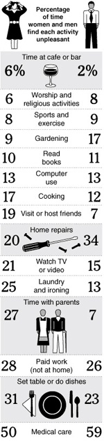
What caught my eye was this: Nestled between “Read books” and “Cooking” was “Computer use”. It says that 13% of both men and women find using computers unpleasant.
This is interesting for two reasons. First, it quantifies the technophobe demographic at about one out of every seven people.
But in the context of the other activities asked about, it’s interesting to note that “Computer use” actually ranks pretty low on the overall unpleasantness scale. Watching TV is more unpleasant than using computers! This suggests that most people (the other six out of seven) seem to think pretty positively about using computers.
This interpretation fits nicely with my belief that people aren’t quite as fed up with digital user experiences as the usability finger-waggers might suggest. People muddle through the difficult parts and aren’t generally aware of where or how they might not be as efficient as they could be.
But this doesn’t mean that user experience designers can rest on our laurels at all. It means we must be more conscientiously competitive, that we must try to aim a lot higher than simply being “not unpleasant”. It’s like what Todd Wilkens wrote at the Adaptive Path blog: that merely aiming to “be usable” is a low target indeed, kind of like having your cooking objective to “be edible”.
A good product must not only be easy to use, but must also be pleasant to use in order to stand out in a universe of computer products that, all told, apparently aren’t even as unpleasant as, say, cooking dinner or visiting your friends.
Naturally, since the methodology of the Times study is unclear, and since I am interpreting only a small fragment of the study’s intended data set, all of this is speculation and not solidly supported by this specific research. Still, I suspect that this interpretation is pretty close and that people in general like using computers.
Comments
7 responses to ““Not Unpleasant” is Not Enough”
I missed this piece; thanks for calling it out. There’s so much context missing from some of these. Doing dishes is more likely to be unpleasant whereas using a computer could be work, play, problem solving, time wasting, watching a movie, buying a plane ticket, etc. It’s way too broad a category to be compared side-by-side with such specific activities as “laundry.”
I’m thinking about how to even get at these numbers in a reliable way. Could you ask how someone feels about using a computer REGARDLESS OF THE CONTEXT, and then ask about doing laundry? Or how you TYPICALLY feel about using a computer?
Still, it’s so skewed as to be completely useless.
Your post, however, is great, because you used this to springboard to a different discussion, so please don’t take this as critique of your post!
@Steve: Yeah, I am happy to repeat my suspicion that these numbers are a little fishy. It is, however, worth noting that the methodology only allowed them, it seems, to measure time spent on activities and the pleasantness of that time. It could mean that, say, 13% of people hate using computers 100% of the time, or that 100% of people hate using computers 13% of the time. And it could mean that 87% of all computer use is goofing off and playing games. More questions than answers, which I suppose can be a good thing, too.
These numbers are meaningless.
Four years ago a virus wiped out my main machine and I switched to Mac. The changeover was agony, but now, apart from a few necessary windoze apps, I use Mac for everything else. These days, instead of it being a chore, I actually enjoy working on a computer. It took a while, but I eventually got what the Mac fanboys knew all along: Macs not only work, they are fun to use.
Would they run these surveys on cars without differentiating between Fords and Ferraris?
@kenif: The Ford/Ferrari thing is interesting. I guess when I read the survey, I see it less as “% of time people find activity X pleasant vs. unpleasant”, but qualified with “given the variety of ways of doing activity X that exist today, the % of time people find activity X pleasant vs. unpleasant”.
So if the numbers says that car owners find driving unpleasant 20% of the time, we can’t tell if there is any difference between Ford drivers and Ferrari drivers (my gut tells me there is!). We can tell, however, that the automobile industry as a whole is dissatisfying their consumers 20% of the time. It’s possible, I think, to draw general conclusions from this data. The Times’ conclusion that there are differences between men and women, for example, seems pretty solid to me.
RE: Mac… that reminds me of a Consumer Reports review I read for the MacBook Pro. They rated it inferior to some dumb Dell computer because their bean counting method of rating the machines put more value on the sheer number of USB ports and the quantity of stupid little bloatware apps that come with the machine, and neglected the value of the overall user experience completely. Similarly, negative reviews of the iPhone miss the mark in the same way: IMHO, there is no legitimate basis for arguing that the iPhone isn’t the best phone ever, by leaps and bounds, simply because of the user experience.
Perhaps it would be interesting to perform a quick survey to see how many Windows, Mac and Linux users found using their computers – whether they thought they were hard to use or easy to use or something else.
IMO Windows provides a very different experience to a Mac. I’m glad I switched.
@Ben: That would be a great follow-up study. But then we’d want to figure out what % of that time was spent doing specific stuff: using MS Office apps, surfing the web, writing code, playing music, chatting, writing business emails, etc. Perhaps, for example, one OS’s users’ results could be skewed because they were spending a lot of time surfing the web compared to the others, not because the OS was any more pleasant.
Once you start going for specific applications, you’ll probably notice that it is the application that will get the most complaints. If you are focused in that one program, you are more likely to notice it’s flaws – thus, it is hard to get a picture of general use as there are many different options you have when using a computer (as you say).
It’s hard to do any kind of study as usability flaws don’t tend to annoy straight away – it’s more like a dripping tap. 90% of the time Windows doesn’t frustrate me – however, 10% of the time it could be having a bad day (perhaps it fell out with one of it’s components, who knows) and I’ll get very angry at it for no real reason.
The best examination would have to be over a period of six or so months, testing regular users using regular applications (browsing/office/music/photos), on different operating systems, all with roughly the same skill level and perhaps, temperament.
There’s a lot of factors involved here, and such a study would inevitably produce mixed results. In my experience, the Mac definitely annoys me less than Windows (if at all).
I’m not so sure that it’s as simple as 13%.