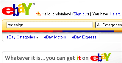
The online auction site eBay recently redesigned their site, and (as it usually has in the past) the new design is being subjected to some pretty harsh critique.
When critics bash eBay’s design, they usually focus on the site’s general visual design, or on the information design of individual pages. Even I have in the past focused in on the site’s downmarket, low-class visual style. But there is much to say about eBay’s fantastically complex interaction design as well.
The process of becoming an eBay seller is central to eBay’s entire business. I once tried to sell some of my old bike parts on eBay. Now I don’t want to disparage the talented people who have spent years developing the eBay user experience, but it was probably the most difficult and nerve-racking user interface I have ever used.
Setting up my eBay store was confounding. I never quite understood what step in the posting process I was in, I was constantly scared that I was going to do something wrong and break a rule (or even a law), and I was never confident that I was doing the best I could to ensure that my items would be visible and attractive to prospective buyers.
And yet half a million people make their living using this UI!
Good interaction designers usually assume that our end users are less sophisticated users of technology than we are. I’m not being elitist when I say that for mass-market web sites this assumption is almost always true.
And yet for eBay, I am awestruck at the fact that millions of normal everyday people have managed to figure out how to navigate one of the most complicated interaction designs I’ve ever seen.
How is this possible?
Muddling Through Interaction Challenges
eBay users are just like many other Internet users — reckless and ignorant. They are the same people that open random email attachments, type URLs in the Google search box, and willingly install spyware apps on their own computers. When it comes to technology, they aren’t afraid to take risks, and they are not overly upset by failure. If they screw up their eBay posting and their photos don’t show up, they simply chalk it up as yet another example of how technology is just messy. And they muddle through… If they forget to set a reserve (minimum) price and their item sells for peanuts, they blame themselves, not the UI. And they muddle through…
I suspect that the most successful eBay sellers “muddle through” dozens of botched and sub-optimal sales before they figure out how to do it right.
If any other online business had such a difficult process at the core of their business model, they’d go broke overnight. What is it about eBay that makes it able to succeed with a difficult user experience for their most important kind of user? Is it because they help people sell things (as opposed to enabling them to spend money on things), and thus the user’s tolerance for obstacles is higher than it would be when the user is actually paying money?
Don’t get me wrong: The IA and user experience design challenges for eBay are astronomical. The site is complicated because online auctioning is complicated. The business rules for eBay are probably more complex than anything 99% of the world’s information architects have ever even dreamed of. I have met many people from eBay, including interaction and customer experience designers, and they are super smart and know a lot about how to make UIs that work. So why the complexity?
There is a whole chapter in Steve Krug’s “Dont Make Me Think” entitled “How we really use the web (Scanning, satisficing, and muddling through)â€. In it, he identifies similar reasons why we, as users, are often content to muddle through difficult interfaces:
- It’s not important to us. For most of us, it doesn’t matter to us whether we understand how things work, as long as we can use them. It’s not for lack of intelligence, but for lack of caring. In the great scheme of things, it’s just not important to us.
- If we find something that works, we stick to it. Once we find something that works—no matter how badly—we tend not to look for a better way. We’ll use a better way if we stumble across one, but we seldom look for one.
Is it possible that eBay, by “satisficing” their own design process (instead of working endlessly to make it perfect for all users) is deliberately enabling users to do what they would do anyway, that is, muddle through? Or is it simply an example of an application’s complexity — and the market’s demands — outpacing the design team’s ability to improve and perfect the system?
Comments
10 responses to “Muddling Through eBay”
Part of me thinks that eBay has left a certain amount of features “unoptimized” purely to create the demand for professional services.
Basically users muddle through, or if they are tired of muddling they go to an iSOLD It store or pick up iSale 4.
If it were *too* easy, there’d be less demand for (and revenue from) eBay certification programs.
Services and features make money.
@Noah: Besides PayPal, does eBay have any revenue relationship with any of these “parasite” products?
“And yet half a million people make their living using this UI!”
Not really true. Sellers who are truly making a living from eBay almost certainly use some of the many 3rd party seller applications that integrate with eBay’s API. If you are selling a lot of something, you don’t fill out that confounded web page. In fact, many one-off sellers with expensive items won’t even use that page: try one of the many bricks-and-mortar businesses that will sell your stuff on Ebay for you.
These are definately NOT “parasite” products, Chris, anymore than Microsoft Certified Partners are to their products. eBay makes money licensing their data and API access, and these 3rd party vendors make a far better channel to interact with true power users than if eBay had to support them directly.
Yeah, what Andrew said!
“The above benefits are available to providers who are approved for Certified Provider status at $3,000/year, due upon approval for membership, prior to gaining actual certified status and prior to receiving your logo kit.”
http://developer.ebay.com/programs/certifiedprovider/benefits/
Yep, this sentence “What is it about eBay that makes it able to succeed with a difficult user experience for their most important kind of user?” totally made me think Microsoft – MCSE, MCSD, etc.
It’s a long-running joke that if MS stuff just worked millions would be out of jobs. And it’s actually pretty true.
@Andrew: Okay, not “parasite”… how about “symbiant“? Anyway, thanks for setting the record straight about the eBay API and storefront alternatives to the eBay site’s user experience. This information, of course, makes eBay’s sub-optimal on-site UX even more explainable, if not fiscally excusable, since if what you say is true the most lucrative (for eBay) sellers don’t even use eBay’s own UI.
Still, my point remains: Lots of other regular people successfully muddle through eBay’s on-site UI even though professional UX designers like me drop off in frustration, proving that perseverence and patience are alive and well among web users. This still fascinates me.
Chris, I think it’s clearly because auction sites succeed because of the buying audience, not the site’s features.
eBay’s crossed the critical mass where they have no need to change significantly until the buyers go somewhere else, and the buyers won’t because all the good auctions stay on eBay because the sellers want the most eyeballs on their auctions as possible so they can make the most money. It’s self-sustaining.
It is easy to criticize, difficult to design.
I am impressed by the fact they are using live-fire A/B testing to see how people respond to incremental changes to the UI. There is something going on there.
I think Steve Krug is right on with his concept of how we muddle through difficult interactions.
The hardest time I’ve had recently with a web application was on MySpace — took a friend and me over an hour just to figure out how to make a page for our band.