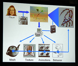
Will Wright‘s cryptic, clip-art crazy PowerPoint slides make sense when he’s right there talking about them.
Microsoft’s PowerPoint is frequently blamed for the poor quality of many presentations and for a supposedly- disastrous state of communication in both the private and the public spheres. Public speakers are lambasted for their wooden stage presence, crippled by their over-reliance on projected slide shows and meaningless bullet-points. The slides themselves, too, are often rife with design crimes ranging from clip-art diarrhea to impenetrable verbosity.
And because of the ubiquity of the tool and the technique, because public speakers from Al Gore to members of Australia’s Parliament use slideshows to support their speeches, the software itself has become the de facto target of criticism. I don’t think this is quite fair.
[For the purpose of this argument, Keynote on the Mac is basically the same animal as PowerPoint, so with apologies to both Microsoft and Apple I’ll just use the term “PowerPoint” to mean any slideshow method or tool.]
The Critics
The most outspoken critic of PowerPoint is Edward Tufte. In his essay “The Cognitive Style of PowerPoint“, Tufte makes the case that PowerPoint is inherently flawed because it provides a specific, severely limited vocabulary of communication methods, forcing our ideas to conform to a medium that does not lend itself to complex ideas. For Tufte, the tool itself is to blame.
George Orwell’s classic essay “Politics and the English Language” gets right the interplay between quality of thought and cognitive style of presentation: The English language becomes ugly and inaccurate because our thoughts are foolish, but the slovenliness of our language makes it easier for us to have foolish thoughts.: Imagine Orwell writing about PP: “PowerPoint becomes ugly and inaccurate because our thoughts are foolish, but the slovenliness of PowerPoint makes it easier for us to have foolish thoughts.”
Tufte focuses on PowerPoint’s many specific features like bullet pointing, slide templating, and gratuitous animations/transitions (especially insofar as PowerPoint essentially drives you to use these features whether you want to or not). But the basic concept of speaking and having pictures next to you is not undermined by any of his arguments. In fact, he aims much of his attack at the use of PowerPoint to create static documents for unaccompanied digital and paper distribution — few of his arguments discuss the use of PowerPoint in the context of a live presentation.
Another critical study, however, does address this aspect of PowerPoint usage. This study (full PDF paper here) alleges that even when used as part of a live presentation, PowerPoint does more harm than good because its typical usage mode — where the speaker simply reads, verbatim, the contents of each slide as they flip by — flies in the face of how the human brain works. The study’s author, Professor John Sweller, claims that humans have a limit to their “cognitive load”, and that information simultanously presented both visually (as text) and aurally (as spoken words) adds up to less than the sum of their parts, and that the resulting communication and retention is actually worse than if the words, or the slides, were presented by themselves.
The exception, Sweller admits, is when the slides themselves illustrate something that is more effectively communicated as a picture, or when the slide contains words that instead of distracting from the verbal point being made actually helps sum it up in a way that allows the audience to better comprehend and retain the information. In short, slides should underline, not undermine.
It’s Not All Bad
I agree with the point-by-point granular arguments of both of these critics, but I take issue with their shared top-level summary contention that PowerPoint hurts effective communication. When Tufte and Sweller argue, in short, that we should throw PowerPoint away, I wonder if they aren’t throwing the baby out with the bath water.
First, I wonder if the majority of the world’s crappy presentations wouldn’t be just as bad, or even a hell of a lot worse, if the presenter didn’t have the slides to use as a crutch. Tufte himself wonders if PowerPoint’s stupidity isn’t because PowerPoint is a “stupidity magnet”, attracting stupid people to its all-too-easy toolkit. Of course, smart people use PowerPoint all the time, but perhaps these people are simply terrible communicators regardless of PowerPoint, and they would do just as poorly with any other communication tool, or with no tools at all.
I think that blaming PowerPoint or Keynote conflates the technology with the concept of the multimedia presentation. Neither of these two critiques succeeds in discrediting the basic concept that images can help make a spoken presentation a hell of a lot better, by illustrating concepts, summing up key facts, or providing entertainment. And neither argument adequately addresses the obvious application where the visual imagery is, in fact, central to the presentation, such as when discussing a design portfolio, a information graphic, or a battlefield map.
Some Presentation Tips
Slim down. If you are a good speaker, yes, consider dramatically limiting your use of slides to help you remember what you want to say. Think of each slide from the audience’s perspective: Does the slide help them remember what you are saying? Does it keep them alert and more receptive to your words and arguments? This could mean limiting the number of slides you use, or limiting the amount of content on each slide, or both. The bottom line is to try to lose the crutches and rely on your own speaking more. You may need to do this gradually over time, incrementally removing texts and slides from your slideshows until you’ve reached a comfortable and elegant level.
You may even find that your concepts may somtimes be better off with no slides at all. I’ve brought slides to presentations many times only to decide at the last minute to leave the projector off and just talk aloud about my ideas.
You and your slides are inseparable. Unless your slide deck absolutely needs to function autonomously without you there to speak about the slides, do not worry about whether or not each slide makes sense by itself. The best slideshows, in fact, are almost completely nonsensical outside of the context of the live presentation (see the Will Wright example above). This is why I am currently wary of sites like SlideShare which in its current form supports precisely this kind of isolated, speaker-less publication of slides. SlideShare will soon permit the inclusion of audio, which will in my mind dramatically improve the quality and usefulness of the tool.
If you need your deck to exist separately from you, try to record a live audio or video presentation of the slides being presented by the speaker and make that multimedia file the formal document for distribution — not the deck by itself. Think ahead before giving any presentation, and make sure that someone is recording it. (I made this mistake at the IA summit, forgetting to hit the on button on my recording microphone.)
Explore a variety of alternative presentation styles. The TED site offers a page chock-full of speakers who use slides in very different ways.
Take Hans Rosling, whose fast-paced running commentary on development statistics reveals hidden patterns that can change our understanding of the world. Or David Pogue, a tech journalist who can turn a serious speech into cabaret camp. Joshua Prince-Ramus uses visualization software to take a tour of his latest buildings. Frans Lanting uses his pictures to tell the story of life itself, from the Big Bang to the present day. And then there’s TED favorite Ze Frank, who uses software, songs, images, emails — any means necessary, really — to get a laugh.
Evolve. I’ve found that my style has evolved over time specifically because I’ve been watching and emulating other speakers I admire. Every presentation or keynote I attend, no matter how boring or tiresome, usually offers some insight into things I should avoid in the future or, better yet, things I could try to do myself in my own next presentation. I try to change my presentation every time I speak, if only to keep me on my toes and to try something new, and to undermine any tendency to just read the slides.
Comments
20 responses to “In Defense of PowerPointism”
The point about you and your slides being inseparable is well-taken. Often, people “share” their PowerPoint slides as if the slides themselves can be used as a stand-alone documents. They shouldn’t be, so using them in that way reduces their efficacy and provides a wrong impression of how “useful” the slides are.
Fabulous!
I discovered a neat trick a few years ago that can solve the show-a-picture/support-later idea. Powerpoint lets you hide slides. So you can include your image and jot some key points. Hide the points while you talk but they are available in the presentation later. It resolves every powerpoint criticism except the one about poor speakers, and that is not a tool problem!
@Donna Maurer
Nice tip about hiding slides.
I agree that many of the problems Tufte & others talk about are a direct result of people writing their presentations the same way they would a paper. A well-structured slide deck should be semi-incomprehensible when viewed without its accompanying verbal component. The media of a live and written presentations are as different as TV news is from a newspaper. Attempting to design a slide deck to work in both modes will result in one that works well in neither.
I give a lot of talks about computer programming, and in these cases you really feel the visual weight of an app like Keynote. Much of programming is about the manipulation of text, so the visual demands of projected imagery can sometimes be awkward. It’d be awesome to be able to fill a talk full of the sort of killer images that Al Gore has, but when you’re talking about object-oriented methodologies that’s going to be hard without resorting to a lot of sloppy (and distracting) metaphors. I wrote a bit about this at http://fhwang.net/blog/114.html. I suspect I’d have the same problem if I were giving a talk on, say, contemporary poetry, though when I give the occasional talk on preserving digital art, picking slides is a piece of cake.
I agree, also, that slides separate from the talk are pretty stupid — if you can get the gist of your talk from the slides, why did you bother with the talk in the first place? — but they’re popular since they’re a fairly low-cost way of spreading the message to folks who couldn’t be there. Luckily, with a gazillion free video-sharing sites out there it’s getting gradually easier to distribute video of a talk. But recording a decent quality video of a talk is deceptively difficult, I’ve found.
IMO, one of the central problems is people develop their speech and the slide presentation concurrently. Since most people are incapable of writing a good speech but can, at a minimum, write a couple of bullet points, the mental shortcut is too easy to pass up. As a subpoint, I think the ubiquity of the tool has made it too easy for people to be given the task of making presentations, regardless of their suitability to do so.
Not that it will happen this way, but if people wrote their speech first, using pen and paper or a word processor, and then pulled out what would make a good slide, presenations would improve dramaticallly.
Someone once remarked to me that your audience has 3 categories of people. One listens to you and ignores your slides. One reads your slides and ignores your voice. And one actually both listens to you and reads your slides.
The existence of these categories mean that it’s very hard to make you and your slides inseparable. The mere fact that you have slides up means that some proportion of your audience is always ignoring your talk, and some other proportion is ignoring your supporting points. Making your slides significant but not distracting is an art indeed.
One solution: When you want people to hear your words, turn off the projector (or put up a blank slide).
I’m surprised that practice, or the lack of, was left out of this article. As a grad student I practice my presentations before I give them, partly just to make sure I have the timing down. I find that as part of the rehersal process I reduce the number of slides I use by 10-30%.
In talking with my fellow students, I’m often amazed how few of us practice our presentations. Perhaps technologies like PP make us think we don’t need rehersal time and that alone accounts for some of the boring or sloppy presentations of often fabulous material we’re subject to.
I think it’s going to far to advocate that slides should be incomprehensible on their own. Even the example from Wright, while it may seem incomprehensible without any context whatsoever, conveys meaning–I can make out about half of what this slide is about, and I’m sure if I knew what the topic of the slide was supposed to be, I could get more. The parts I understand best are the parts with labels, and they make sense because the images are well chosen. But they also convey meaning because I recognize the concepts. Anyone who has heard the presentation should also recognize the concepts, and this visual representation should remind them of what they learned.
If the slide was meant to stand on its own, it would need a few paragraphs of text to explain what it was talking about. Powerpoint does give the option of including text with each slide, which will not be displayed on the slide itself, so even within that limited media there is a way to include the information, albeit a rarely-used one.
For myself, I find that when I use slides, I use text and bullet points primarily as a reminder about what I am supposed to be talking about. Few points of importance can be made in one sentence or less, but a brief summary of the point which is then explained in greater detail verbally is useful. In reviewing notes from a talk they have already heard, the summaries may very well be sufficient so that the listener does not forget the point, even if it is not fully explained.
In honesty, though, I rarely use PP at all. I deliberately weaned myself from it because presentations without slides take less prep time. 🙂
In my judgment, one of the great risks comes from the way in which a PP presentation can (but it need not) resemble a slide show — that the projected items are in a certain order, to which the speaker is bound hand and foot. This is not a necessary feature, although it takes a bit of preplanning to break free. In PowerPoint itself, one can come equipped with a numbered list of the slides; entering the number at the keyboard takes you directly to that slide. For Corel’s Presentations, it’s one step, not two: you hot-wire each slide to a key ( A, B, C, etc.), and touching that key does the trick (or takes you out to the web, plays a movie clip … )
For a counter-example of how slide presentations should always require the speaker, see http://www-src.lip6.fr/homepages/Alexandre.Duret-Lutz/autotools.html. Even without the presenter, these slides comprise the only effective explanation of the GNU Autotools that I have ever seen.
@Kevin Stevens: Yes, I find that writing your speech first, then deriving slides from that, is a great way of working. I often do both at the same time, too, slipping back and forth between applications (Word and PowerPoint) to ensure that my visual story keeps apace with the verbal story.
@Jonathan: I wasn’t advocating deliberately making one’s slideshow totally incomprehensible on a slide by slide basis. I simply meant to remove the constraint of worrying about the slides existence separately from the presentation, which is presumably the origin of overblown slides which try to explain everything in once barrage of images and text. Your point of trying to avoid PP completely because it saves time is similar to this logic — only create a slide when it helps your point or your flow, otherwise do NOT create a slide.
@A. Davidson: Yes, practice is important, but that depends on your style, I think. Practice can help you avoid reading slides, I suppose, but you should avoid that anyway. As for me, I deliberately avoid *too* much practice, because it makes you less open to improvisation and it makes you too apt to want to try to stick to a strict timetable. I like to work like a Jazz musician, practice small chunks but leave the whole a little open.
To your point that some presenters are not very effective, audiences must also bear some responsibility for making a presentation work. As a university instructor of art history and the business of art, I’ve used many images and small word prompts onscreen to bolster my spoken delivery. However, many students, sometimes most, never read the text and expected the powerpoint to do it all. Sadly, my corporate presentation experience has been that many business people also are not prepared to receive the information given, which the presenter cannot fix no matter what she or he does.
As an instructor of PowerPoint I have seen just about all the bad presentations you can imagine.
The most egregious error people make is reading the slides.
Almost never use animation or sound
Your thesis is your presentation, not PowerPoint.
One particularly weak aspect of PPt, methinks, are the slide designs that come with it or are easily available from third party sites. I find nearly all of them garish, superficial, and distracting. I’d love to find ideas for slide designs that really work. Either some principles or recommendations for rolling one’s own, or else examples of slide designs that support the presentation rather then trying to hog the whole show.
I have too much fun with animations/transitions in Keynote. Here’s the first major presentation I ever gave, at an undergrad math conference in Indiana: Black Box Linear Algebra: The Search for an Efficient Rank Preconditioner (you can click through it in Quicktime). I really like how Keynote makes the objects on screen seem like physical things, with shadows/textures/etc. The effect I was trying to go for was proceeding through a lecturefull of notes written on an incredibly smart, Minority Report-style chalkboard, or a very fanciful series of transparencies (the mainstay of the mathematical lecturer).
Probably flashier than was really necessary, but it was a lot of fun to make and present, and I think the audience was more engaged than with a lot of the other presentations.
A second-best alternative to providing the speaker’s lecture with the slides would be an easier way to add the speaker’s notes to the handouts. The only way I’ve found to do it is the “Send to MS Word” feature, which results in a bloated file about 10 times bigger than the PPT file it was made from.
Every once in a while, I see conference proceedings where the slide images are converted to a PDF. If you’ve done anything non-linear, or fancy with animations, etc, it is lost in the conversion process.
For example, I did some highway work zone training, and used animation to show the order in which the signs, cones and other devices were set out. Without the animation, a lot is lost. At least with speaker’s notes, I could describe the action on the screen well enough for the audience to remember what I did.
A second-best alternative to providing the speaker’s lecture with the slides would be an easier way to add the speaker’s notes to the handouts. The only way I’ve found to do it is the “Send to MS Word†feature, which results in a bloated file about 10 times bigger than the PPT file it was made from.
Probably flashier than was really necessary, but it was a lot of fun to make and present, and I think the audience was more engaged than with a lot of the other presentations.
As an instructor of PowerPoint I have seen just about all the bad presentations you can imagine.
I use powerpoint a lot on my mac powerbook. I do NOT use any of the microsoft clip art, animations, video clips, nor transitions. It’s very “unmicrosoft”.
Transitions, animations, sounds from microsoft take away from the content. The worst comment you can get after a presentation was… “cool transitions” or “loved the animations”
That said, I use a lot of graphics and video clips (permission granted) to embellish the content, dramatize a point, or break up concepts. The video centric Web2.0 generation we teach to wants what I call “texture”… that is multi-media objects in a lesson.
Fair Use and copyright dictate what you can use, but with permission, your presentation can keep the viewer alert and engaged with a little video clip creativity.
Finally, TED and Steve Job’s keynotes are both great examples of how to present with flair while using slides.
People should be taught public speaking skills before being allowed near powerpoint.
YOU SUCK!!!!