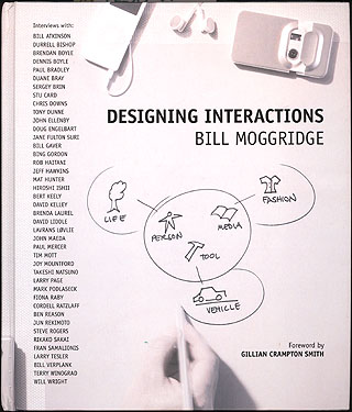
The cover of Bill Moggridge’s excellent Designing Interactions features a sketch/diagram that looks intriguing at first glance. But then when you actually try to figure out what it means, you’re stumped. I tried, but I couldn’t even scratch the surface.
Inside the book itself, we learn that the diagram is based on sketches that Bill Verplank drew while simultaneously discussing some of his thoughts about interaction design — it is what I call a “performative diagram”, a diagram that is created as an integral part of a real-time performance or presentation. After reading the chapter, we learn that the inner circle’s three icons represent three different basic ideas about what a computer is (an intelligent person, a useful tool, a expressive medium) while the other icons (life, vehicle, fashion) are metaphors or examples for how each notion manifests itself in an interaction design.
These are interesting concepts, to be sure. But that diagram really doesn’t “say” what the words say at all, especially when viewed all by itself and out of the context of Verplank’s voice, his gestures, and his actual words.
Diagrams are usually intended to take difficult concepts and make them easier to understand, but this diagram doesn’t exactly do that. Instead, it is an artifact of an explanatory process, the fossilized remains of a performative pedagogical technique combining spoken words and real-time performative gesturing and drawing.
The web site for the book, which is also excellent, includes a video of Verplank sketching a different diagram while talking about some key questions of interaction design. The book’s printed version of Verplank’s “diagram+text” technique pales in comparison to the video’s animated depiction of the same lesson, where the drawing and speaking unfold together in real time.
I appreciate being able to peek at Verlplank’s style of speaking and teaching, but I’ve always had a little bit of a pet peeve about the publication of diagrams that don’t make sense without a person standing in front of it talking and pointing. It’s common in academic publishing to do this — a teacher develops a habit of using a blackboard or whiteboard to explain their concepts, and later that teacher incorporates some of those ad hoc drawings into their published works on the subject.
I also suspect that this is the origin of some of the worst PowerPoint diagrams in business contexts — “It looked great on the whiteboard, lets put it in the presentation!”
They say a picture is worth a thousand words — but only if the picture says precisely the words you want it to say. To me the risk that an ad hoc diagram might confuse (saying the wrong thing or saying nothing at all) can sometime outweigh the potential benefits. Maybe you need to revisit the diagram, iterate it into something a little more communicative than what you drew the first time on the whiteboard. Maybe using no diagram at all is better than regurgitating the one you drew on the whiteboard.
And sometimes you’re just better off writing a thousand words.
Comments
2 responses to “Performative Diagramming”
Toward the end of your post, you hit the nail on the head. Powerpoint presentations (the slides) suck because a presentation is actually about *presenting* the information. In other words, you need the guy standing in front of the room, not just the slides. In order to “get” the presentation, you should get a quality video/mic’d audio of the speaker, along with the slides en situ. The only thing from that perspective would be the realtime answers to your questions. I think the TEDTalks ( http://www.ted.com/tedtalks/ ) are easily the best examples of this, as are the Apple/Jobs keynote speeches.
One of the best examples within TED was Hans Rosling: http://www.ted.com/tedtalks/tedtalksplayer.cfm?key=hans_rosling
CMH: Good point: PowerPoint gets a bad rap for two completely opposite reasons:
PPT as Speaker Surrogate: When people compose their PPTs like Word documents, cramming so much information on each slide that it ruins the live performance of the presentations by forcing the audience, and sometimes the speaker themself, to simply read all the text on the screen.
PPT as Document: Or, the opposite problem, where the PPT is properlystructured as mere support for the live speaker’s voice and gestures, but is then shown out of context as, say, a downloadable file.