
In a recent blog post, Garret Dimon claims to be hot on the trail of something fabulous:
I don’t have the details worked out yet, but I’m slowly putting together a vision of how we can really document web applications in a pragmatic way. The primary driver is to create something that people can understand, and to make documents that engineers actually look forward to using. It’s a hybrid of wireframes, page description diagrams, and functional specs.
I call this the “Holy Grail of Information Architecture”. It’s a versatile, powerful, and entirely mythical document format that almost every IA has fantasized about. Depending on who you talk to, embodies most or all of the following qualities:
- It combines site mapping, process flow logic, and wireframming into a single entity
- It allows atomic-level interface modules to be modified or replaced globally
- It is accessible via a web browser
- It can be printed
- It simulates the user experience via click-throughs from page to page or feature to feature
- It permits extensive feature annotation for programmers, bordering on functional specifications
- It is fast and fluid for the document creator
The 2006 IA Summit had two sessions entirely devoted to this. I wrote about it at the time, and honestly back then I still thought that the “Holy Grail” existed.
But I don’t think so any more. Until someone actually shows us the goods, I’m not holding my breath.
Designing for Communication
Richard Saul Wurman’s idea of an information architecture deliverable
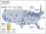
The term “information architect” was coined in the 1970’s by Richard Saul Wurman, who was talking very narrowly about the art of making charts, graphs, and diagrams that communicate dense information in efficient and effective ways. Think of the charts you see in USA Today or in science magazines illustrating, for example, “How the Internet Works”, or maps showing the state-by-state party breakdown in the last presidential election — that’s Wurman-style information architecture.
These old school designers, who today we’d call “information designers”, don’t just pick up a template every time they are given a new assignment. Instead they make up their design from scratch every time, drawing on their long experience but also utilizing a broad array of design techniques, tools, and visual languages.
Today’s information architects and interaction designers aren’t simply charged with the job of “coming up with good ideas”, or “documenting structures”… we are supposed to be communicating these ideas and structures to our teammates who need to understand them as deeply as we do.
Most IAs, however, begin their design process by opening up a document template and starting to execute sitemaps, flowcharts, and wireframes. Sometimes there are fancier models in the toolkit, too, such as mental maps and user scenarios, but even these formats are often approached by opening templates and filling them in. More often than not, we deliberately avoid “re-inventing the wheel”.
But why not re-invent the wheel now and then? What happens when the best way to communicate a structure simply isn’t among the tools in the templated toolkit? Is a site map the best way to communicate the critical fact that 90% of a site’s features requires a user to register, or can this be done in a simpler, unique new site diagram?
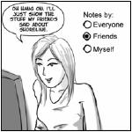
Kevin Cheng‘s idea of an information architecture deliverable
And what happens when the templates don’t fit the project’s needs? Does every site map need to avoid documenting the content within each page? Do site maps and wireframes need to be separate documents? Does a user persona have to just describe one person? Would a comic book-like storyboard do a better job of communicating an RIA’s functionality than a simple wireframe?
One of the best things about being a manager is my ability to interview information architects and look at their deliverables. I love it when a candidate shows me something I’ve never seen before, a design technique that they invented just to solve a particular problem for a particular project — in fact, several of the examples I described above I have seen in candidate portfolios.
Every client/project is unique. We simply cannot assume that any deliverable template will work for every job. Templates are great for “normal” design tasks, but more and more interaction design tasks simply aren’t normal.
This is the first reason why the Holy Grail will never be found.
Designing for Use
Another argument against the Holy Grail is that it may not even be usable for the designers and information architects who need to create the documentation in the first place.
Here’s a list of the tools I use to generate interaction designs:
- Talking
- Sketching with pen and paper
- Whiteboarding concepts and structures
- Writing text descriptions of concepts
- Making documents in Visio, Word, OmniGraffle, Powerpoint, etc.
- Making documents in Illustrator, Photoshop, etc.
- Making and testing low-fi clickthrough prototypes
- Making and testing functional prototypes
- Building, testing, and revising the real end product
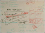
My idea of an information architecture deliverable
As you go down this list, the power and level-of-detail of each deliverable increases. But the ability to create or revise those deliverables decreases at the same time. It’s a lot easier to radically revise a whiteboard sketch than to do the same kind of revision to an Illustrator document.
In fact, one of the reasons many people like to use Visio or OmniGraffle instead of Illustrator to make flowcharts and site maps is that these programs are far better at permitting rapid changes to be made to the structure of the content on the page. The results aren’t pretty, but you can drag boxes around all day long and they will stay connected no matter how convoluted your flow becomes. You can radically revise your design ten times in as much time it would take an Illustrator user to revise their diagram once.
This is what I mean by “use”: The primary use of some design tools is to allow fast-and-loose changes to be made early on in the design process, before you become too committed to those design decisions.
In this sense, Visio/OmniGraffle resembles the low-fi fluid process of drawing with pencil and paper, where Illustrator resembles pen-and-ink drawing, or even painting with brushes. The farther down the list you go, the harder it is to iterate and improve your ideas — and the more likely you are to become irreversably attached to the ideas you’ve already documented.
Designing a System vs. Building a System
Another observation you might make about the list above is that the further down the list you go, the closer you are to actually building the final product. This is, to me, another problem with the Holy Grail: in pumping so many features into this imaginary documentation medium, we’re just not designing any more — we’re building.
Here’s an anecdote: Years ago I was designing an epic CD-ROM adventure game. The game involved hundreds of plot and script branching points, and it was a challenge to document and track all of these changes. We were documenting these branches using flowcharts and word-processor text documentation, but at one point I had a brilliant idea: “Let’s make a Microsoft Access database to store every one of the 500+ plot elements, with each element dynamically linked to the other elements via a rich Visual Basic user interface, with buttons and fields to let us author and browse the documentation almost as if we were playing the game itself.”
That’s the problem right there: We tried so hard to make the documentation feel like the game that we ended up spending days building the documentation tool and continually coming up with new features for the tool to support new ideas we had for the game itself. We were, in fact, doing the same work the programmers were doing. We were programming a game. It was insane.
Documentation needs to be kept simple enough to support fluid and rapid changes, and it shouldn’t be confused with prototyping, or worse, implementation.
Be Creative by Re-Inventing the Wheel
It all comes down to creativity: Our documents need to support our creativity. They need to be able to radically change at any time to permit new and unique project demands. The simpler the document format or template, the more likely it is to be able to be adaptable to new and innovative ways of thinking about our products.
Also, we need to be creative about the documents themselves. We need to create more and more new documentation formats and solutions. Garret Dimon’s quest is, actually, driven by this same motivation to build a better mousetrap. Where it is possibly misguided, I think, is that it pretends to be a Swiss Army Knife solution, a jack of all trades.
Instead we should all be constantly ready to invent a new template, a new deliverable, or a new process for creating effective interaction design documentation.
Maybe that’s the real Holy Grail.

UPDATE: Here’s a cool site documenting a hundred different techniques of visual communication, from Flow Charts to Gantt Charts to Zwicky’s Morphological Box(!). How many of these, or combinations of these, do you use on a typical IA project?
Comments
17 responses to “The Holy Grail of Information Architecture”
a bunch of years back, a number of IA’s on my team were bickering about which standard to run with for wireframes and task flows. should it be visio or illustrator? boxes & arrows or 3d forms? three levels of granularity or two? etc.. i responded with the direction of “use blood on the sidewalk for all i care, just communicate the behavioral specs.”
it still applies today, methinks.
This feels like an over-reliance on process and not the end result.
Since there are *people* involved, you can’t break down any process into the “achieve goal by nailing every step” type of philosophy, as they teach you in archery.
In a sense, communication with the client is every bit as much a challenge as communicating the design message. Each one is different, and deserves special treatment.
I wonder if any IA’s could think Beyond the Information Age to an age of True Knowledge sharing. I have an ebook about a software system that manages true knowledge instead of information. Ebook at: http://www.vias.org/beyinfoage/ and I hope you can comprehend it.
Enjoy!
Good stuff!
My huge concern with any templating approach is that designers start filling in the template rather than thinking through the design. I continually have to remind people that they should be thinking about what is important rather than thinking about fields in a template…
I guess this depends on what the templates contain. I’ve always created templates that have questions rather than headings. This helps stop the “fill in the blanks” approach and can prompt anyone using them to think about what it is they are doing.
I’ve also had similar discussions with people when trying to explain that, no, they won’t be getting an _______ just because someone else did. Once they “get” that, they seem to trust you more.
So maybe this is a ‘toolkit’ rather than ‘template’ discussion? With the top level of the toolkit being “what is it you are trying to communicate, why, and to whom?” (the rest of the toolkit can be blank or a grab bag of possiblly useful starting points).
I wonder if anyone has thought about how to *sell* a deliverables-driven process where the deliverables themselves are deliberately left undefined at the outset of a project.
You could, for example, sell a project where a “wireframe deck” is presumed to be a key deliverable, but where upon kick off and investigation of the project requirements, a different approach (say, a modular storyboard for an RIA-type site instead of page wireframes) would be more appropriate.
Some consultants craft their statements of work vaguely (“We will plan the structure”) while others who have clients who demand more precision and detail in their contracts need to specify the deliverables themselves and even describe the scope and nature of those deliverables (“We will produce approximately 20-25 page wireframes”).
How does a firm or client who prefers the more detailed/specific approach to contracting accommodate the kind of flexibility I describe in the original post?
Why not develop models that at their highest level are simple to understand like a wire diagram, flow chart, process diagram, etc? Then use each diagram element as a container for a more complicated (dense, technical) view of that particular object. Sort of a “drill down” approach – double click on the element and get taken to another more detailed model that explains that element more precisely.
Last, while I agree that we need to be creative and flexible, I think we should stick to some sort of standard modeling language that clients can become accustomed to. I really like to use standard (and intuitive) symbols so that I don’t have to explain and re-explain what the symbols mean each time we meet. I don’t want the client to get hung up on presentation. I’d rather they spend that time on my design.
Paul
Paul: Great point. Some degree of standardization is really important. “If it ain’t broke, don’t fix it” is of course another good rule of thumb. I just think your first instinct should be to try to visualize a solution without resorting to the standard vocabularies, as an exercise to explore the creative boundaries.
From the quoted post: “I don’t have the details worked out yet…”
That the first red flag to me. Cause it’s nothing *but* details, all the way down.
If I compare your list of qualities for the Holy Grail with this quote from the Swipr website (http://www.swipr.com):
“A large number of IA’s already use Microsoft Visio to create (some of) their deliverables, such as screenflows, sitemaps and wireframes.
Integrating these deliverables into one navigable set of HTML documents facilitates the communication of the deliverables. Letting the client click through the sitemap and see each wireframe in the map helps their understanding of the order in which the wireframes are displayed in the application or website. By also allowing links within the wireframes, the IA can now easily create a low-fi prototype from their wireframes.”
…I see a clear match. Or is it only a model? 😉
Disclaimer: I was a close colleague of Swipr’s creator Jacco when we developed a first version of the tool (J-Flow, as presented at the 2005 IA Summit) at EzGov.
I don’t believe there’s a Holy Grail, and my one concern when trying to get a point across is doing it in the language the client understands. Unfortunately there’s no single unified vocabulary (or visual vocabulary) one can use to effectively communicate all the complexity of some problems. However, a combination of existing methods works fine.
I’m more concerned with the lack of a visual tool or language to address some of the nuances of projects where the “page” as concept is outdated. Documenting complex interactions is something I’ve been giving a lot of thought to and would love to see (or help work towards) some solutions for.
@Fred:
I too have been doing a lot of thinking about communicating complex interactions where the “page” metaphor breaks down. I’ve found that I’ve turned to cartooning and film for my inspiration, and started to create storyboards, which conveniently dovetail to use cases.
We were demoed iRise some time ago but it is exorbitantly expensive per-seat. It did all the big points, tho’. Created clickable prototypes but printed out as requirements.
But yes, of course the failing point was that it couldn’t capture what was new, only what was established. Sliders weren’t in there, but would be in the next release, for example. Top of the curve is the best such a tool can accomplish. At worst, it was the tool that “anyone can use,” which in some places *anyone* would.
For the “everyday” projects, such tools are enormous timesavers, but they can’t replace real diagramming and prototyping skills and never will. IMHO, too much time is spent trying to make tools that incorporate real functional elements and not enough spend time simplifying the faking of them.
You misspelled the “Desigining for Communication” title (extra “i”).
This is brilliant material, I’m going to make a reference in my blog. Thanks!
I think this could exist but not in a software package! Commmunicating is the key, and I think as much as your taxonomy and organisation may be ground breaking if you can not communicate this visually then you will lose the interest of half the audience. People love pictures and as long as they are explained then they should be understood.
I think the Holy Grail is there to be taken, multi-facet diagrams – that is where it starts…
[…] Most notably is his comments on technology’s growing focus on exploring methods of exploration. It is not enough to follow a process of exploration, one must continually look for weaknesses or variations on the process. This reminds me of an article about information architecture which argued that there is no holy grail approach to process. […]
Was intersted in the grail photo-grail in sky glowing….please contact me!