(This is Part 5. Please check out Part 1, Part 2, Part 3, Part 3a, and Part 4)
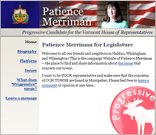
Go get ’em Mom: patiencemerriman.com
I recently designed a web site for my mother, who is running for the Vermont state legislature (I’m so proud of her!). Vermont is a small, largely rural state, and there are a lot of regular working class folks there who like many Americans have to struggle to get by. And despite its ultra-liberal reputation, it’s actually a fairly conservative and traditional place in most parts. You actually won’t find a lot of latte-drinking, sushi-eating elites in Vermont, in particular where my Mom lives.
So when Mom asked me to design her site, she said “don’t make it too fancy”. It couldn’t look like some fancy New York City hipster boutique web site that cost thousands of dollars to build. Candidates in Vermont literally have a spending cap of $2000 for their entire campaigns, so although my work was pro-bono I needed to keep the design simple and economical.
What’s more, my mother hates Helvetica!
So I tried to make it nice but not hip or slick. I think the result is nice enough that I’m happy to link to it here on my site and show it to all my elite snobby designer friends, but honestly I had a hard time finding a balance between fancy and not-fancy. I actually think I am pretty bad at non-fancy design!
Left, Right, High, and Low
I’d like to see what more-skilled and elite designers would do with a similar challenge, where something real and important is at stake and appropriateness to the audience is critical.
A handy example is Andy Rutledge’s unsolicited redesign for the White House web site. While excellent and elegant design-wise, I think it is entirely wrong for the typical Bush voter, or for that matter to the typical American. I presume Andy to be sympathetic to the Administration’s political objectives, but his design sensibility does not map to what I think Karl Rove thinks President Bush’s “base” would prefer. The current White House site is anti-slick and anti-elitist by choice. Andy’s White House site design, on the other hand, looks like something a latte-drinking, sushi-eating, President Gore would have wanted — and he would have been just as wrong as I think Andy is.

One look at President Clinton’s White House site from 2000 (love that Wayback machine!), complete with two-fisted animated GIF American flags, shows that Clinton’s web team, like Bush’s, thought that a lowbrow design was the best approach.
Both parties have upper-class elites among their target voters and supporters, of course, but these supporters are not reached by web sites and banners — they get embossed letters with elegant typography inviting them to $1,000-a-plate dinners. The masses of working-class and middle-class supporters in each party’s “base”, however, are the targets of politicial web sites, and the design language used to communicate and connect with them is mission-critical.
Next: Class and Web Design, Part 6: Breaking The Class Barrier
Comments
7 responses to “Class and Web Design, Part 5: The Politics of Class”
Your mother’s name is Patience?
As an interesting sidenote, the State of Michigan (http://www.mi.gov/) has had the same crummy web site design for four years. It even looks like the guys who designed it also put together the WhiteHouse.gov site.
So I was surprised when I heard the news that IT HAD BEEN CHOSEN AS THE BEST STATE GOVERNMENT WEB SITE IN THE NATION! Now they’re never going to make it better 🙁
David, that’s hilarious! Maybe the MI site has good content, and that’s why they won. Our local site, http://www.nyc.gov, is much-liked here in NYC for its helpful content and tools, although it, too, is not a paragon of high-class design.
And yes, my mother’s name is Patience — like Faith and Hope, it’s an old school “virtue” name.
Good job with the site, very appropriate.
I actually encountered the opposite problem in designing for the Green Party of Seattle. The Greens had an old site that revealed their rootsy nature. Many Greens are teachers, activists, social workers, etc. Their old site reflected the level of visual sophistication of their collective class (see it here)
I believed their challenge was to actually appear more sophisticated to all the latte drinking sushi eating Seattle Democrats (of which there are many). So I designed two sites for them over the years which I hoped would do that. See them here and here.
Funny thing is, they eventually hacked my design apart and replaced the logo with their own creation. The look contradicted the original work. You can see their new banner at http://www.seattlegreens.org. My gut tells me their decision alienates the middle and upper middle class voters who might consider them as an option if their communications disproved rather than compounded some of the unsavory Green Party stereotypes. I admit I may have failed at this though and missed the point.
Did you really just pass up the chance to have the rippling flag[s!] on your site in a non-ironic way, using a single frame instead? Was that a line you weren’t willing to cross? (I’m half-joking — I think). Or mere tech glitch somehow? Just found it an interesting occurance given the discussion… I think your highbrow audience would’ve let it slide!
ToddG: I don’t understand it, sometimes that GIF works sometimes not. It’s supposed to animate, of course… Hmmm, looks like the original version stops animating after a few loops. It’s all Clinton’s fault!! Thankfully, I still have an old animated GIF editor!
Oh say, does that star spangled banner yet wave?
Hi Christopher, your article on class and web design is really enlightening. I recently completed a job (http://bioair.com.sg/home.html) and I found myself at the end of cursing the design changes that the client imposed on us, from making the fonts huge to flash splash page on the index page.
But now looking back after your article, I guess your statement on judging a design on its appropriateness seems like a best way to gauge the success of a site.
thanks 🙂
Dear Chris,
Everyone loves the site, including me. THANK YOU so much for your help!
We are down to the last 3 weeks of the campaign and I am ready to implode from the tension. When I got into the race, I thought it would just be a learning experience because, as a third-party Progressive candidate in a conservative Republican district — and with a strong Democratic opponent — I didn’t think I’d get more than 10 votes.
But then some people actually started to support me …
Love
Mom