
(This is Part 3. Please check out Part 1 and Part 2)
Does the “AS SEEN ON TV” badge tell you that a product is good? Or does it have the opposite effect on you? My guess is that, if you’re anything like me, the little red badge indicates “cheap crap” to you. But to millions of people it is a badge of quality — it tells them that the product is mainstream and well-known.
Why the difference? How can a little red badge radically alter the perceived credibility of a product? Whatever the answer is, you can bet that it correlates pretty closely with class. In fact, I contend that class plays some kind of role in just about every aspect of a product’s existence, from its business strategy to how it’s marketed and everything in between.
Before I go any further, however, I want to be clear that I’m not saying anything about this is right or wrong. I’m just saying that is the way things are, and that we should be talking about how much class can or cannot be extracted from the design equation.
Back to the Honeycomb Hideout
While writing this post, it occurred to me that much of what I’m thinking corresponds closely to Peter Morville’s user experience honeycomb diagram, seen here.
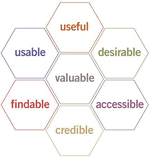
Each of Peter’s facets of user experience design can be looked at through the prism of class. Especially in areas like desirability, value, and credibility, where marketing and messaging come into play. And insofar as a user’s class background might correspond to (for example) the limits of their vocabulary or experience with high-tech services, findability and usability might work differently for one class versus another. Accessibility-wise, are some classes more likely to be sensitive to the needs of the disabled? Are disabled people from the upper classes have a greater sense of entitlement to accessibility than the lower classes do? Or is it the inverse?
Class Defines Budget (How Much it Costs to Make and Buy)
Is there a correlation between (a) the amount of money spent on design and (b) the class the product’s target audience? I’m sure there’s some connection, but it’s not an exact fit: Some elegant design is so simple that it takes little time and money to accomplish, and some truly trashy design takes many hours of labor to accomplish.
But in general it’s probably safe to say that products targeted at lower classes spend far less money on design per customer/user than those targeted at the higher classes. Mostly this is because a lower class target audience has less money (money being the easiest indicator of class), but it’s also because lower classes In other words, if a company perceive your target audience as lower class, you may likely also think that spending a lot of money on the design might not be worth it.
Class Defines Quality (and Service)
This is largely a correlary of budget, insofar “ya get what ya pay for”. But it’s worth mentioning because it seems a common practice for industries to deliver poor quality goods and services to the lower classes. A class of people who are not used to asserting their rights as consumers and who lack the money and/or experience working with lawyers are probably less likely to want to return damaged goods, to sue when they are ripped off, or to complain when they are under-served. Some classes are not yet accustomed to feeling “entitled” to good service and good products — and businesses who target these classes take advantage of this.
Have you worked on a web site where you were asked to try to bury the phone number for customer service? They you’ve taken advantage of the lack of a sense of entitlement that most Americans, even in the middle class, live with every day.
This is where bad design (specifically, bad user- or customer experience design) practices and profitable business strategies most vividly overlap: AOL would almost certainly have gone out of business a decade ago if they made cancelling accounts easy.

Do you trust these banner ads? Many many millions of people do, even though they are clearly (to me) scams.
Class Defines the Language of Credibility
The success of late-night TV infomercials is entirely dependent on the lack of education (and in particular the lack of media savvyness) on the part of the consumers they target. They rely on the viewer’s inability to distinguish between a real TV show and a pre-packaged pseudo television show. The same can be said for borderline scam internet marketing such as spam hawking ultra-low mortgage rates or \/1agra pills, where the audience’s ignorance is an explicit part of the business plan.
People in the higher classes may be more likely to deduce a products’ credibility from its association with other higher class brands, from the exclusivity of its availability, or even quite simply a high price. Conversely, lower class people may be more likely to derive credibility from a celebrity endorsement or from astonishing claims of quality. Or simply based on the product having been seen on TV.
Class Defines What Things Looks Like
This is the area where class most obviously comes into play. Instead of picking out web sites that seem “classed” to me, however, I will cite a few examples from other fields of design in the hope of demonstrating that class is right up in your face everywhere you look.
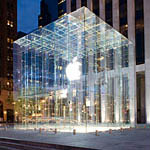
- Technology: Look at a typical Best Buy retail store. Then look at the uptown Apple Store in NYC (shown here). Despite Apple’s hippy counterculture vibe and scruffy spokesdude, the store looks an awful lot like elite stores like Tiffany’s and Cartier. Hell, it’s located only a few blocks away from Tiffany’s and Cartier in the toniest shopping district in the world. Would someone accustomed to shopping at Kmart feel welcome here? In fact, I’d argue that Apple is a pretty upscale brand. The iPod is an emerging exception, of course, opening new doors for Apple. I am very interested in seeing how much Apple continues to broaden the class base of their target customers.
- Fonts: Comic Sans, detested by designers, is beloved by millions. Helvetica, beloved by the cultural elites, is considered boring by millions. The difference between these groups is, I’d argue, a manifestation of class.
- Clothes and Fashion: Clearly clothes denote class. A pink sweatshirt bedazzled with butterflies means something totally different than a Banana Republic cashmere sweater, which in turn is very different from a navy Brooks Brothers sportcoat with brass buttons. It’s not all about money, either: Paul Fussel notes that the ultra-rich aren’t as flashy about their clothes as the upper middle class is — that patches on the elbows of an old suit jacket are markers of the highest classes for whom conspicuous consumption is not a question.
- The Human Body: Humans aren’t products, but they are designed by our exercise and diets, and to that extent they do denote class. For much of history, corpulence was a marker of wealth, and muscularity was a marker of physical labor. Nowadays, this has largely reversed, where having a healthy body is now considered an upscale lifestyle choice.
Think also about food (baby greens versus romaine lettuce), magazines (The Economist versus People), cars (Audi versus Pontiac), anything else where the product itself is closely associated with class.
Why should we think that web sites would be any different?
Class Defines What We Want
So when a person is surrounded by the markers of class, immersed in it from the magazines they and their friends and peers read, the software they use, the food they eat, the fonts and images they see, the clothes they wear, and the beer they drink, doesn’t it also make sense that this person might seek out products that are consistent with those they are familiar with?
Next: Class and Web Design, Part 3a: Tabloid vs. Broadsheet
Also: Class and Web Design, Part 4: The Vicious Circle of Desire
Comments
6 responses to “Class and Web Design, Part 3: As Seen on TV!”
I’m enjoying this series Chris, so refreshing to see a new approach at something many of us know so well (the web) that’s not afraid to be a little unPC.
It makes a lot of sense too, I constantly have to re-evaluate my design decisions along the lines of ‘i know this goes against my taste, but i think it really is wha they want.. even if it is terrible!’
Perhaps in response to the first post in this series, and vigorously agreeing with this post, is my opinion that there are particular esthetics that signal low cost. For example, I’ve argued that the design of eBay is beneficial in that it borrows the slap dash esthetics and usability of a flea market, the physical space where we find bargains in the same sort of used products.
http://noisebetweenstations.com/personal/weblogs/?p=976
“As Seen On TV” is an anomaly that has somehow survived the deconstruction of TV credibility, and harkens back to the days when people believed there were strict broadcast standards that prevented inaccurate, flawed, or otherwise improper content from being aired. So you’re right, it absolutely preys on ignorance, as the only people who would still put faith in a brand like that are people who haven’t yet learned how broken the television industry really is.
Noah: Interesting angle on the ASOTV badge. It never ocurred to me that there might be some actual logic to it. I always assumed that it harkens back to a time when TV lent everything a kind of magical quality and had an almost mystical godlike/oracle-like truthiness to it.
I particularly like what’s embedded in here: “So when a person is surrounded by the markers of class, immersed in it from the magazines they and their friends and peers read, the software they use, the food they eat, the fonts and images they see, the clothes they wear, and the beer they drink…” This is the first time I’ve read of software and fonts being class indicators. But in this era of immersion in type and the computer screen, I guess, yes, they are big aspects of identity.
People are walking around so brain washed that it is almost better to keep them this way- so they can still feel happy when they get up in the morning.
If you told people the truth on tv and other media ways then they would be full of feer.