Version 4 of Google’s awesome Desktop Search came out a few weeks ago. It’s great in a lot of ways, but I wanted to focus on one interesting new(ish) feature: Quick Search.
(The Quick Search feature has been around since version 3, but since verison 3 only came out in March, I imagine some people don’t even know about it yet.)
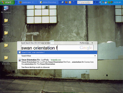
The concept is simple: you hit the Ctrl key twice, and up pops a search field in the center of your screen, on top of all of your other apps, ready for you to type in your search terms in a gigantic font. The “window” is not draggable — it just sits smack in the middle of your screen waiting for you.
It also behaves a little like the Mac Launchbar, too, returning some Desktop Search results instantaneously — as you type — allowing you to quickly reach your applications, documents, recently-viewed web pages, etc.
What’s particularly smart about the app is that it recognizes the fact that entering search terms is a singular, discrete, and highly-focused task. Because searching doesn’t require doing anything but typing or pasting in your terms, the search interface itself can largely dominate the “focus” of the screen. The “state” of the user experience becomes centered, literally, around entering your search terms. Because of this singular focus, they can safely make the while thing almost comically big.
Full-Focus States
Yeah!
There are, in fact, many common tasks that are so singular and focused that it’s perfectly okay for the task to trample all over all the other apps you may be using. I think of these tasks as “full-focus states”, where you have only two options: complete your task, or cancel it.
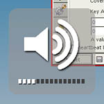
Changing the volume on your computer is a great example of this. Most computers these days allow you to change the volume using keyboard shortcuts and big fat on-screen volume indicators that overtake the screen for the duration of your volume adjusting, disappearing when you’re done.
Duh!
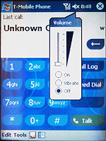
On the other hand, on my 4-year-old Pocket PC-based PDA/mobile phone, changing the volume requires interacting with a tiny dialog box requiring precise control with the stylus. Why isn’t this a full-screen interface with a giant slider? Why in the world would I want to use the phone buttons while the volume control is still open? I suspect the UI designers chose to make it a dialog box because they were trying too hard to make the UI look like a traditional desktop application, with layered windows.
Instead, they should have been thinking in reverse: What tasks are mobile phone interfaces already doing quite well? Having a robust desktop-like operating system in a handheld is cool, but there are some UI conventions that non-desktop platforms have figured out how to do right. If it aint broke, don’t fix it.
I think we’ll see more and more desktop apps take their UI cues from non-desktop devices where multi-tasking is not required. Mobile phones, of course, but also interfaces like those on DVRs and ATM machines, where the user’s task is quick, focused, easy to complete, and doesn’t require the availability of multiple windows and interfaces.
Comments
3 responses to “Google Desktop and Full-Focus States”
Good post. I’d add that what is or isn’t a full-focus is going to be different for different users. I’ve been thinking about this since last December, when I was home for Christmas and helped my mom do some financial stuff online. She kept on clicking links more than once, and resubmitting forms — because the Firefox “page loading” indicator is a tiny thing in the upper-right hand corner, and she doesn’t know to look for it, and thinks nothing is happening.
Netflix, on the other hand, grays out your whole browser window when you do an Ajax request to, say, add a movie to your queue. Which I’m realizing I really like personally, even though I’m supposed to be one of those uppity gen-Xers who can do twenty things at once.
Now I’m wondering what it’ll take for somebody to release an alternate version of Firefox, stripped down for users who are senior citizens, have minor visual impairment, etc., etc. (Not that I’m volunteering.)
Francis, that’s a great observation, making the connection with Firefox and the NetFlix Ajax functionality. I can totally imagine the little Firefox “loading” spinner filling the whole screen as a full-focus state for some users. At the very least, typing in a URL or an intra-page search query would make sense as a full-focus state.
Related to this is the simple matter of how users size their application windows. Many Windows users, including me, like to “maximize” their app windows to full the whole screen, forcing them to focus on only one app at a time. I almost never have multiple windows on my screen stacked up like a pile of papers. Mac users, on the other hand, almost always have their app windows stretched out to something less than the full screen, with an obvious stack of windows visible at all times. Clearly there are user behavioral “style” preferences at play here, too.
Personally I’d love to see more dialogs/alerts handled in a Lightbox kind of way.