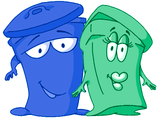
New York’s recycling mascots. They used to have an alley cat nemesis, too.
In recognition of Earth Day 2006, here’s an environmental design challenge: Inform nine million people how, when, and what to take out for recycling. Your audience, the citizens of New York City, is the most diverse group of people in the world. Many of them may not speak English. Some may not read at all. Some may not want to recycle. Some may not understand it. Some are children, some are elderly.
After September 11, 2001, part of New York City’s recycling program was put on hold indefinately due to budget constraints as the city faced a major financial crisis. Thankfully, the program was fully restored in 2004, and New Yorkers are recycling again. Before, during, and after this change of service, communicating with the public and educating them about what to do and how to do it has been a critical and ongoing challenge for the Department of Sanitation.
So they put up recycling posters in public places, provided stickers for landlords to put on trash cans. And so every so often they send every New York resident brochures and newsletters in the mail. For years, these pamphlets, stickers, and posters have employed mascot-like cartoon character recycling bins. These characters — these products of design — are as much a part of every New Yorker’s design environment as our world-famous subway line icons.
![]()
Sometimes public sector design and hipster design intersect, as with the subway iconography. Sometimes, however, they don’t.
Cartoon Pants?
Last week, Peggy and I got this flyer (below) in the mail, describing the city’s latest efforts to promote composting, electronic device disposal, and clothing donation.
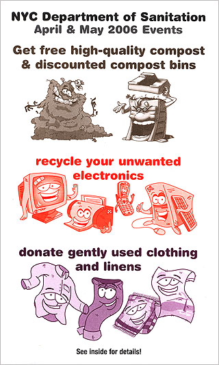
Our first reaction was to laugh at it. WTF is going on with all these cartoon characters? Cartoon character pants? (Doesn’t that towel look a lot like Towelie?)
But then, upon a few moments reflection, we realized that this brochure is actually good design! It succeeds at its goal: educating the public about the existence of new recycling programs. The cartoon characters may be a little childish and hamfisted to those of us who like to think of ourselves as the design elite. But it’s obvious that a key part of the target audience for this brochure, and indeed for all of the recycling program’s promotional materials, is children. By making recycling a positive and fun ideal for kids to aspire to, children will not only encourage their families to recycle, but they might grow up with recycling as a core value themselves.
And besides, the typography is clean, the color coding is clever, the interior of the brochure is clean and easy to read.
Design Snobbery
I sometimes think the design world has a certain pecking order, with some design “styles” thought of as higher, more sophisticated and more elegant, than others. I don’t put much stock in such stratification, however. Yes, I have my own tastes in design, but I have a lot of respect for designers whose work succeeds in addressing important challenges even if their solution may not make it onto the cover of ID Magazine.
I can imagine what the design-world hipster version of these brochures would look like: You’d have a neat, grid-based layout with obscure cryptic icons for each type of recyclable: A little apple core icon for the composting, a little mouse or mobile phone icon for recycling electronics, a little shirt for the clothing program. It would look really slick, but would it work? I wonder.
Comments
6 responses to “High and Low in Public Sector Design”
A few things: first, where do cartoon pants fall in the pecking order? Hehe. And second, I resent that remark about grids!
Khoi you can take your grids and shove em. We don’t take kindly to grids here at graphpaper.com!
I don’t know, that piece isn’t really cartoon pants (a.k.a clown pants). It’s not that bad, actually: it uses one readable font in a consistent size, the colors are intentionally limited via a sectional monochrome scheme, and the layout is pretty sensible. A cartoon pants design would use garish crayola colors, have no layout sense whatsoever, and use 7 different typefaces (Comic Sans and an all-caps script face among them).
I guess for me, “cartoon pants” refers to quality, not style.
Recently I had a potential client turn down a proposed design mockup…he said he wanted something more “sophisticated.” What he really meant was he wanted unnecessary graphic elements added for no reason. Which is a different type of cartoon pants…
Hey Mike, I was just referring to the pair of pants at the bottom of the page. Those are gen-u-ine cartoon pants!
I realized it after I commented…I originally thought you were referring to the “clown pants” phenomenon of horribly awful design 🙂
[…] Anyway, here’s a great article on cartoon characters being used for New York recycling, and why it’s not only a cute program, but also good design. […]