Yahoo’s interaction design department has for the last year or two been developing an intranet dedicated to sharing, internally, their interface design conventions and standards (or, to use the current hip jargon, “Design Patterns”) for their internal development teams, to ensure quality and consistency of interface widgets.
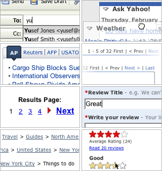
It’s kind of an IA “style guide” for common user interface elements, such as breadcrumbs, pagination, tabbing, etc. There’s even a blog so that Yahoo’s internal users can update or discuss each element in the library.
Some of the Yahoo team wrote about the whole process a year ago at Boxes and Arrows. At the time, I was pretty skeptical about the extravagance of the project: It seemed unfathomably unrealistic for any company besides one as big as Yahoo to build their own internal interaction design pattern library and blog system.
But now Yahoo has released the whole thing to the public.
It’s far from complete right now, but there’s a lot of very cool stuff already posted. And the TBD pages look like they’ll be really interesting, too. I highly recommend it. It’s basically a library of “best practices” for common IA problem solving.
This is not to suggest that Yahoo’s patterns are the ONLY way to solve these everyday design problems. In fact, there are others who have been developing similar design libraries of interface design examples, including:
- Christina Wodtke’s excellent Widgetopia blog
- Jenifer Tidwell’s new O’Reilly book (and web site) “Designing Interfaces“
- Van Duyne, Landay, and Hong’s book “The Design of Sites“
- 37signals’s Matt Linderman and Jason Fried’s book “Defensive Design for the Web“
- Martijn van Welie’s eponymous welie.com
All of these are great resources, and provide great examples of best (and worst) practices. Yahoo’s implementations and guidelines are largely elegant, simple, flexible across massively diverse products and services, and of course rigorously tested with hundreds of millions of real users… but that does not mean that there isn’t room for improvement, adaptation, and innovation in any of these user interface widgets.
The most interesting question, however, about Yahoo’s release of this useful material is: Why did they do it?