I am not much of a sports fan, but I am always impressed with the information design on many TV sports broadcasts. I love the little icon in the corner of many baseball broadcasts that quickly sums up the current game status: score, inning, who’s up, who’s on base, etc. And of course, the virtual first down line in Football games is a fabulous and elegant example of adding information to the “channel” without crowding the field (both the field of vision and the gridiron itself) with excess clutter.
Watching the Torino Winter Olympics on TV the last couple of nights, I saw another novel example of this kind of information innovation.
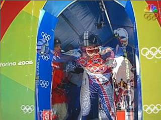
At the gate, these two skiers are almost a single entity…
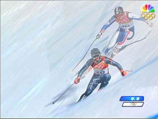
But after passing a few turns, a clear difference has emerged.
In downhill skiiing, each competitor makes their run down the mountain alone, one at a time, and they are said to be “racing against the clock”. In reality, of course, they are racing against the other skiiers who went before and after them.
Traditionally, the sportscasters will announce “split times” as each racer descends, reporting at intervals whether the skiier is ahead or behind of the athlete currently in first place with the best time. When a skiier passes a time checkpoint, we are told that they are a quarter of a second ahead of the leader.
The image this conjures up for me is a race against a phantom: as you make your run, the leader (who may have done his or her run hours earlier) is still right there with you, ahead or behind you and separated only by split seconds.
Now NBC has actually made this visualization real, and it is an eerie and beautiful thing.
With the same kind of computer-controlled cameras used to project the line of scrimmage on a football field, this effect is created by superimposing the video from two athletes at the same time, with the camera locked to the identical angle and zoom settings sequence for each run.
This is information design. You can watch two skiiers descend in perfect unison, but then see one skiier falter slightly and immediately the synchronization of the two skiiers falls apart and the impact of what a .3 second gap really means becomes glaringly obvious.
Some may call it a gimmick, but I think it’s far more than that. I think that by adding information in such a startling and compelling way, they are actually making the sport itself clearer. Something about these images strikes me as having a psychological truth to them, that somehow they capture the exact right “mental model” of this sport. A skiier is more likely to think “I need to get four feet closer to the leader’s position” rather than “I need to make up .08 seconds to catch my rival”. Perhaps this sort of image manages to capture a little of how each of the skiiers are thinking, how they are visualizing their performance and how they really understand their competitive objectives from second to second.
Comments
4 responses to “Olympic Special Effects as Information Design”
Interesting observation. This is very similar to something they do for swim meets here in Australia (and I imagine in other countries). Rather than having a ‘phantom’ skiier, the world record line is imposed over the pool to show the swimmers’ pace relative to the record.
You’re right – although numbers are how many sports are traditionally represented, they leave almost no way to relate them to a current race, a new competitor, etc, in an immediate, spacial way.
I imagine that world record line moves, too. That sounds cool!
This actually started in video game sports simulations. For example, Gran Tourismo has a “shadow” car, when you’re racing. It pops onto the scene after you’ve completed your first lap, and replays your prior lap. You can immediatly see where you falter, and where you improve.
Since then, they’ve been doing this in NASCAR and WRC races.
Gran Tourismo has a “shadow†car
Holy shit, you’re right! I totally forgot about that.